Rebecca Senf: Creating Artist’s Books
 Today’s post is written by Rebecca Senf, a significant voice in our community holding positions at both the Phoenix Art Museum (as the Norton Family Curator) and the Creative Center of Photography in Tucson, Arizona. She was featured in a Lenscratch Mixtape in 2013. Earlier this year, she hosted and co-juried an exhibition on self-published books and after the experience, felt she could provide some feedback into creating personal books. Thank you to Rebecca for these insights!
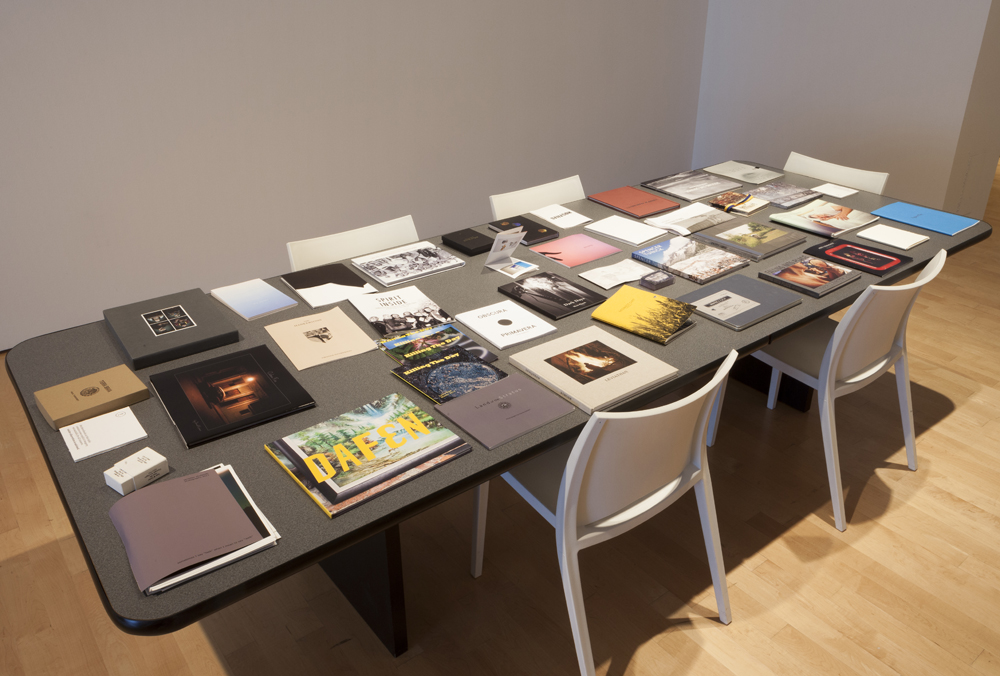
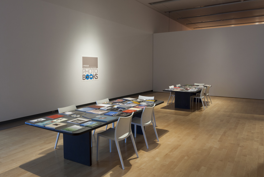
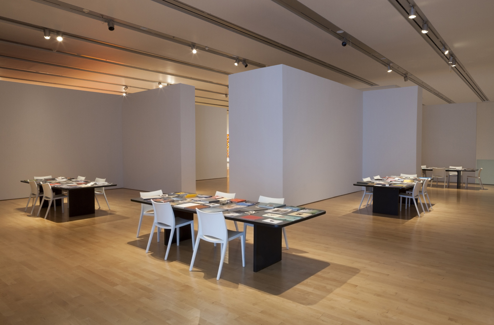
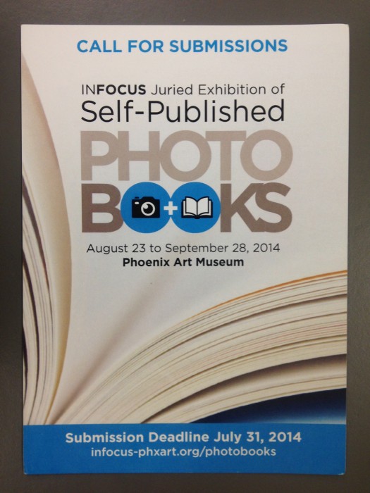
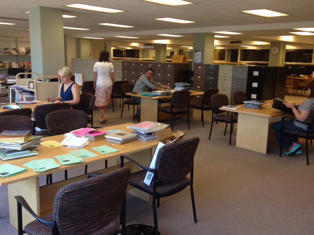
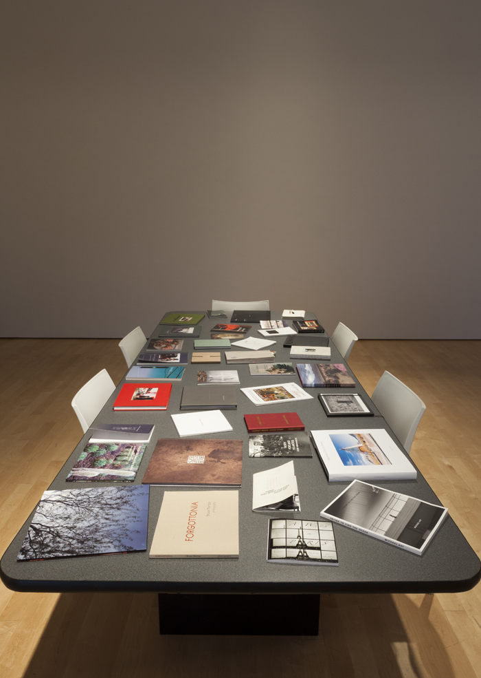
This past summer the Phoenix Art Museum hosted a juried exhibition of self-published photobooks. Over the course of about five weeks, the museum received 271 books from all over the United States, and the world, including Australia, Brazil, Canada, Colombia, Germany, Japan, Mexico, the Netherlands, New Zealand, Russia, Sweden, Ukraine, and the United Kingdom. Each book was reviewed by a panel of seven jurors, including:
Abigail Nersesian, the Librarian for the Phoenix Art Museum
Jennifer Barnella, the Retail Sales Manager for Phoenix Art Museum
Joshua Chuang, Chief Curator, Center for Creative Photography
Myself (Rebecca Senf), Norton Family Curator, Center for Creative Photography and Phoenix Art Museum
Mary Virginia Swanson, the co-author, Publish Your Photography Book
Darius Himes, the co-author, Publish Your Photography Book
Larissa Leclair, the founder of Indie Photobook Library
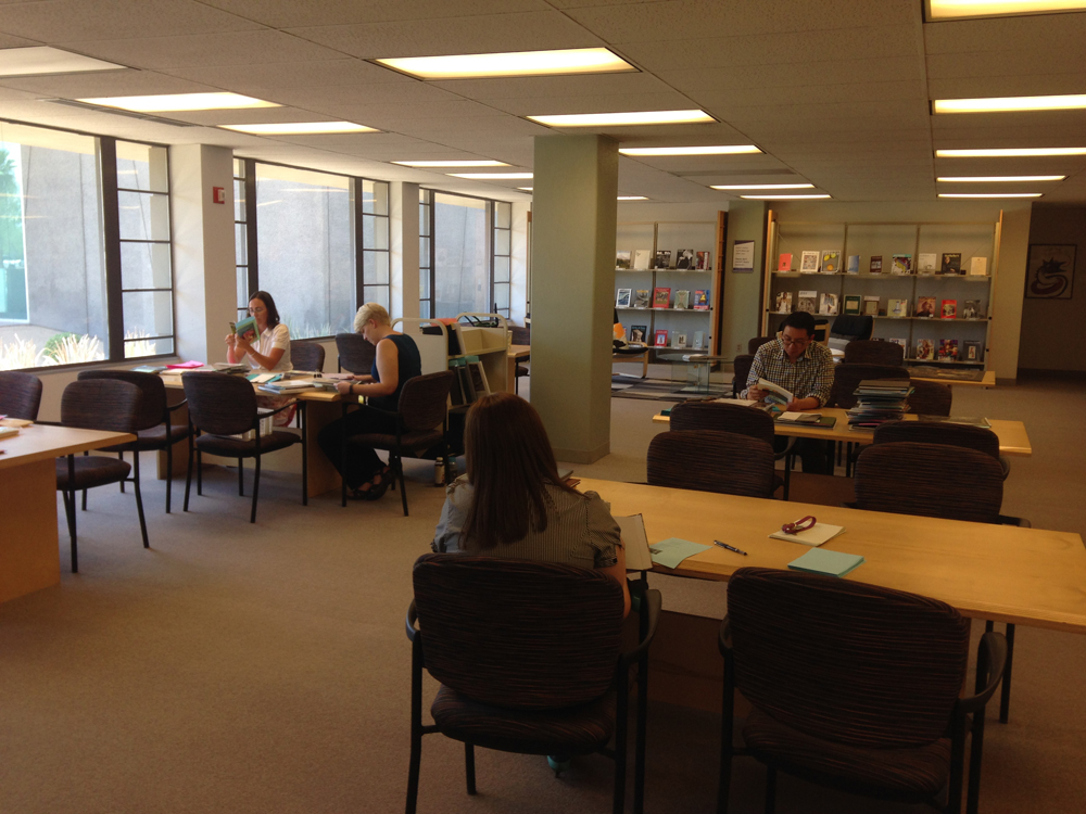
A nice advantage of the large jury of diverse professionals was that it captured an equally diverse range of perspectives on books. Over the course of two separate day-long sessions, a portion of the jury would meet and review books, each juror giving each book a score. The jury was instructed to evaluate the submissions based on their effectiveness as books (as opposed to scoring them based on the quality of the photography presented in the book). We asked ourselves: How well did the maker combine images and text into the book medium? We considered issues like the type of binding; title page and endpaper design; printing method and reproduction quality; size, placement, and sequence of images; typeface choice, color and size; and use of text.
Naturally, over the course of the review days, we jurors got to talking about our favorite books and how impressive we found some of the stand-out examples. Clearly many book-makers had invested tremendous thought (and in some cases, expense) in their finished product. We saw incredibly inventive uses of commercial book-making options. It was also interesting to note that some of the books reflected a team of creative minds having come together.
 As the jurors talked about the books and what we were observing by reviewing a large number of books all at once, we began to identify characteristics that distinguished the exceptional books. In the weeks following the selection of the exhibition (which included 151 books by 152 book-makers) I found myself talking frequently about what we jurors noted. Here are some of the ideas that surfaced:
The power of typeface
Graphic designers can discuss at great length the origins of particular type styles, the periods of their greatest use, and the mood or effect a typeface can create. Unfortunately, however, the rise in “desktop publishing” has allowed amateurs to select from a large range of default fonts without the specialized knowledge that a trained graphic designer brings to the selection process. I say unfortunately because sometimes the difference between the right type and the wrong one can have a dramatic impact on the final product, and it can be hard for an amateur to see the difference. Type size and placement, of course, also have a major impact on the way that the text is read. Short of consulting with professional designers (which I’ll address below, and which I think is actually a great approach), it is a good idea to fine tune one’s sensitivity to typeface. Pay close attention to type styles seen on books – maybe even keeping a folder of photographs of book covers or page layouts that are particularly appealing to you. These can be inspirations when working on your own projects.
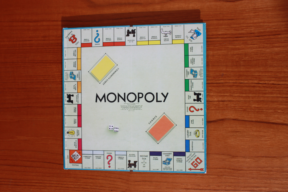
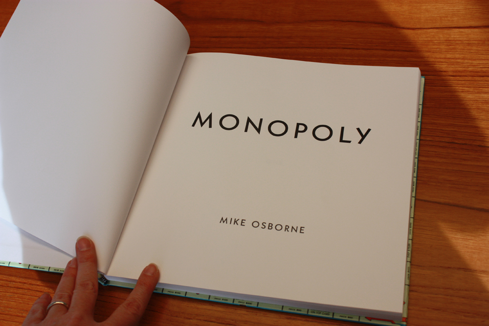
Monopoly by Mike Osborne is a wonderful example of how type style and thoughtful design can create a powerful sense of concept. © Mike Osborne http://www.mikeosbornephoto.com/project/monopoly/

Editing – When less is more
Professional photographers and photography students know how crucial the editing process can be. Knowing that it is a crucial step, however, does not make it easier. The time, energy and emotional investment in a given image can be immense, and it can be hard to let go of a picture, even when one suspects that it is not an effective element in a sequence or as part of a larger body of work. Not only is the sequencing of pictures important, but their selection is crucial. Just because a picture is a good picture doesn’t mean it belongs in a particular book. Think of the book like a poem where each word must be exactly right, and where each image must strike exactly the right tone. Is every picture doing its part? Are any pictures redundant or superfluous? Would fewer pictures tell the “story” more clearly or effectively? A good way to do the editing process is to print the pictures at small scale (3×5 or 4×6 perhaps) and shuffle them around in various orders. If something doesn’t seem right, simply rearrange. Try removing pictures, or group them into chapters. Or pair them. Play with lots of options before settling on a final selection for the book.

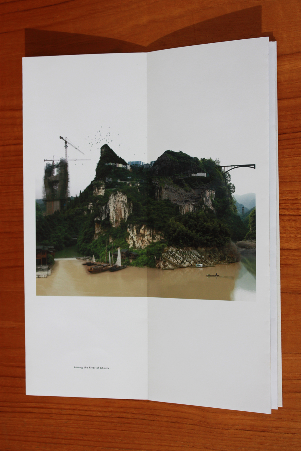
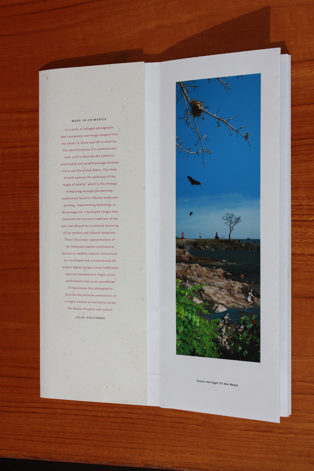
Made in Chimerica by Julee Holcombe is an accordion folded book with a loose wrapped cover that features just ten of her constructed images blending scenes of China and America. © Julee Holcombe http://www.plainspoke.com/shop/chimerica.htm
Make the form match the intent
Books come in all kinds of forms, with their own specific styles and designs. School yearbooks convey certain kinds of ideas and intents and we expect them to look at certain way. Cookbooks have their own pattern and style; as do children’s alphabet books, or novels, or photo albums, or comic books. Thinking about what ideas you want your book to convey will help you select the right form – which includes the style and design and may also include elements like the binding, size, paper type, and length.
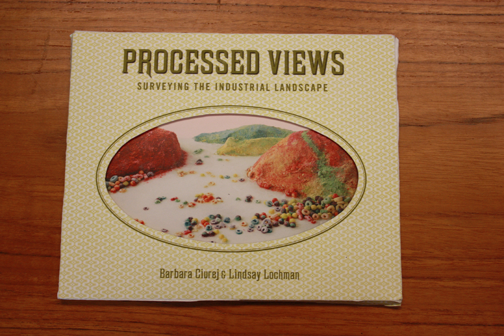
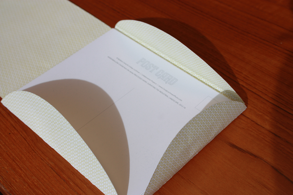
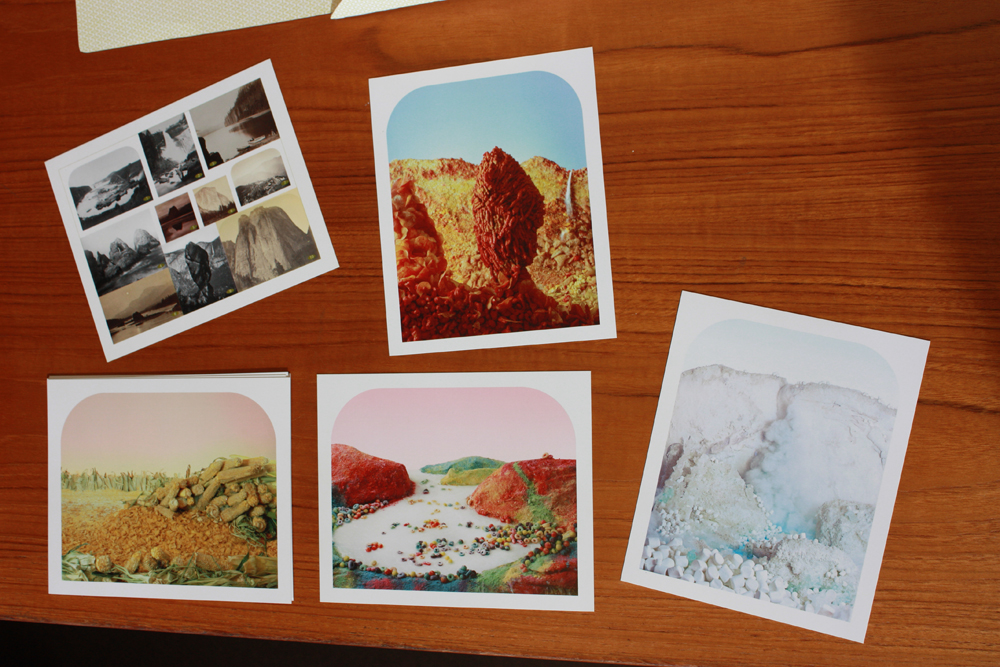
Processed Views: Surveying the Industrial Landscape by Barbara Ciurej and Lindsay Lochman are a group of photographs presented as a group of packaged postcards, rather than in a convential book form. Since the images are representations of iconic historic western landscape views, the choice of the postcard format serves the images well. © Barbara Ciurej and Lindsay Lochman http://www.ciurejlochmanphoto.com/Processed%20Views/ProcessedViewsStatement.html

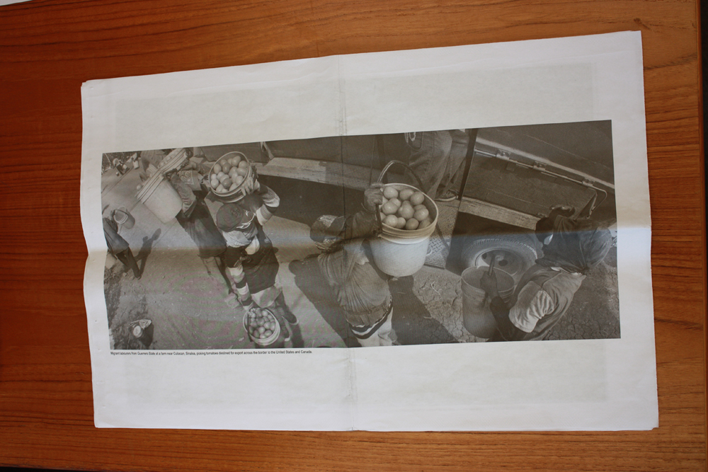
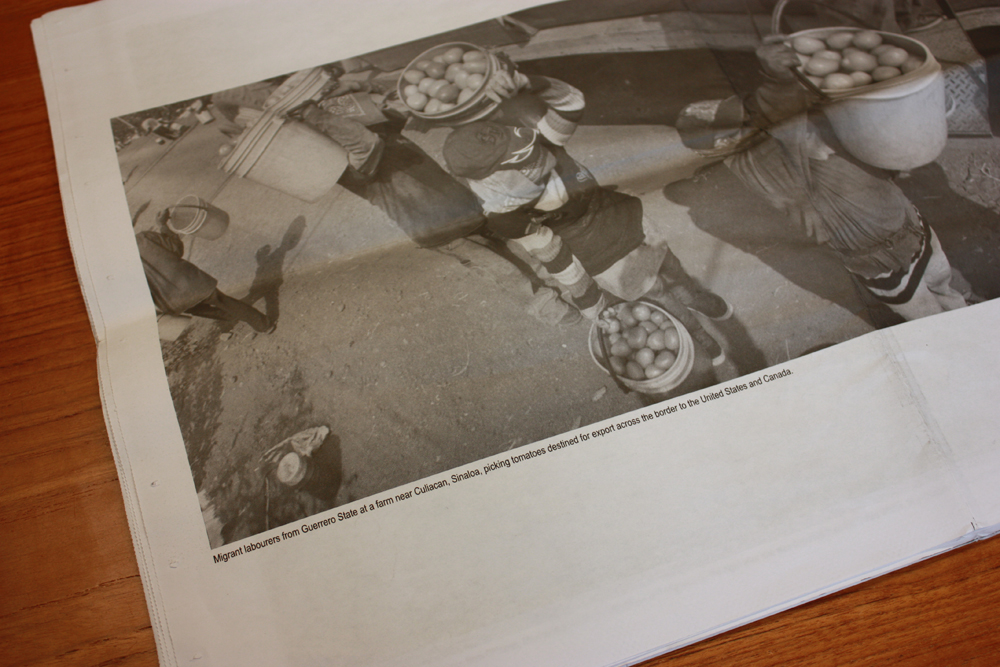
Mira Mexico by Louie Palu is printed on newsprint and presented so that viewers can disassemble the pages and reorder or exhibit them. Palu includes violent images and non-violent images, asking his readers to consider what kind of images are delivered through the media, and how they might choose to re-present them. © Louie Palu http://www.photoeye.com/bookstore/citation.cfm?catalog=zf763&i=&i2=
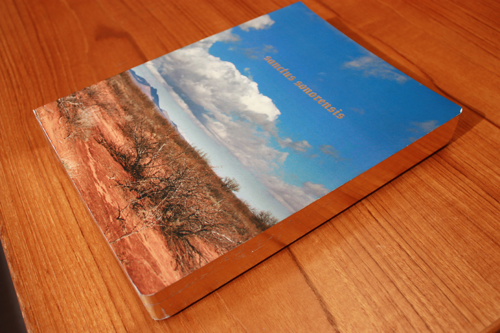
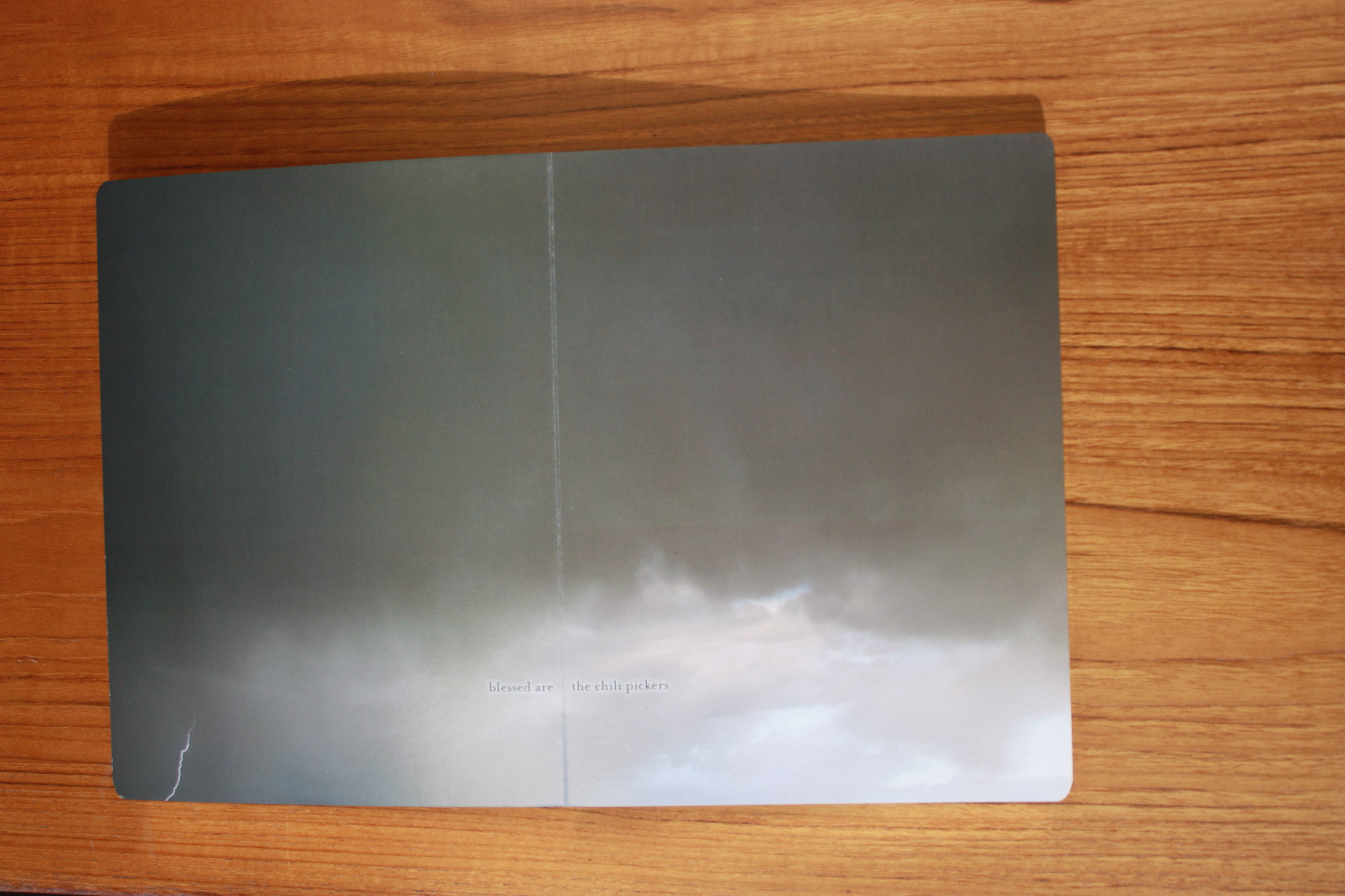
Sanctus Sonorensis by Philip Zimmermann melds form, image and text into a seamless presentation and cohesive work of art. As a professional book artist who appreciates a book as an experience, Zimmermann creates videos for his books to allow viewers to get a sense of the size, design, length, and feel of the book: https://www.youtube.com/watch?v=S27ZszyJtB4 © Philip Zimmermann http://www.spaceheat.com/books/sanctus-sonorensis

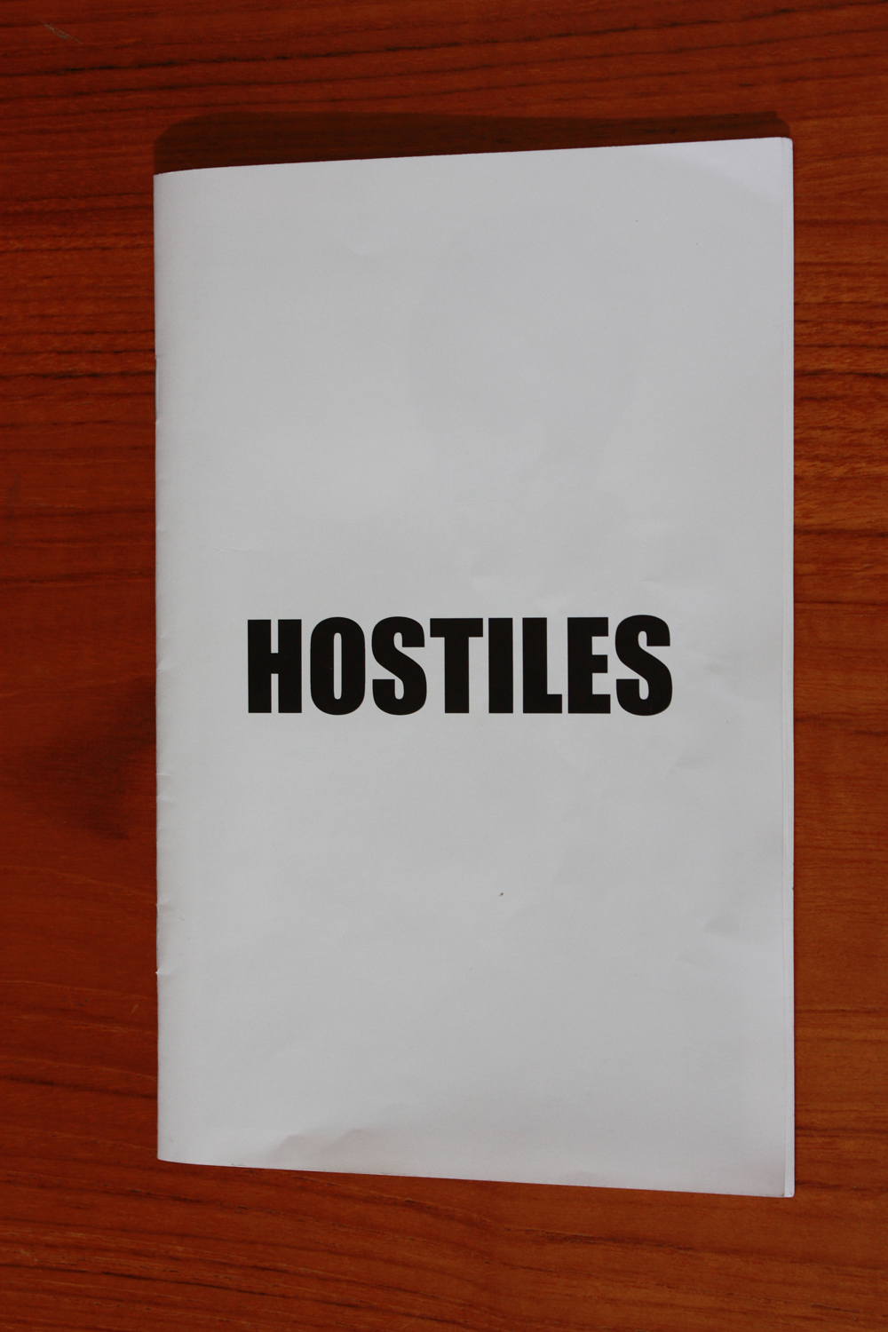
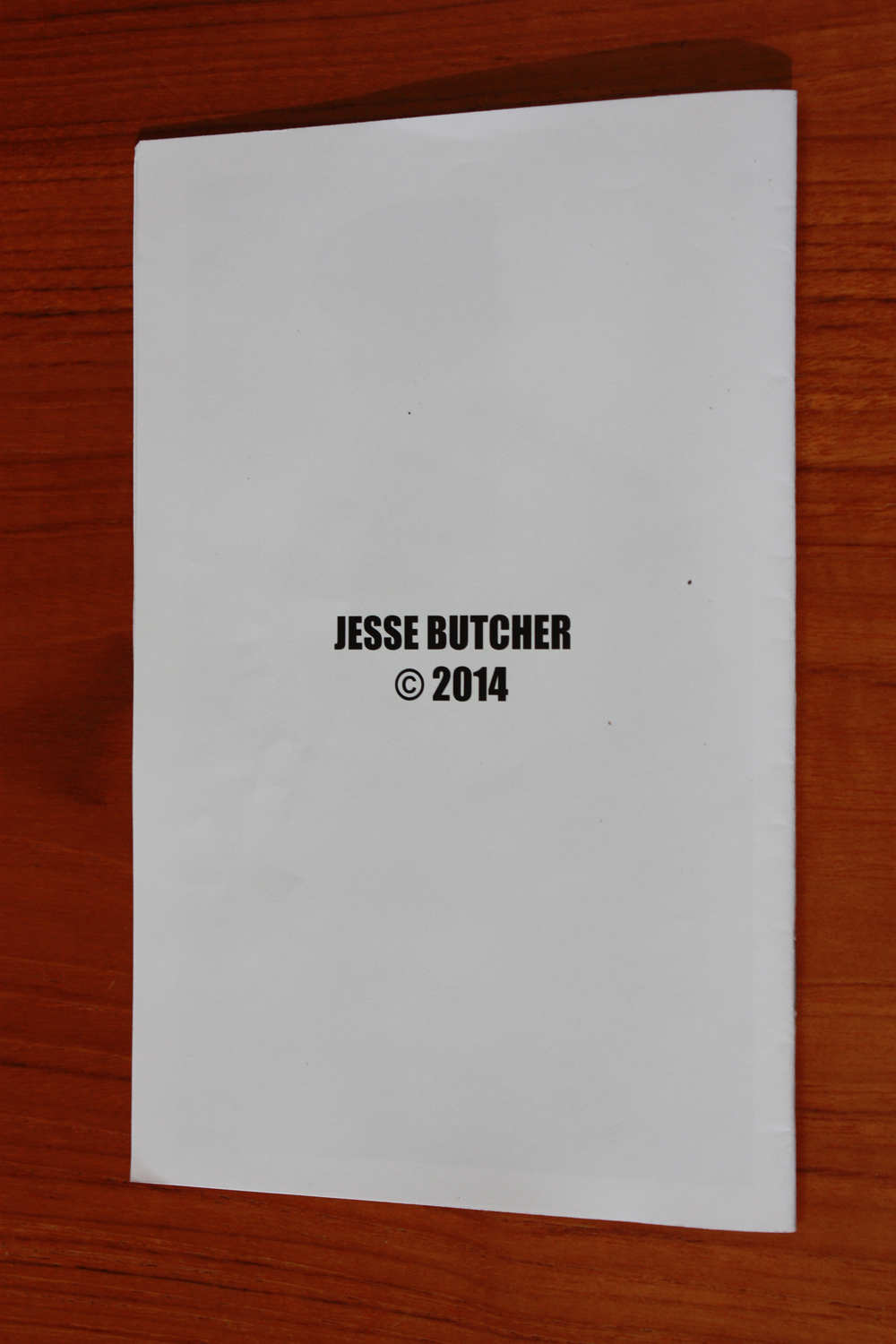
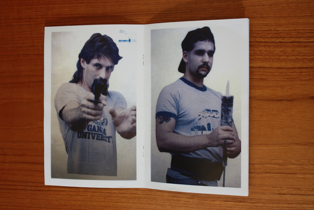
Hostiles by Jesse Butcher, a group of 20 images of shooting targets, is assembled onto six sheets that are bound by two staples. The type, binding, and informality of the design mimic the ephemeral nature of the photographs’ subject. © Jesse Butcher http://www.jessebutcher.com/
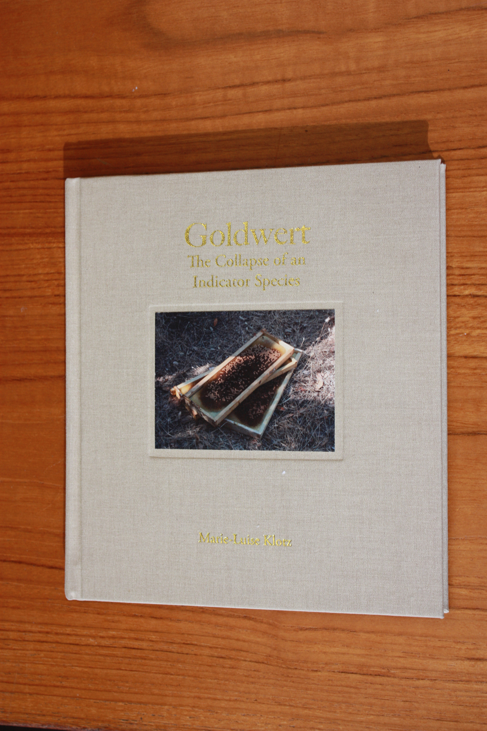
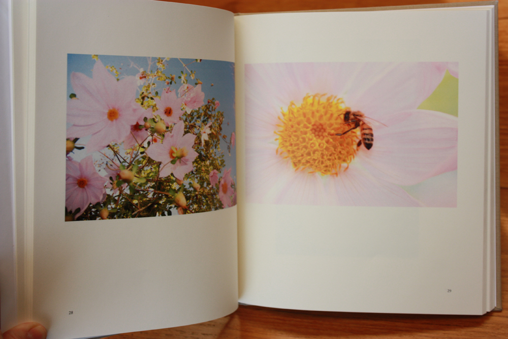
The cover of Goldwert: The Collapse of an Indicator Species by Marie-Luise Klotz with its gold foil lettering, cloth covering, and inset image introduces the idea of the presciousness of pollenating bees that she explores in image and text within. © Marie-Luise Klotz http://www.marieluiseklotz.com/menu05.html

Placement of text
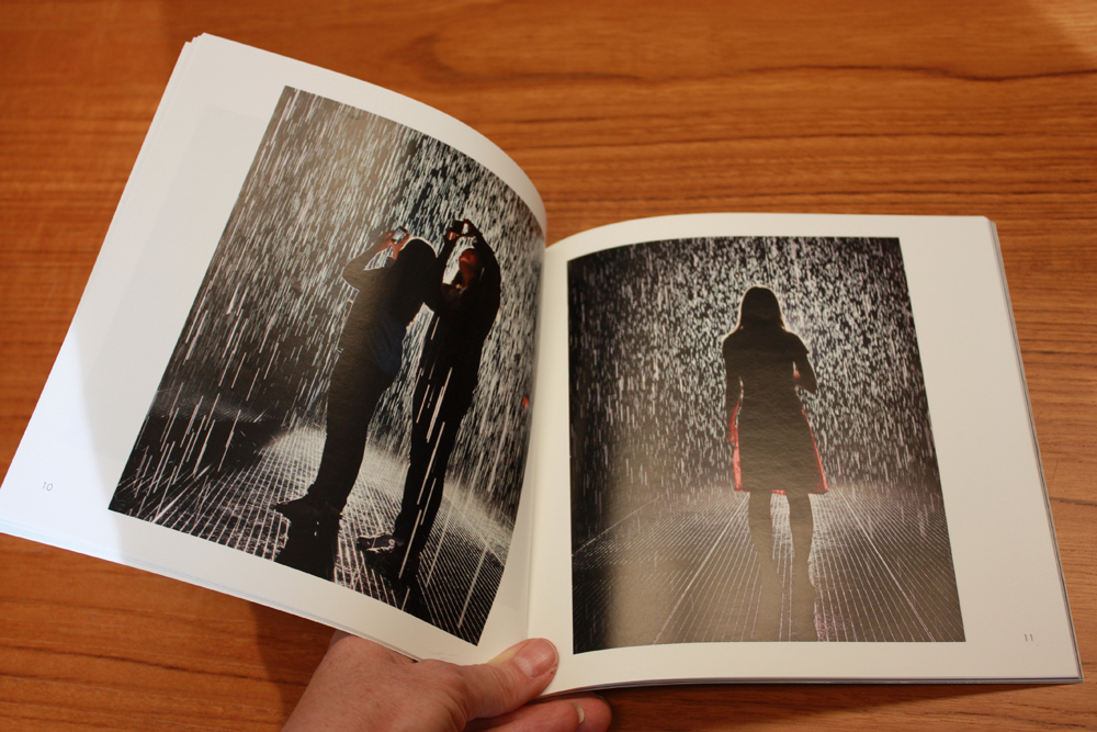
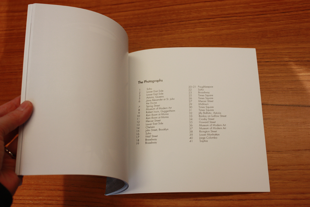
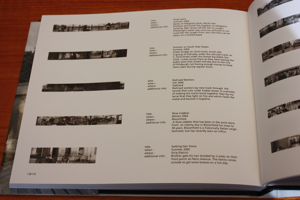
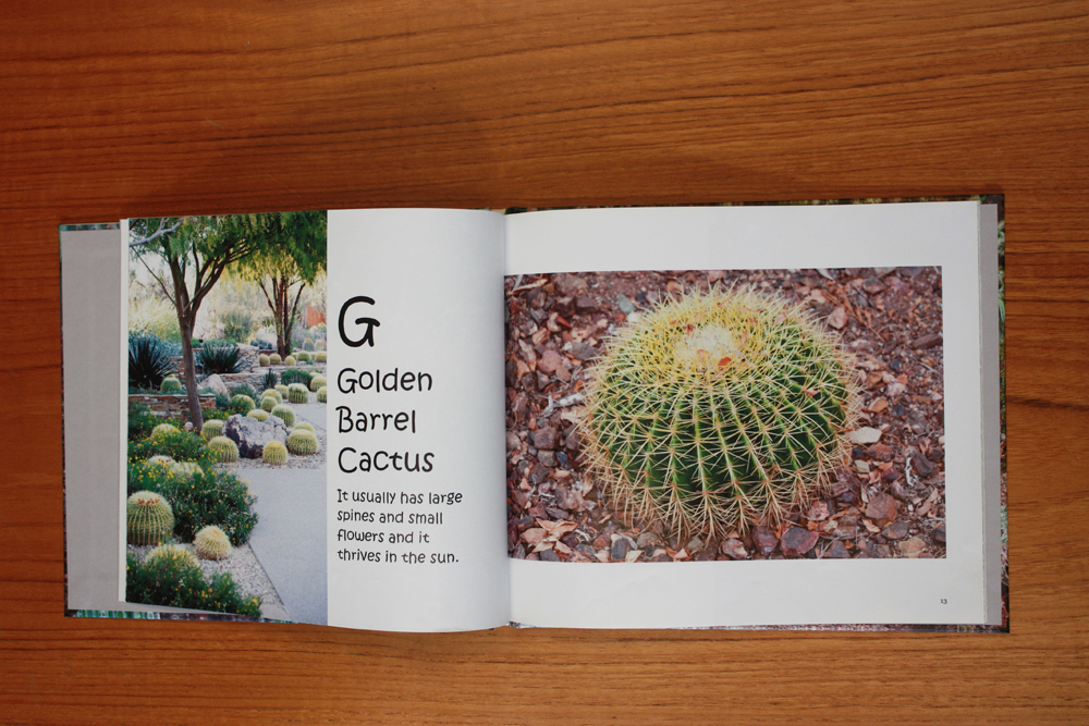
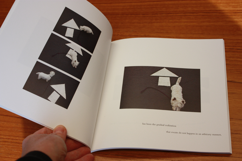
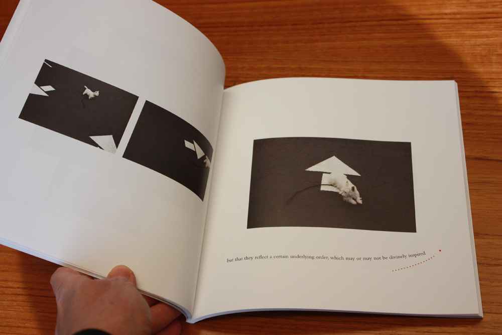
Some of the most powerful photographic books in the history of the medium are just books of pictures. The process of viewing image after image, without interjection of text to draw you away from looking and appreciating the photograph is one of the great pleasures of the photobook. (Of course, this isn’t the only kind of book, but more on that later…) Just because you have information about a photographic image does not mean you should include it in your book. And even if you decide to include the information in your book, the placement, size, type style (see above) and length of your text all impact how your book functions. For instance, if you are publishing a book of photographs you made during your travels, you may have dates, places, and even anecdotes about the making of the picture. If you place that text adjacent to (or overlayed on top of) the image, you are instructing the book’s reader that the text is as important as the picture. Examine the image and text closely. Does the text add to the image? Does the image add to the text? Are both necessary? If you find that the text distracts from the image, but that you want to have the text as a reference (for instance, you want to remember where each picture was made, but it doesn’t enhance the picture to have it appear immediately adjacent as a caption), consider moving all the text to a “list of plates” or “list of captions” at the back of the book.
It is, of course, possible to make effective use of a more extensive text in combination with images. Poetry, prose, definitions, statistics, or coordinates (written by the photographer, or by others) can add a rich dimension to a photographic project. But consider the impact of the words you bring alongside your pictures as carefully as you consider any of the decisions about the design and presentation of your book.
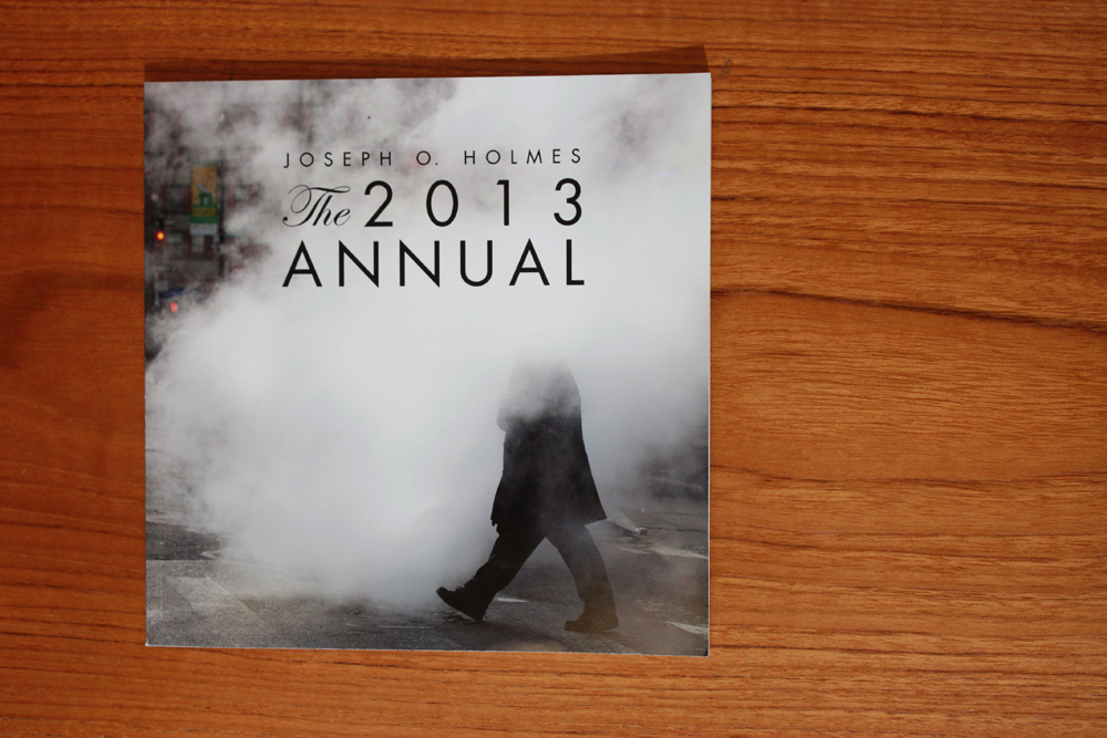
Joseph O. Holmes’ The 2013 Annual is a straightforward presentation of photographs (one to a page, sometimes one to a spread, and an occasional full bleed) with the captions removed to a page at the end. © Joseph O. Holmes http://www.josephholmes.io/blog/announcing-the-2013-annual-3778


Pittsburgh Project by Dylan Vitone contains a series of panoramic photographs, shown in details and in their entirety, throughout the book. At the end, small “thumbnail” images of each photograph are placed next to title, date, location and anecdotal information about the picture. © Dylan Vitone http://www.dylanvitone.com/pittsburgh.html


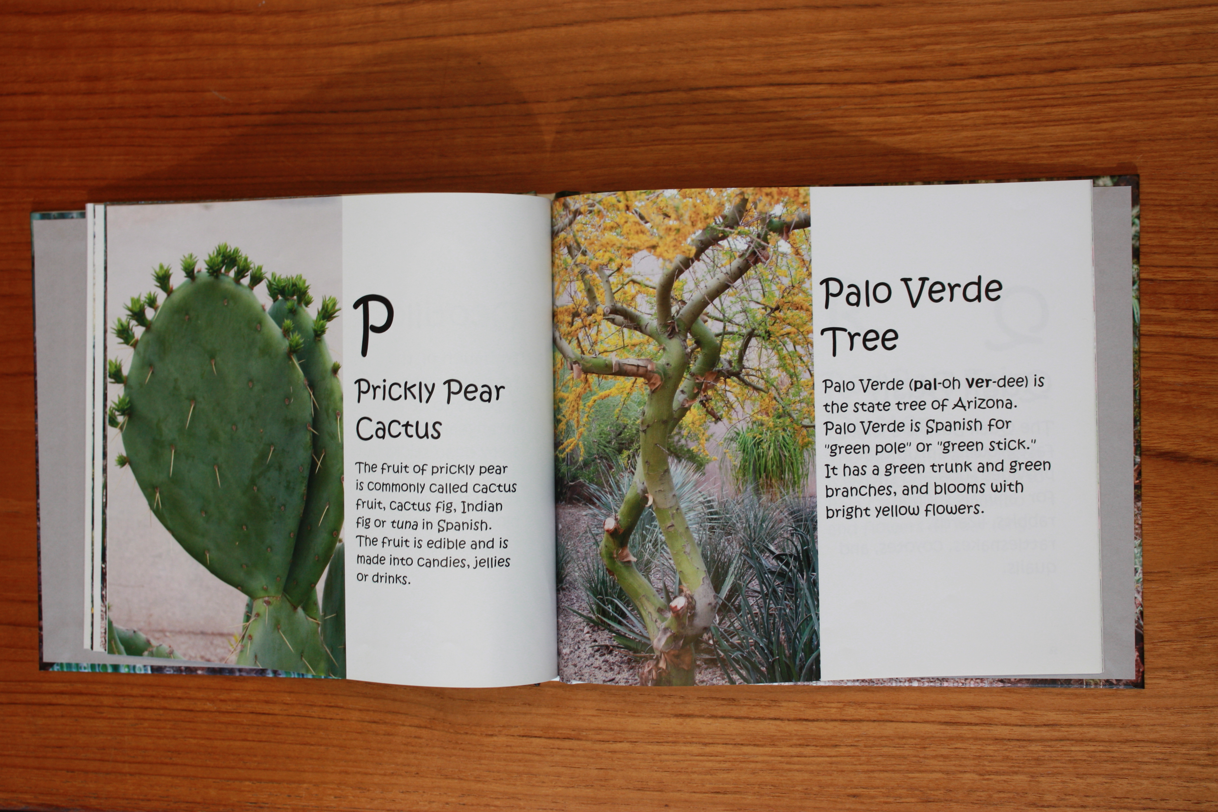
O is for Old Man of the Andes: An ABC Book of Desert Plants by Sara Jarvie is a playful children’s style ABC book that naturally pairs image and text together on a page (or spread). © Sara Jarvie http://www.blurb.com/b/5546361-o-is-for-old-man-of-the-andes
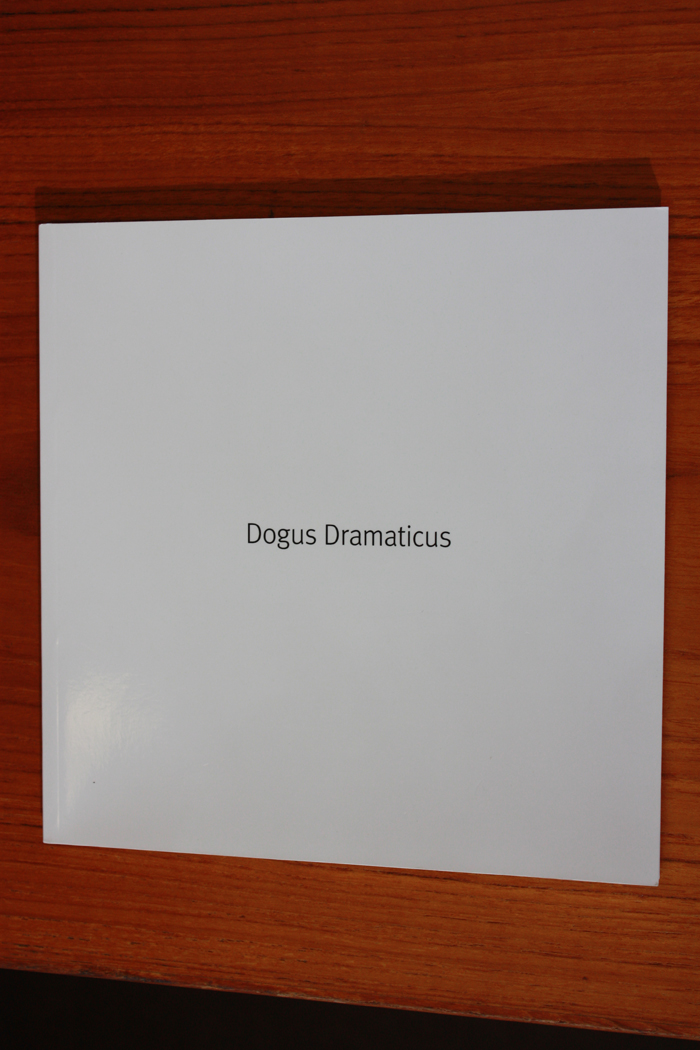
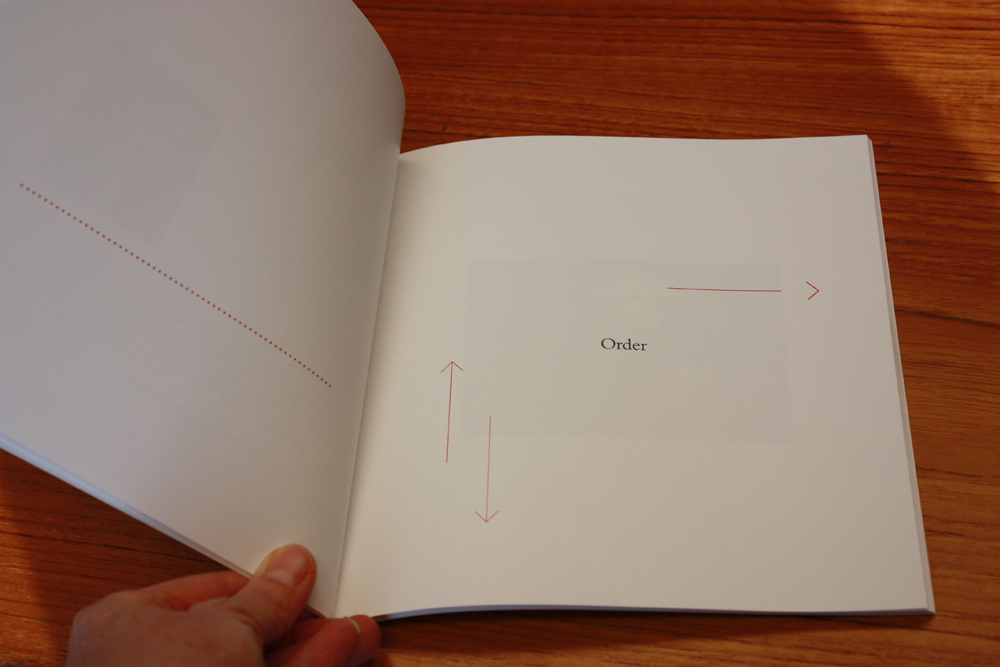
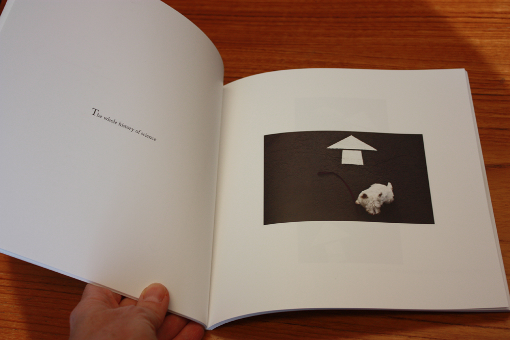
Dogus Dramaticus by Charlee Brodsky uses playful design and light-hearted photographs to explore a series of quotations about the “human search for place and meaning.” Without feeling “designy,” the book uses graphic design elements, placement of text and images, and lots of open space to create a whimsical book. © Charlee Brodsky http://thespotpress.com/products/dogusdramaticus
Trim size
The trim size is the size of the book, and with the many various commercial companies producing books the choices of trim size are proliferating. It is essential to consider the scale of the book in how the reader will experience both the feeling of the book and the size of the pictures within. A tiny book may best evoke the intimacy or tenderness of the book’s subject, while a large book may be the best choice for a subject of weighty importance. No matter what the intention, the size of the book should match that intention. Think also about how the pictures will feel on the book’s pages. Are your photographs complex and detailed? They may need a larger size to be effective. Or are they focused pictures with a clear impact? A smaller size may be sufficient. Do not assume that bigger is better. Just as including more pictures in an edit can weaken a project or water it down, so too can an oversize book be an inappropriate fit for a body of work.
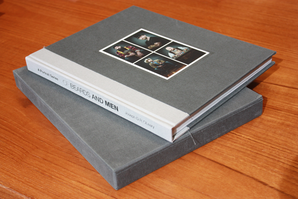
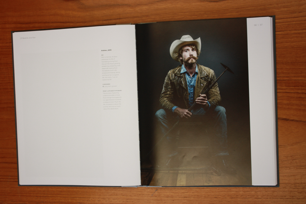
Of Beards and Men by Joseph D.R. OLeary is an epic collection of portraits of men with beards that reads like a catalogue of contemporary men, their interests, and appearances. Appropriately for a survey of this type, the book has a large trim size, is many pages long, and comes in a handsome slipcase. © Joseph D.R. OLeary http://ofbeardsandmen.com/Artist.asp?ArtistID=39975&Akey=W568XGL8
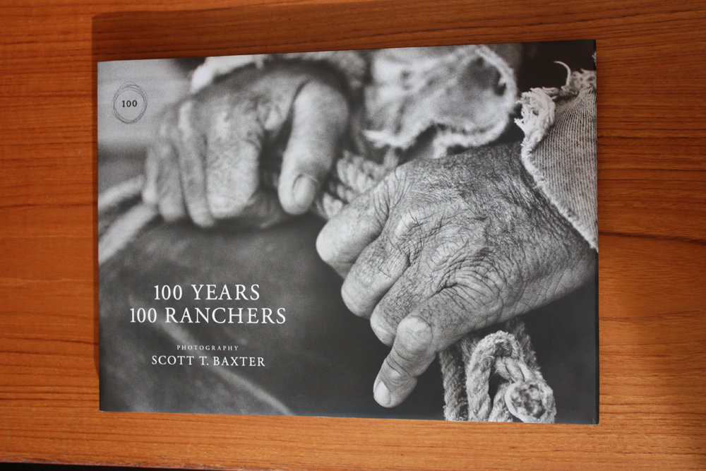
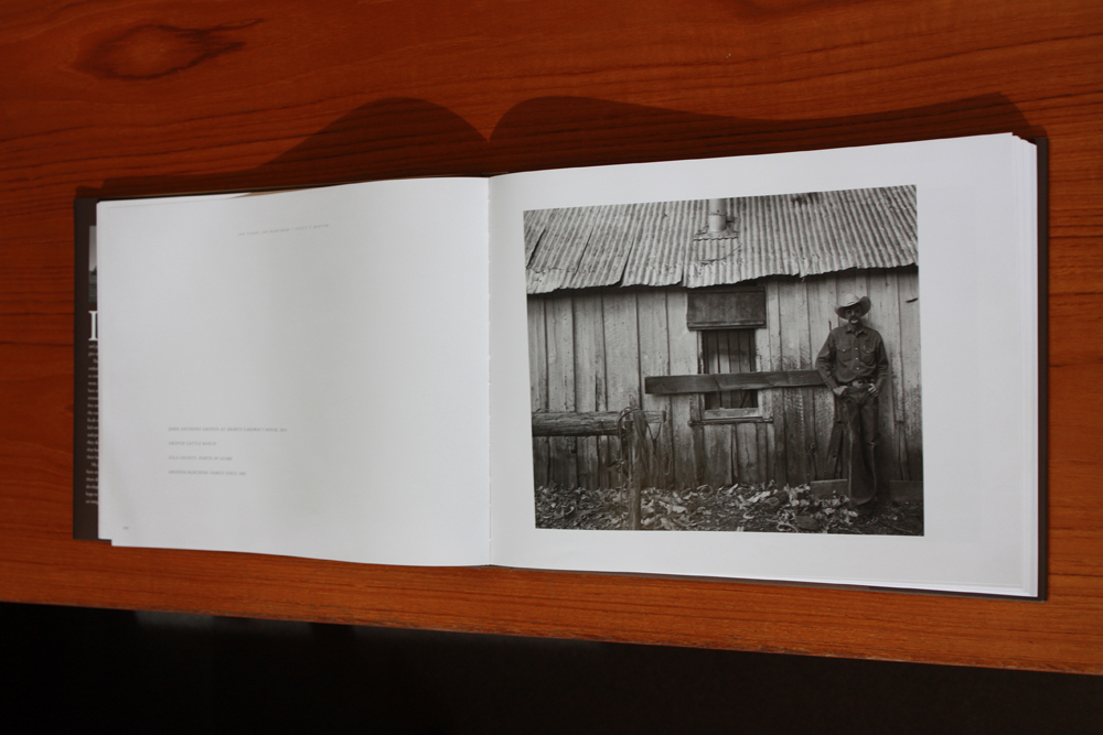
100 Years 100 Ranchers by Scott T. Baxter: The large trim size befits the centennial study of Arizona’s ranching community. © Scott T. Baxter http://www.100years100ranchers.com/
Leave the template behind
The templates offered by the various commercial book-making websites can be helpful to book-makers who are just starting out. By providing a range of page designs, it can help create some rhythm to a book. Keep in mind, however, that the template designer is looking for solutions that will work with a wide range of pictures and subject matters, and “designs” that will appeal to the largest possible audience. Adopting those templates can interfere with achieving a style for your book that is perfectly tailored to the intention for which you are striving. Designing from scratch can be intimidating for somebody just starting out, and as mentioned before, graphic design is a professional field with people who bring extensive knowledge and skills to making books. The process of working with a designer to clarify your ideas may be worth the added expense.
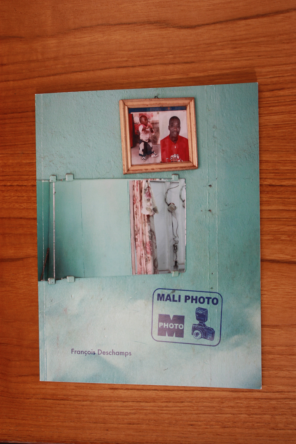
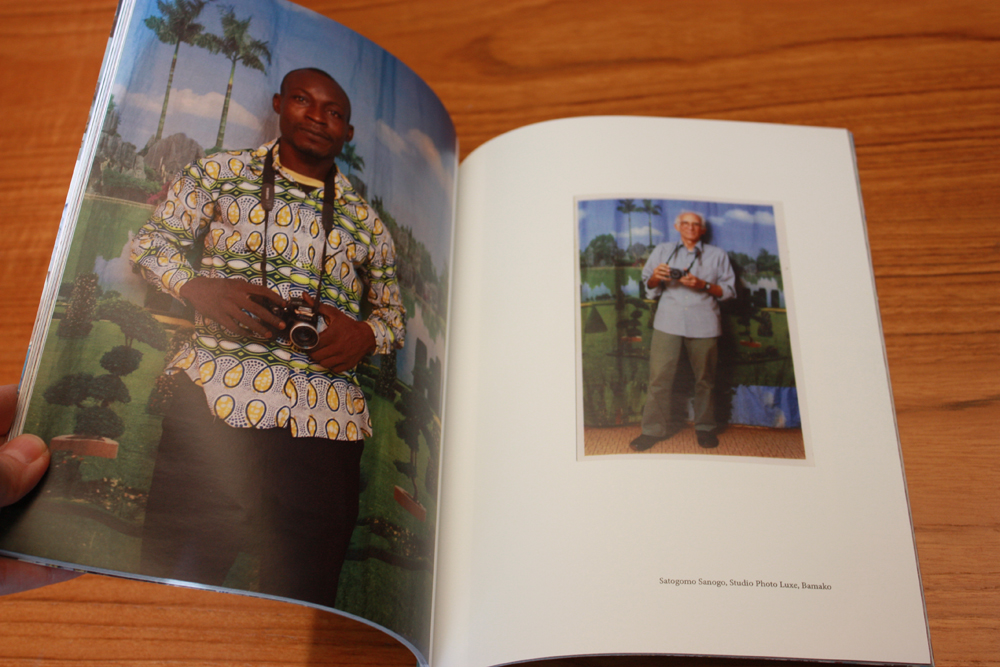
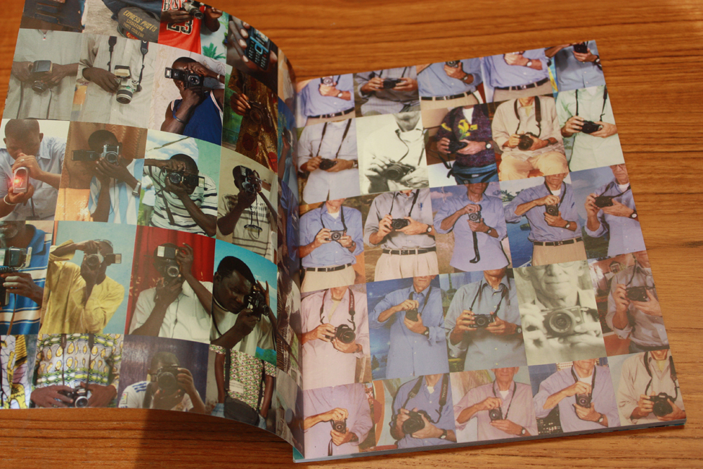
Mali Photo by Francois Deschamps uses a deceptively simple format and design, pairing pictures Deschamps made of Malian studio photographers along with photographs of Deschamps by the photographers he visited. The end papers group the photographs into a grid, demonstrating the variety and number of pictures made. © Francois Deschamps http://www.vampandtramp.com/finepress/p/papyrus-productions.html
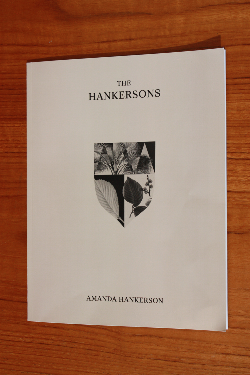
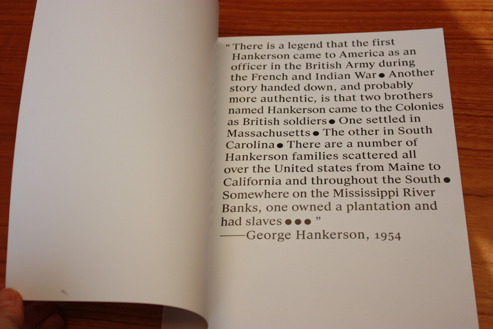
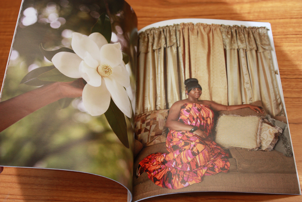
The Hankersons by Amanda Hankerson presents a series of photographs, introduced and followed by short passages of text, that simply fill the book’s pages, bleeding off the edges. © Amanda Hankerson http://www.amandahankerson.com/#/hankersons/

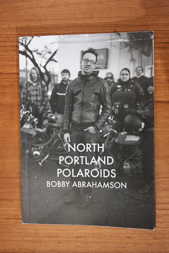
North Portland Polaroids by Bobby Abrahamson arrays the portraits in a straightforward presentation – one image to a page, names of the subjects below. The minimal design allows the work to speak for itself. © Bobby Abrahamson http://www.bobbyabrahamson.com/books/

Find help
Any creative project benefits from consultation with others. In today’s dynamic world, there are increasing opportunities to find people who can help you fine tune your ideas. Certainly those closest to you may be able to provide a useful sounding board in the process of editing your selection of pictures, in defining what kind of a book you want to create, and in selecting an appropriate design. Naturally you want “editors” who are honest, detail oriented, and can provide a critical eye. You may be able to find classes and workshops in your area that also give these types of services in a group setting and allow you to move your project forward with the helpful input of teachers and classmates. And of course, there are also professionals that are available to hire to help with particular aspects from editing your text, so refining your selection of picture and to designing the book. While you may imagine these services are too expensive, it never hurts to get an estimate. And consider bartering – a matted print or copies of the finished book – may be a welcome compensation to a professional within your circle. In the end, it’s important to acknowledge that a self-published book that is the product of a team is likely to be stronger and more effective than one done by a single contributor, just as is the case with commercially produced books.

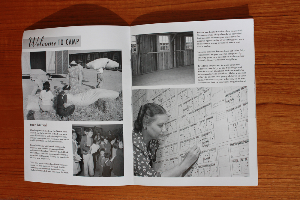
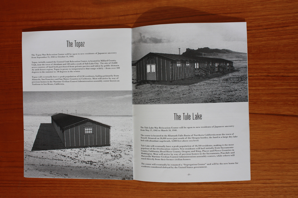
A Guide to Modern Camp Homes: 10 New Models and Plans for Persons of Japanese Ancestry by Kevin Miyazaki beautifully blends thoughtfully chosen trim size, binding, design, type style and selection and placement of images to create a work of great power. Miyazaki commissioned architectural drawings to complement the book and based the design on Sears, Roebuck and Company catalogues. © Kevin Miyazaki http://kevinmiyazaki.com/moderncamphomes
One exciting aspect of self-published books is that it is an eminently affordable way for arts supporters to start collecting. We encouraged visitors to the exhibition to purchase books if they saw something that excited them. It’s been wonderful to hear from artists in the exhibition that they have sold copies of their books to buyers in Arizona over the last few months. We have provided a list of all the books in the exhibition on our website, with links to where the book can be purchased to facilitate easy collecting. The website also includes some additional resources for book-makers, collectors, and those interested in learning more about this exciting and burgeoning field. Those resources are found at the bottom of the page: http://www.infocus-phxart.org/photobooks/
Posts on Lenscratch may not be reproduced without the permission of the Lenscratch staff and the photographer.
Recommended
-
The Photography Show presented by AIPADApril 5th, 2024
-
2023 in the Rear View MirrorDecember 31st, 2023
-
The 2023 Lenscratch Staff Favorite ThingsDecember 30th, 2023
-
Inner Vision: Photography by Blind Artists: The Heart of Photography by Douglas McCullohDecember 17th, 2023
-
Black Women Photographers : Community At The CoreNovember 16th, 2023


