Cover the Book: Edition One, Interview with Four
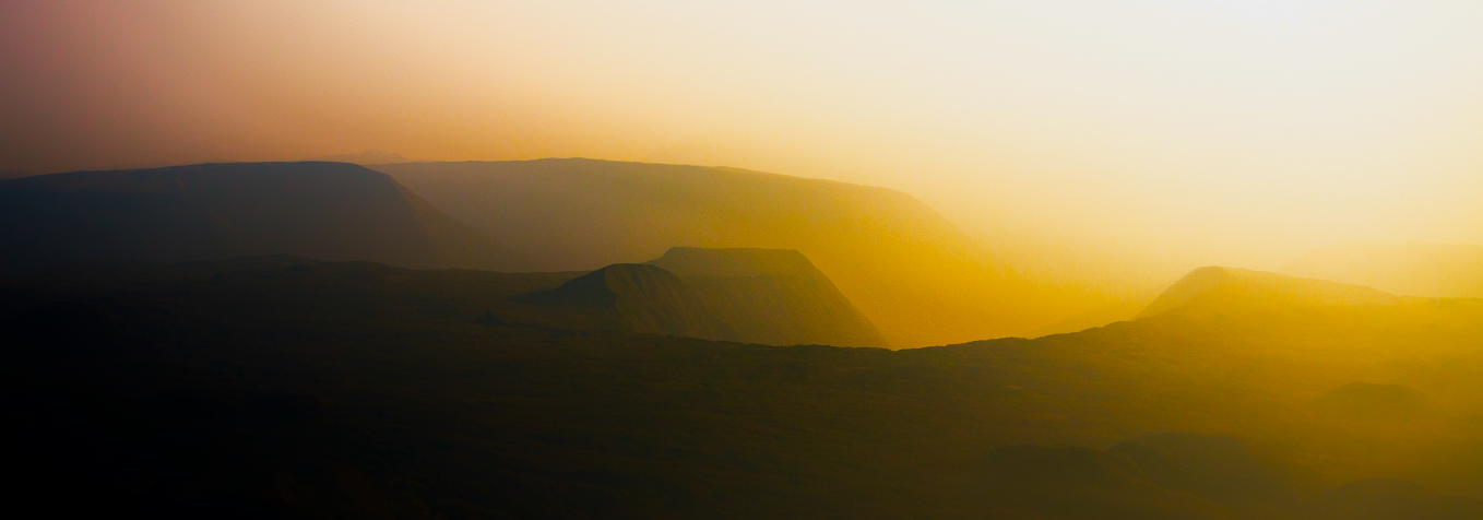
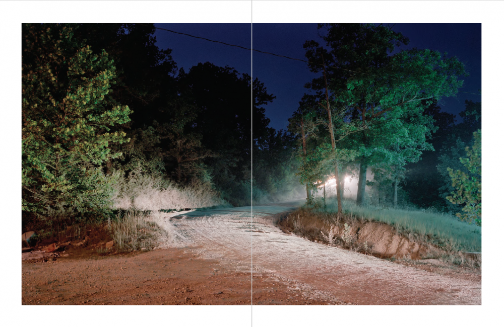
© Matt Shallenberger, The Leaping Place, Courtesy the artist
This post on photobooks was intended to be a comparison of four working artists and how the produced or are currently producing their book projects: Matt Shallenberger’s The Leaping Place book and limited edition will be published later in 2018; Dana Mueller’s May Days was released in early 2018; and the collaborative team Lara Shipley and Antone Dolezal’s Spook Light Chronicles was released in three volumes and a limited edition starting in 2014 and is now out of print. The four artists all had differing experiences with the photobook and I hope that you will read all the interviews to see how publishing can vary, and learn more about their work and the experience of publishing a photobook.
Please find details and some specs on each book at the bottom of this post. I will be publishing a few more posts on the photobook in the upcoming weeks. Please enjoy my first post on the photobook. — Melanie McWhorter

©Matt Shallenberger, The Leaping Place, Courtesy the artist
The Leaping Place: An Interview Matt Shallenberger
Melanie McWhorter: Will you briefly tell me about the project The Leaping Place ? What is the project about and how did it start and evolve?
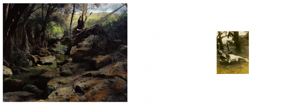
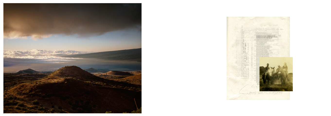
Matt Shallenberger: The project began in its loosest form about 10 years ago while shooting pictures in the Azores, on the island from which my family emigrated in the 1880s. They settled on the big island of Hawai’i, where the bulk of the images were shot over the last five years. The series follows two paths: first, a look backward in to my own family history; and second, the Kumulipo, the ancient Hawaiian creation chant, a memorized chant of more than 2000 lines that tells the cosmological beginnings of Hawai’i through to the royal lineages of the 1700s. The images in the book are meant to tell a personal story but using the style and tools of the Kumulipo. The book of the photographs is divided in to three sections: 1. Black-and-white images of the Azores, set against pieces of a small part of the Kumulipo chant. 2. Large-format color images of the Big Island of Hawai’i, paired with vintage photographs of and by my family and excerpts from my research notebook. 3. Large-format color images of the Big Island, titled after and depicting the stories of the chapters of the Kumulipo.
MM: How important is the thread of text through your book? How did you handle the text inclusion, including text layout, copyright issues, etc?
MS: The text is fundamental, but even with the entire text of the Kumulipo and all my notes by your side, you’d still only have hints at the thinking behind the photos. The premise the whole time was that the Kumulipo specifically, and Hawaiian chant poetry more broadly, was the best representation of what it feels like to be in the Hawaiian landscape… so to try and interpret that would be a good way to try and render that landscape sincerely. Within the book, the text pieces hopefully work as dots to connect the photos, or as opportunities to write your own stories that connect them. I guess, ultimately, they should help set the mood of the project.
MM: You had great success in your Kickstarter campaign. I have some hints at how it was successful, but will you share your thoughts? How did you build your network to help with the support? Do you think it was the awards?
MS: I think the awards certainly help in part because they give the backers something to look at beyond the book itself. Ultimately not many people purchased the larger print awards, but having them all there was a way to show the images, and maybe to discover as a backer that the scope of the project was bigger than just the book.
MM: You raised more than anticipated. What changes did you make to the book with an expanded budget?
MS: The Kickstarter campaign didn’t cover all the costs of the book, but that’s because I’m doing a larger print run than just the backers of the campaign. I made more on the campaign than I had anticipated and put that money back in to upgrading a couple of the specs of the book. The dimensions are slightly bigger, and the page count is a little higher. Also, I was able to go for a binding that’s more expensive.
MM: I believe that your video had quite a bit to do with the success of the Kickstarter. Will you briefly discuss how you produced the video?
MS: I did the whole video myself, which I wouldn’t argue for. I shot and edited the whole thing, and thankfully had a friend do the music for it. There’s a lot of downtime in large-format landscape photography… waiting for light and weather, etc. I used that time to shoot video of the landscape and of my working in it. I think I probably had a few hours of footage that I edited down to a few minutes. Anyone who’s ever edited video knows how much work that is. But I thought it was important to get a certain personal sense of the project so people could feel like they were a part of the process of making it, so being with me while I’m taking photos, or seeing my family (there’s a good bit of old home movies from my family in Hawai’i fifty years ago, etc.) felt personal, which I thought might be helpful. I also viewed it as an opportunity to show parts of the project that no one would see otherwise, which made it appealing to me, too. If I were out there thinking that it was just a means of selling the book I would have gotten exhausted with the slow, laborious process of shooting/editing video.
©Matt Shallenberger, The Leaping Place, Courtesy the artist
MM: Your book is scheduled to be published this year, but you have had some difficulties with selecting the correct printer. Will you share a bit about the difficulties and how and why you selected your current printer? Will you go on press?
MS: That’s been by far the hardest part, but it didn’t have to be. I first sought out recommendations, and got a few. One of them was for a printer local to me, who seemed very highly regarded, and was helpful and receptive when we first met. It was at first important to me that I could be on-press, because I had had something printed before that was poorly done – so I was excited that this press was local. We set up a set of specs I was excited about, with a couple decisions left unsettled as I went off to design and make the whole digital version of the book – which meant that I wouldn’t talk to him until I was done with that, about a month later. When I reached back out he didn’t reply for a week, and then began more than a month of a strange cycle in which I would call or write, he wouldn’t reply, I would get (justifiably) nervous and follow up, and then he would reply with a different problem each time… I continued to be optimistic in part because I knew that going to a different printer was probably going to mean finding someone not local, and delaying production significantly. So every time he wrote back saying that it would all be ok, I believed him. Finally, I had to drop him and move on. And I’ll never really know what happened. When I went in he wasn’t there and the employees told me that he was on vacation. It’s strange and frustrating and doubly so because I feel like I’ve got other peoples’ money in my pocket right now until the book is delivered.
A few weeks before I ultimately dropped him I started researching other printers, looking mostly to see where books that I love had been printed. I wrote to a dozen places in one day, and heard back from about half of them, and started corresponding with about half of those. I chose I/O Color in Seattle, who had printed the most recent book by a friend of mine, and he had a great experience with them. Most importantly, they’ve been incredibly helpful and communicative. I won’t be on-press, since the book is printed overseas, but their proofing process is fantastic. They do a series of proofs and tweaks in Seattle, and then the final versions of those proofs are used as hard-proofs on press. I’ll still of course be nervous until a satisfactory book is in my hands, but much less so than I would with a less engaged printer.
©Matt Shallenberger, The Leaping Place, Courtesy the artist
MM: When do you anticipate that the book be released?
MS: The heavy lifting on my part was obviously the design, but that’s been done and locked for about a month now. We’re in the proofing process right now, which will hopefully be done this week, and then it’ll woefully be another 2-3 months after that the books are in my hands. I’m about to write the Kickstarter update that tells people of that delay, and am mortified. I know that it’s not uncommon and that many Kickstarter projects, especially books, run well behind schedule. I’m about to receive a book that was highly anticipated and well-regarded almost a year after I contributed to the campaign. I feel terrible for making people wait for something they’ve already paid for, though, and I know now that I should have bailed on this printer (or started working with a backup option) sooner.
MM: Do you have some exhibitions in conjunction with the release? Did the book help with exhibitions or vice versa?
MS: The campaign ran concurrently with an exhibition at the Honolulu Museum of Art, and then I just opened another exhibition in Hawai’i last week. So it’s nice to have things happening simultaneously. But it’s tricky. The exhibitor’s job isn’t to market the book… they have their own needs, so it’s not entirely appropriate to pitch the book at the opening, etc. But the momentum of each obviously informs the other. After the book is out I’m optimistic about using it to help get the work shown elsewhere… but as lovely as it is to have giant prints on the walls, I still think that the best representation of the project will be the book, where all of the different threads of the series can be tied together in a cohesive way.
MM: Having gone through this project thus far, what advice do you have for photographers who want to self-publish a book?
MS: Be honest with yourself about why you want to do a book. I don’t know anyone who’s really made money making one, so it can’t be for that. I’ve been working on this project exclusively for about five years. I would have to sell out of all my books plus a lot of prints to even break even with the investment I’ve made in it, let alone my time. I guess it could be rationalized as part of broader strategy… to have books and exhibitions and personal work and commercial work all inform each other. I know that’s how a lot of photographers get there. And if I did commercial or editorial work that might be true. But if you work primarily doing personal fine art projects, then I think you must feel like a book is the best culmination of your project to justify doing it. I lose some sleep over the fact that the more ‘successful’ I become, the more opportunity costs me. Ten years ago, I would occasionally get an online piece or a magazine piece, and they wouldn’t make me any money, but they wouldn’t cost me anything either. Now when I get a show I expect that I’ll invest many thousands of dollars in preparing it, and to cross my fingers that I’ll make some of that back. A book is very much in that same category, even with Kickstarter and pre-orders, etc. It has its pros: it’s cohesive, and designed in a way you want, and portable, and potentially inexpensive enough that you can justify giving it away. It’s a way for many people to see your work in physical form who wouldn’t have otherwise. But like a lot of art work, you might never know if it was a good decision except as a part of your own artistic needs.
Oh, and research your printer and find a backup one just in case.
More on Matt Shallenberger.
_____________________________________________________

©Dana Mueller, May Days, Courtesy the artist
May Days: An Interview with Dana Mueller
Melanie McWhorter: Will you briefly tell me about the project May Days? What is the project about and how did it start and evolve?
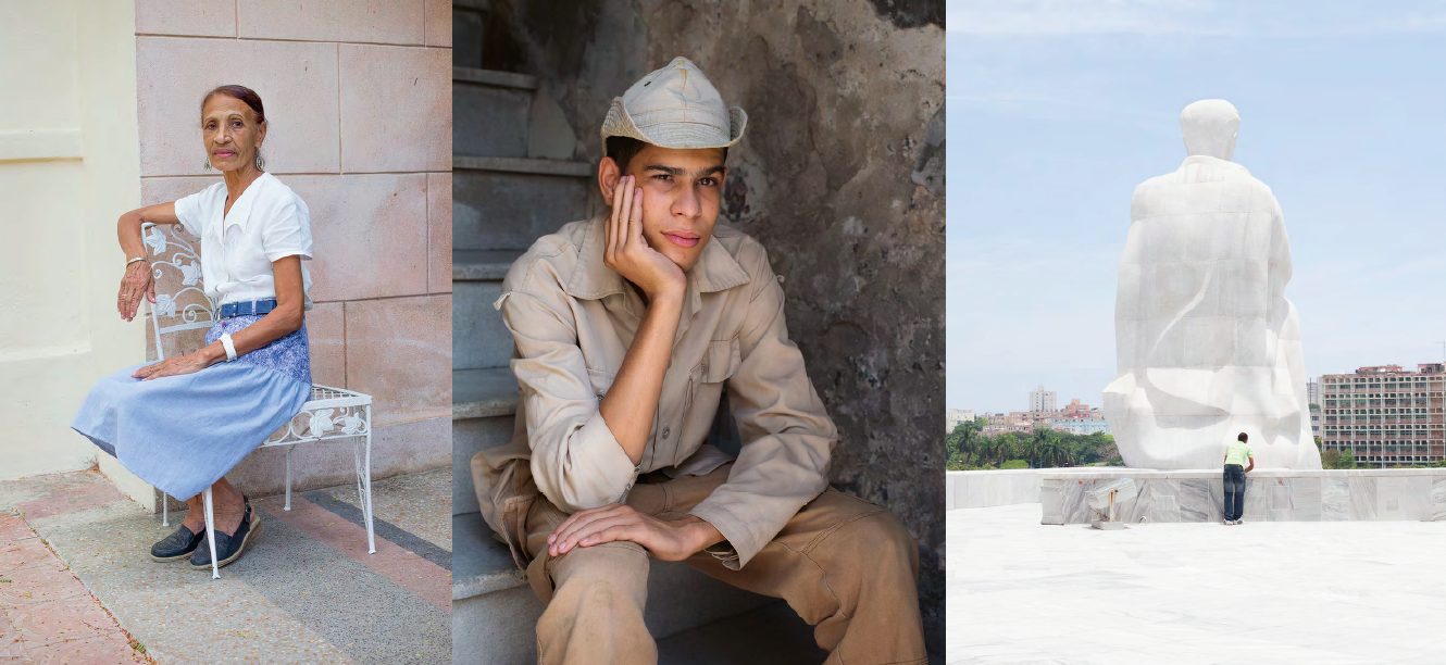
Dana Mueller: May Days is my first monograph. I have worked on this series of photographs in book form for the past three years. In 2014 and the following year, I taught photography at the Center for the Studies of Jose Marti, where I met Cuban friends who introduced me to attitudes, views, and life of the island. The series of photographs are a visual record of my time there – during the days of May – and encounters with people and places that seemed significant to me at this specific moment.
Although I grew up in the former East Germany, it was important to me not to see things through the filter of socialism and economic hardship – although only too apparent – but through social and human engagement that was serendipitous and open.
MM: We met at Filter Photo Festival a few years ago when you were presenting May Days to reviewers there. You were trying to decide who you wanted to work with for publishing your book. How did you finally decide on the current publisher? Was the final book relatively true to your mock up?
DM: Yes, I was speaking to a few small independent publishers and printers at the time and was trying to figure out the best fit for the project. This being my first monograph I was new to the experience and, with the plurality of book publishing venues, it seemed overwhelming. Through my wonderful collegue Shawn Bush who designed the cover and text, I was introduced to Fraction Editions and the enthusiasm for the project, by both my designer and publisher, is what motivated me to move forward. I also had a strict budget and both were willing to work with me to find solutions when costs went beyond what was anticipated.
I am happy to say that the published version of the book is essentially identical to the mock up, with only a couple of deviations. The layout involved 13 gatefolds and, fortunately, we found a printer who was willing to take on the challenge (thank you Kehrer Design! and Alexa Becker).
©Dana Mueller, May Days, Courtesy the artist
MM: Many publications today, whether entirely self-published, require a financial and time investment from the photographer. How did you fundraise for this book? What should a photographer plan for the budget that you did not expect?
DM: A good question. Publishing a photography book is expensive, still, even though new technologies in independent publishing create more opportunities for artists like myself to realize work in book format — but it remains a considerable financial commitment. The uncertain and unsettling aspect was to raise the funds, which I did partially through an online fundraising platform, plus I also needed to approach private donors, which was not easy. Once I felt the goal was within reach, I committed myself to go ahead as so much time, effort and collaborative energy was allocated in making the book possible (I am talking months, even years in the end).
There is so much one learns in this process. For me it was threefold.
First, the creation of the actual book, which included the investigation of relationships between images and possible narratives, plus the consideration of a more interactive object which was incredibly exciting and it was what I enjoyed most.
Second, the fundraising: now having had the experience using an online platform I would not recommend it, the reason is that 99% of the money I was able to raise came through my own contacts, friends, colleagues and only 1% was generated through the platform itself. In the end, I felt I paid too high a fee for usage services. Maybe these platforms give legitimacy to one’s fundraising efforts, I’m not sure, but once again the majority who gave to the project already knew me, knew my work and trusted me. At the same time, if one feels there is no other way to fund a project — grants, support from institutions, or private donors — then of course online fundraising is still an option. But I would first recommend using your own network of friends and acquaintances.
Lastly, the production of the book is where you hand over everything to a team of wizards who transform it into a physical reality. I loved that process and again working with a production team that supports the work was tremendously rewarding.
In terms of planning a budget – the most costly aspect of publishing is the printing. Everyone will tell you that. If you are self-publishing that’s where I would do research first. If you are thinking about working with a publisher speak to your friends and colleagues who have had experience working with various venues, and get a better sense of what is right for you and your budget.
Publishers don’t come running or knocking on your door. And that is fine, it forces you to figure out other ways of making it work. I wasn’t necessarily interested in well-known or established publishers of photography books, and it seemed unrealistic.
For me it came down to how can I make this book, and who can I work with to collaborate. It’s a beautiful experience when you eventually find those people.
©Dana Mueller, May Days, Courtesy the artist
MM: What is your role in design, production and marketing? In your experience, what is the time investment that a photographer must make in the success of their book?
DM: My goal was to publish in the fall of 2017. I started the book in the summer of 2015. It took a year — off and on between my teaching schedule — to edit, layout, design, and create various versions of the book dummy (four in total). Into the summer of 2016 and early fall, I started to approach printers and independent publishers. In spring 2017, I fundraised and it was not until early summer of 2017 that I knew the book had a chance of being made. David Bram at Fraction was committed to finding the right printer, which took some time, and eventually we were finally able to publish in spring 2018 – the first books arrived in May. Publishing involves numerous parties and it takes time. Patience, patience, patience.
MM: Your book is loaded with gatefolds and makes for a slow experience of viewing the book and allows for more dynamic interaction with the publication. This was also your concept in the mock up as I recall. How important are the gatefold to the experience?
Also, I know that features like gatefolds can increase cost. Did you have to compromise for other features of the book such as dimensions or binding to all for the gatefolds in the budget?
DM: I definitely wanted to create for the reader an experience of discovery when turning the pages, as well as creating visual echoes and repetitions (I am referring here to the plates that I call ghost images). A sense of play is important in navigating an unfamiliar place on photographic terms (negative/positive interpretations). The gatefolds added significantly to complicate that play. Some gatefolds split the images, which enable the photographs to be seen in not just one way, but in two or three different ways (depending on the viewer’s choices). I found working with edit and layout was incredibly exciting.
In terms of costs, we approached the printer with all 13 gatefolds and gave them our budget. As we talked to Kehrer, they confirmed all gatefolds were possible. It was a challenge. It’s the reason why I have such respect for their team, they truly made the effort to produce the book as I envisioned it. To stay within budget, we had to compromise. A type of paper I preferred was too expensive and we found another, still very fine paper but for a better price. If one works on a book for some time, priorities both shift and also crystalize, so you make your choices and changes as you go along. At least that is how it worked out for us.
©Dana Mueller, May Days, Courtesy the artist
MM: Finally, I am working on a piece about text in photobooks. My first question asks you to explain the book. You may talk about it, but you chose to allow the book to be an object without explanation. You do not include any text in the publication aside from the dedication/colophon page in the rear. How did you make the decision to not include text and how important is the experience of viewing the book without a verbal description for you?
DM: The viewer’s interactive experience of the work without written text was key. I wanted to allow for an active involvement when coming to the work without a pre-determined understanding or explanation through the written word. It’s purely visual communication, which was part of the challenge when assembling the book. How could I hold the viewer’s attention without a written context? It was important to create an opportunity for each reader to have their own subjective experience without the directive of an author’s point of view or specific orientation. If, as a result, the viewer is interested to know more about the author’s incentives for the work they can dig deeper and find project statements and so on, which might or might not augment their experience. But I wanted to offer an experience with May Days that was more open to interpretation and response.
More on Dana Mueller.
_____________________________________________________
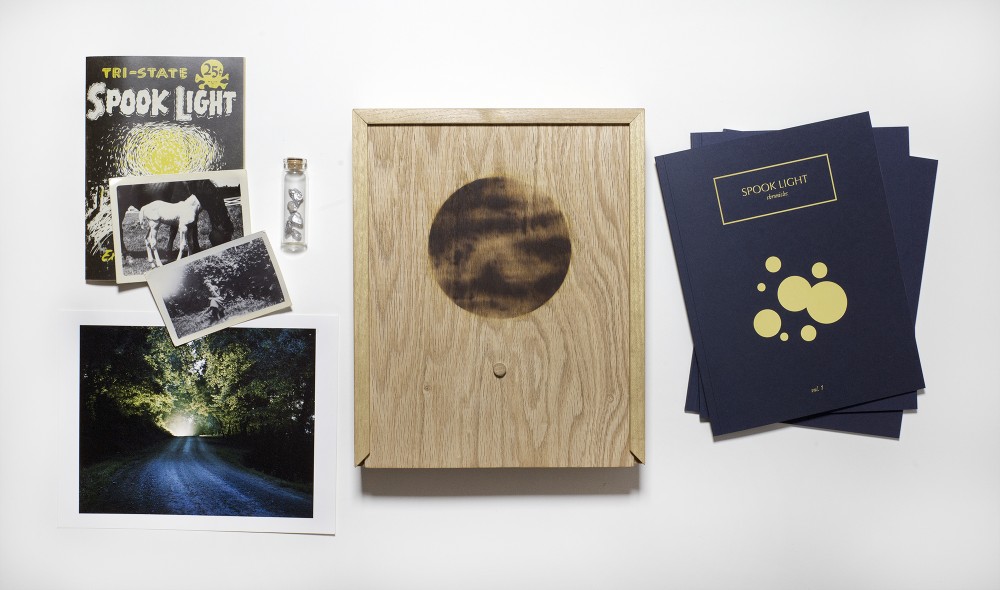
© Lara Shipley and Antone Dolezal, Spook Light Chronicles, Courtesy the artists
The Spook Light Chronicles: An Interview with Antone Dolezal and Lara Shipley
Melanie McWhorter: Will you briefly tell me about Spook Light Chronicles? What is the project about and how did it start and evolve?
Antone Dolezal: The project is placed in the Ozark region of Missouri, Arkansas and Oklahoma and focuses on folkloric and oral storytelling traditions of the region. The cornerstone of SLC is the story of the Spook Light, described by locals as a strange orb of light seen on chance nights on a road known as the Devil’s Promenade. Locals also claim to see the Devil on the road at night, giving passersby the chance to exchange a wish for their soul. Lara and I viewed this story as the perfect metaphor for searching and desire and the pull between dark and light that finds its way in rural Ozark life.
Lara Shipley: The story of meeting the Devil on the road comes from European folklore. We thought it was interesting that this story became embedded in the Ozark wilderness. We think it’s lasted so long, being passed down through Ozark families, because it resonates with Ozark life. It’s a story about fate. You come to this place and you might find something beautiful or something dark, and you don’t know which until it happens.
We are both from this region and wanted to make a body of work that spoke to our own memories of the place we grew up in while also addressing the current social and economic realities facing rural life in the region. The project began as a traditional documentary body of work, but quickly evolved to contain interpretive images, text and archival photographs. We worked on the project for five years and amassed a huge amount of material, much of which never made it into the books, the result being a multi-genre narrative with many layers and interpretations.
MM: How did you decide to do your book? Was the project conceived and produced to ultimately be a book project?
AD: Initially, we did want to do a photobook. We both naturally gravitate towards the book to focus in on a project and to be able to give the viewer a much more nuanced view of what the body of work could possibly be. We decided to do a book because we had been receiving some attention for the work before it was finished.
This project seemed perfect for the book form. I wanted to turn the Devil’s Promenade into an immersive world that was part based in reality and part based on these fantastical stories. The book gives you the opportunity to slowly get to know the landscape and get a feel for life there. It also gives you an opportunity to explore the archive, essays and oral histories we included.
© Lara Shipley and Antone Dolezal, Spook Light Chronicles, Courtesy the artists
MM: Why did you decide to do as a trilogy?
AD: We decided to do as a trilogy because the whole body of work which we called Devil’s Promenade is complex with a lot of text, old photographs, and archival images, but there are also a lot of stories that are intermingled within the photographs that are separate from the Spook Light story itself. So, the way we see it as there is the tree that is the Devil’s Promenade and each volume of the Spook Light Chronicles is a branch.
The first volume is called Spook Light Chronicles: The Road and The Light. It revolves around people coming to the road where they claim to see the glowing orb or light. We would go to the road and hear the current generation of telling stories of seeing the light and their interpretation of that the light may be, but also their parents’ stories as well. So, we really tried to capture specifically the region of where the Spook Light happens and that oral story telling tradition of that place and track the evolution of the Spook Light story itself.
The second volume is called Spook Light Chronicles: The Phosphorescent Man and revolves around the Spook Light Museum which operated on the Spook Light road between the 1920s and 1980s. It was run by a character named Spooky. Spooky would often lure people out with different brochures and postcards. He would try to get people to the museum to sell stuff. He would do these performance pieces where he would dance and sing his song about the Spook Light for tourists.
Another aspect to this story is that people also claim to see the Devil on the road at night. The Devil and Spooky are intermingled as this mythic and trickster character in volume two.
LS: Volume three is called We Always Lie to Stangers which is an homage to Vance Randolph, a very well-known Ozark folklorist who worked at the University of Arkansas and would collect folklore stories and oral story telling traditions of the Ozarks. It was a collection of these stories we had collected in the field and images that we made to go along with those stories as well as putting in stories of our own experience of being folklorists and being visual storytellers, but also acting as these folklorists who were collecting stories that are by and large dying out.

© Lara Shipley and Antone Dolezal, Spook Light Chronicles, Courtesy the artists
MM: I am working on another piece where I want to discuss the importance of text in photobooks. Since the text plays a very important role in your book. It is almost equally as important as the photographs.
AD: Yes, that is true. When Lara and I work together, we are always talking about how we can change narrative sequencing and narrative storytelling. Not change to be revolutionary, but really work with what we can outside of our own comfort zone of how we interpret narrative storytelling in photography. I think narrative and visual storytelling are new and there is a lot that can be explored there. We are always talking of different ideas of how we can engage the viewer in our story.
LS: Devil’s Promenade marked a really different way of working for both of us. But we were both interested in exploring what would be the best way to present this work, rather than replicating a way we’ve worked in the past or other work we’d seen. The text was an important strategy to lead people through a kind of complex project.
AD: The text became so important because there are many kinds of text including archival text, newspaper clippings, brochures about the Spook Light or other folklore stories in the region and our own stories that are factual reinterpretations of old folklore tales and some are new fictions. They are not directly connected with the photographs, but there are substantive connections between the images and the text. We tried to engage the viewer in this effort of having to re-read, reinterpret and reimagine the stories. Also, it gives access to people who are insiders who live in the Ozarks and know these stories by heart. The unfamiliar viewer is left as an outsider. If the viewer works hard enough, they can figure out what an image means that may be a bit ambiguous at first.
LS: To me, the biggest problem to avoid when working with text is to not overly explain the photos or reduce the photos to illustrations of the text. The project is about insiders and outsiders. About getting a glimpse into Ozark culture, but not having everything handed to you. It was important that this delicate balance of making sure the work was accessible without losing the sense of mystery and discovery was balanced in the text as well as the images.
MM: You think that the book is the ideal medium for this, or do you think it reads just as well in an exhibition?
AD: I think I consider them to be two almost completely different forms of communicating Devil’s Promenade. The book you can really sit down and focus and see the complexity of the work much more than in the exhibition. In the exhibition, there are other elements of the project that become more apparent.
LS: A big character in the project is the landscape itself, the Ozark Mountains, the forest, the bugs. Within the exhibition, we have the large mural prints of the landscape and you can become immersed in the landscape and that cannot happen with the book. You can be immersed with a lot of the nuances of the project in the book form.
MM: How long did it take to produce the books?
LS: We released all three volumes over the course of a year. The first volume took us the longest as it was a learning process of working with the printer, figuring out it all worked. We were getting proofs that the color palette did not match the screen. We had to manipulate files to get the right colors.
MM: Do you think that the biggest issues you had with producing the book had to do with getting the images correct?
LS: It was definitely a challenge at first. We have a lot of images with darker tones. Getting the images to keep their rich blacks without being too dark or lose information in the shadows took a lot of back and forth. But it was great experience. I learned a lot about working with a printer producing these books.
MM: You used a presale model for fundraising for the book. How did you go about it? You did a limited edition later, correct?
AD: We did and it worked well for us. We didn’t really think anyone knew who we were as artists. We made a small edition of 125 for each volume. We thought that if we keep the edition low, we should be able to sell through these eventually. During the presale of volume one, we sold the entire volume before the book came out. We were taken aback by the amount of interest and who was buying the book including well-known artists. We had no idea. When we realized there was interest, we set 30 copies aside and did a limited edition of that book which comes in a box set. There was interest from collectors who wanted the book.
LS: Presale was a great option for us because neither of us had the savings for a big upfront investment. Producing a book can be very expensive. The money we made from releasing the separate volumes gave us the opportunity to make the limited edition very special. We specially designed a wood box that was produced by a fantastic woodworker to house the volumes and some other special ephemera related to the project.
MM: Did you up the print run?
AD: The regular edition is 125 and we printed 30 additional for the limited. They were part of the original print run.
© Lara Shipley and Antone Dolezal, Spook Light Chronicles, Courtesy the artists
MM: Lara and I spoke some months ago and she mentioned a new version of the book coming out with a different publisher. Are you working on this and how will it differ from the softbound books?
LS: It is definitely a dream to produce the Devil’s Promenade as one monograph. Because the first volume sold out so fast, there are very few people who have seen the project in its entirety. And there is so much more material that was never published.
AD: We are currently working on putting Devil’s Promenade into one large monograph, combining all items from Spook Light Chronicle and some elements that were not in there before into a larger monograph.
MM: You and Lara are both photographers who work on individual projects as well.
AD: Lara and I are collaborating Individually, I had a three-year fellowship at Syracuse University which ended in May and I produced a new body of work called Part of Fortune and Part of Spirit. It revolves around new religious communities in the Southwestern United States and a lot of the same themes of mythology and storytelling traditions that are present in Devil’s Promenade, but sort of an evolution placed in a different region. He has been releasing over the last month or two.
LS: I am working on another collaborative project with the amazingly talented writer/podcaster Ann Friedman. That project looks at generations of migration in a small town in Iowa, and is a mixture of portraiture and audio. We are presenting this project with Pop-Up Magazine this September and October in San Francisco, Washington DC, New York City, Los Angeles, Portland and Chicago. Pop-Up is awesome and there’s an incredible line up of presenters. If anyone lives in those cities, they should come check it out!
I am also wrapping up a project I’ve been working on for over 6 years, in the borderlands of Southern Arizona / Northern Mexico, called Passersby. I have been working on it extensively over the past two years and am currently putting together a book mock-up. All my work is somehow focused on human desire relating to migration and homemaking. In small rural towns like in the Ozarks, some people feel stuck, without options. There are people in rural Arizona who feel that way too, but of course they are situated on this major migration route between the US and Mexico, where people have been passing through forever. The question of who has access to mobility is very important. Especially today, looking at this place during a period of heightened militarization and surveillance. It’s changed a lot and very quickly.
AD: Lara and I are working on a new collaborative project that takes place in Eureka Springs, AR, but that is all I can say now as it is a new body of work. It is very different from Devil’s Promenade. It is very exciting and making very different photographs that we are used to and we are very exciting to put it out as a book. It is so weird and so bizarre.
LS: It’s been great working on a new project with Antone. After years of working together, I feel we have really figured out the collaboration process. It’s such a great way to experiment and try new things. Yes, the new project is a little weird, but it’s another big departure for both of us and right now it’s just been really fun and rewarding to work on.
MM: I am looking forward to it as I love both of your works.
More on Antone Dolezal and more on Lara Shipley.
_____________________________________________________
Melanie McWhorter Bio and Photobook Details
Melanie McWhorter has been consulting with photographers for almost two decades. After moving to New Mexico in 1997, she managed the internationally recognized photo-eye Bookstore + Project Space until 2016. Learn more or contact her at melaniemcwhorter.com.
Title: The Leaping Place
Photographer: Matt Shallenberger
Text/Essay: interview with Eirik Johnson, essay by Sam Gon
Designer: self
Printer: i/o color, Seattle
Print run details (paper, colors, binding,
Edition: edition of 400 for the regular edition + 50 of the special edition, which comes with a print and a facsimile copy of my entire research notebook.. It’s printed on a silk baryta-esque paper by NPI.. Softcover with a heavy paper cover, partial front flap, and when the whole book opens flat, the book block sits on the right, with all of the smythesewn/glued binding visible.. 4/4 offset printed
Cost (can be a range): 55$ for the regular edition and 160$ for the special edition
Fundraising method: kickstarter initially, now preorders through my website
Purchase link(s): www.mattshallenberger.com
Title: May Days
Photographer: Dana Mueller
Text/Essay: N/A
Designer: Edit and layout Dana Mueller; cover and text design Shawn Bush
Printer: Kehrer Design, Germany
Print run details: paper 170g, thread stitch binding
Edition: 500
Fundraising method: online fundraising platform
Purchase link(s): http://www.danamueller.net/may-days-book/
Publication Date: May 2018
Publisher: Fraction Editions
Title: Spook Light Chronicles Vol. 1-3
Photographers: Lara Shipley & Antone Dolezal
Text/Essay: Lara Shipley & Antone Dolezal
Designer: Lara Shipley
Printer: Edition One Books
Print run details: Perfect Bound
Edition: 125
Cost: $35
Fundraising method: Pre-Sale
Purchase link(s): Out-of-print
Posts on Lenscratch may not be reproduced without the permission of the Lenscratch staff and the photographer.
Recommended
-

The Michael Kirchoff MixtapeMay 23rd, 2026
-

Richard Koenig: Field Notes: View from a Hotel WindowFebruary 13th, 2026
-
Beyond the Photograph: Editioning Photographic WorkJanuary 24th, 2026
-

The Next Generation and the Future of PhotographyDecember 31st, 2025
-

Spotlight on the Photographic Arts Council Los AngelesNovember 23rd, 2025


