Beyond the Photograph: Editioning Photographic Work
Beyond the Photograph is a Lenscratch Magazine series dedicated to helping photographers grow their artistic practices beyond the camera. Capturing images is just one small part of a photographer’s journey. In this series, we’ll explore the tools, strategies, and best practices that support the broader aspects of a contemporary art career.
Early photographic processes such as daguerreotypes and tintypes produced a single, unique image. As photography developed beyond these methods, the ability to create multiple prints from one image became possible. In the 1840s, William Henry Fox Talbot introduced the calotype process, the first to use a negative from which multiple positive prints could be made. Later processes, including albumen and photogravure printing, enabled the production of larger quantities of high-quality reproductions. Subsequent developments such as silver gelatin and platinum printing further expanded the possibilities for multiple prints.
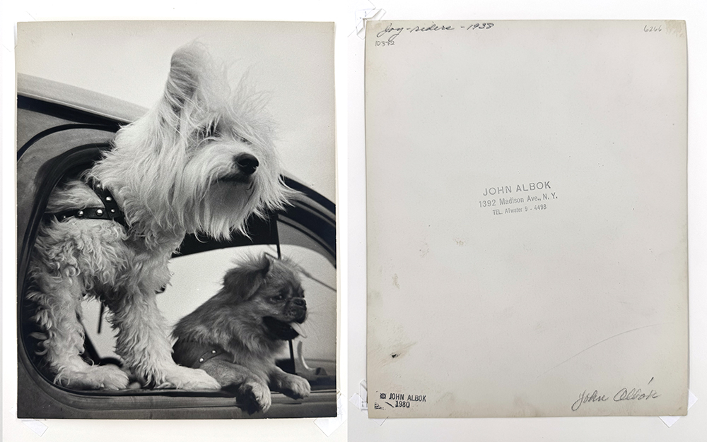
© John Albok, courtesy PDNB Gallery, front and back of a vintage John Albok silver gelatin print entitled Joy – riders, 1938. Signed and stamped by Albok with a separate stamp added verso bottom left-hand corner from the John Albok Estate, 1980
For most of the 20th century, photographers rarely limited the number of prints made from an image. Editioning entered photographic practice in the 1970s and 1980s, borrowed from printmaking traditions as galleries and collectors sought a finite market for photographic art. Over time, signing, numbering, and limiting editions became standard professional practice.
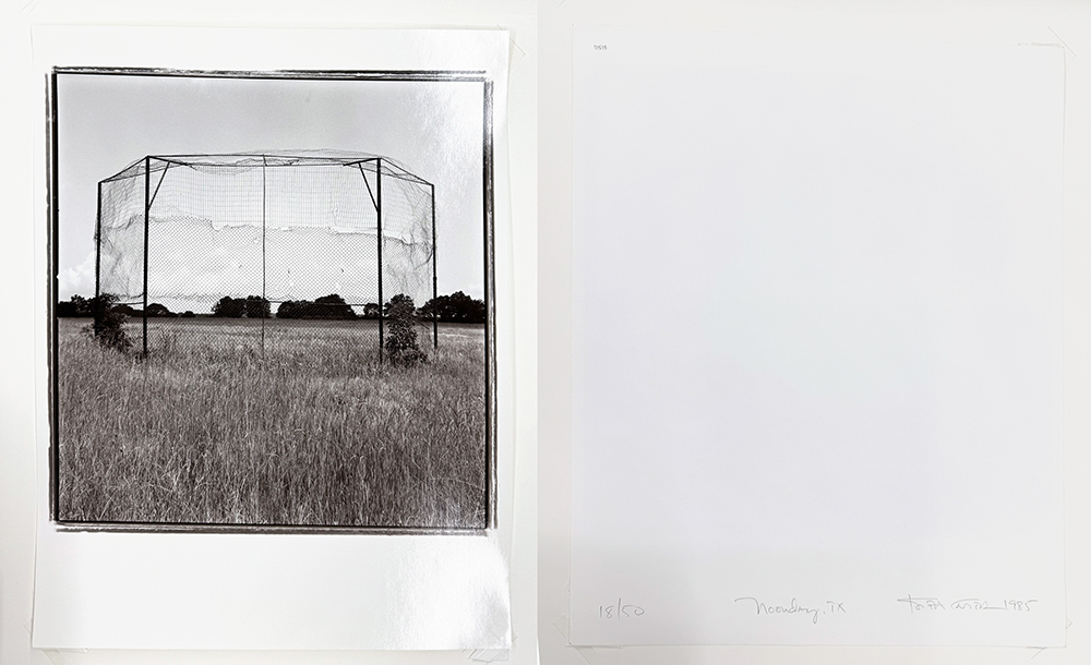
© Keith Carter, courtesy of PDNB Gallery, front and back of a limited edition print (18 of 50) of Noonday, TX, 1985
During the 1980s and 90s larger edition sizes were used by many photographers including Keith Carter and Michael Kenna. Later on, many chose to make their editions smaller in size.
“I started numbering prints in 1981 after an exhibition at The Stephen Wirtz Gallery in San Francisco sold over 100 prints, all at very low prices. It was suggested to me at the time, that it would make sense to limit the amount of prints from any one negative and also proportionally raise prices on prints that were running out. This structure encouraged collectors to view newer works, which would be less expensive than the older, well-known works. Perhaps more importantly, it encouraged me to constantly create new works.”
—Michael Kenna

© Michael Kenna, courtesy of PDNB Gallery, front and back of a limited edition print (6 of 25) of Pine Tree, Nago Island, Tsuda, Shikoku, Japan, 2022, printed 2023
Most of my prints were numbered in editions of 45, some at 90, and even one at 180, (because I had already sold over 100 copies before I began numbering). Now, because I still insist on making all my own silver gelatin prints in my own darkroom, an edition of 25 seems a perfect number for me. This involves printing the negative just two or three times, so a good amount of creativity and spontaneity still remains in the process. I greatly enjoy darkroom time, but at age 72, I need some sunshine and Vitamin D also!
—Michael Kenna
Today, photographers have the technical ability to produce countless identical prints. With that ability comes responsibility. Editioning is not only a logistical choice—it is a contract with the world. Decisions about size, materials, quantity, and presentation should be well thought out, decided upon in advance, clearly communicated, and remain constant once the work has been released into the world.
Thoughtful editioning builds trust with collectors, supports long-term value, and honors the process of making work by hand.
Start With Clear Decisions
Before offering a photographic work for sale, all edition-related decisions should be made in advance, including:
• Edition size
• Number of Artist’s Proofs (APs)
• Image and paper dimensions
• Materials and processes
• Whether variations will exist
• How the work will be signed and documented
Changing these details after collectors have committed to a work can undermine confidence and devalue the piece. Decide early—and stay consistent.
“For artists just starting out and not sure if/when they will have gallery representation in the future, number the prints and keep track of what is sold, gifted, or traded.”
—Tom Gitterman, Gitterman Gallery, New York, NY
Print Size, Format, and Materials
Print size and format should serve the image and the body of work as a whole. Consider aspect ratio, resolution, grain or noise, and whether the image can sustain larger scales without compromise. Make prints on different papers and at various sizes for comparison to help you determine which presentation showcases the image best.
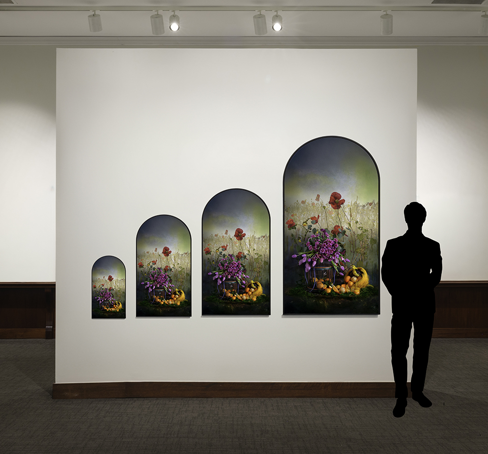
© JP Terlizzi, mock-up print sizing examples with a human figure for scale
Sometimes, the intimacy of an image can be lost when it is printed at a larger size, so bigger isn’t always better. Photographer JP Terlizzi chose only one size for the handmade pieces of his Descendents series because he found that when exhibiting the work, showing several images at the same size, made for a bolder impact.
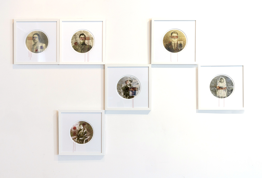
© JP Terlizzi, installation image of his series Descendants, 2018
“Every material and presentation choice in Descendants was intentional. I wanted something warm, inviting, and intimate—something that felt like family. The circular 7×7 inch format achieved that: the circle evokes continuity, connection, and the cyclical nature of familial bonds, while the size allows the viewer to engage closely, creating a portal to memory. Thread was included as a nod to my maternal grandfather, a shoemaker, and my maternal grandmother, a dressmaker, linking past and present through materiality. The microscopic slides that hold my blood specimens protect these intimate traces of my genetic lineage, preserving a connection for future generations. Together, these choices create a layered, tactile expression of ancestry, remembrance, and the enduring ties that shape my identity.”
—JP Terlizzi
Once you settle on your materials and sizes, make a set of match prints—typically at a small size—for comparison every time a print is made. Take special care to check for accurate density, tonality, and color, if applicable.
“For one of my series, I chose digital chromogenic prints because the details hold up in the shadow areas. Those prints are only made on large commercial machines and available through a professional lab, so I made two match print books—one for myself and one for the lab to keep on hand.”
—Jeanine Michna-Bales
© Jeanine Michna-Bales, book of match prints from the series of Through Darkness to Light: Photographs Along the Underground Railroad, 2002 – 2016. Each match print is clearly labeled on the back and is housed in a mylar sleeve that is open at the top for easy removal in order to view the match print next to a test print.
Many artists follow a “rule of three” for photographic editions—small, medium, and large image sizes—with edition sizes decreasing as print size increases. Offering too many sizes can dilute value and overwhelm collectors; a limited range reinforces clarity and intention. Handmade or materially complex works may exist in only one size, which can strengthen their impact in exhibition.
If multiple sizes are offered, each size should be treated as its own edition. Sizes should be distinct enough to warrant separate editions, and larger sizes should typically be rarer.
Consistency within an edition is essential. Prints should be made using the same paper, process, and standards whenever possible. That said, artists may encounter unavoidable changes—discontinued papers, obsolete technology, or changing printers—which should be handled thoughtfully and transparently.
Occasionally, a collector may request a custom size or medium outside of an established edition. You can choose to have a strict no-custom prints policy. Or decide if the work has the ability to stay true to the original intent and vision at a custom size or in a different medium. If so, then the custom print should come from either the closest size in the edition or be pulled as an Artist Proof (AP) within your original edition parameters.
Defining Edition Size and Structure
Smaller, limited editions generally hold greater collector value than large or open editions. There is no universal “correct” number; edition size should reflect the conceptual intent of the work, the labor involved, and how the artist wants the work to live in the world. Opinions differ on the edition process. From no preference if a work is editioned from museum curators, to single smaller editions from some gallerists and auction houses, to other gallerists embracing the “rule of three” and tiered pricing. If using tiered pricing, consider offering an institutional discount or freezing a print price for an institution during the lengthy acquisition process.
“While I understand the purpose of editioning prints, it is something that feels artificial to photography because it has been imposed on the medium by the marketplace. Since it is unlikely an institution like a fine art museum will ever sell a print in their collection, that kind of market value or scarcity is not a strong consideration for a museum curator. Limited editions, especially with escalating price structures, create a false sense of urgency that can create problems for a museum’s slow approval process.”
—Gregory J. Harris, Donald and Marilyn Keough Family Curator of Photography at the High Museum, Atlanta, GA
“I like deferring to the artist’s vision for how they wish for their work to live beyond their studios. When consulted about editions, I guide toward current trends: such as somewhat small edition sizes (collectors in my opinion, prefer rarity). I think for the most part an edition of 15 feels right, but there is no real rhyme or reason behind this feeling. When a print is super large, I suggest an even smaller edition size, perhaps an edition of three.”
—Arnika Dawkins of Arnika Dawkins Photographic Fine Art Gallery, Atlanta, GA“I tend to focus on emphasizing the artwork, not the fact that it is a multiple. For that reason, I prefer small editions in one size that best express a given image. Images presented in different sizes within the same body of work are fine. I prefer the artist’s work to be seen as a certain consistent value and I think tiered or stepped pricing undermines that vision. However, I am fine with the last print or last few prints selling at a higher price. Ultimately, I think the artist should determine size and edition options based on their vision for the work.”
—Tom Gitterman, Gitterman Gallery, New York, NY
A common fine-art edition structure might look like:
• Small: edition of 10–12 + 2 APs
• Medium: edition of 5–7 + 1–2 APs
• Large: edition of 3 + 1 AP
Artist’s Proofs exist outside the numbered edition and should always be clearly labeled and documented. They are often reserved for special circumstances and are typically priced higher than standard edition prints.
If you plan on releasing a limited-edition portfolio of a series, it is good to be transparent about that up front. Sizing of those prints should be significantly different enough to not be confused with the limited edition print sizes.
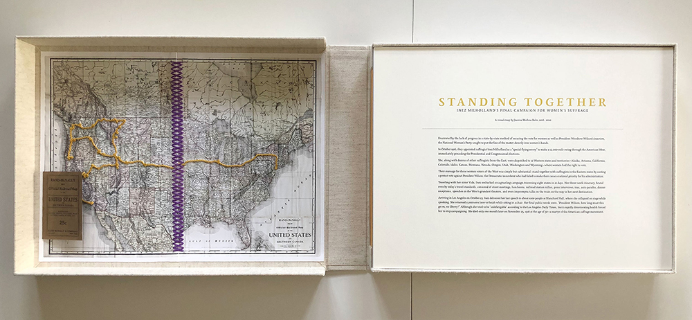
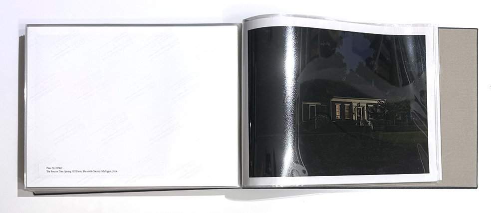
© Jeanine Michna-Bales, limited edition portfolio of the series Standing Together: Inez Milholland’s Final Campaign for Women’s Suffrage, 2016 – 2020
Once an edition is sold out, no additional prints of that size and format should be produced. Completing an edition is a commitment to scarcity and to the collectors who supported the work while it was available.
In rare instances, a collector or institution may lose a print due to circumstances beyond their control, such as fire or flood. In these situations, it is acceptable to replace the destroyed print with the same edition number. Proof of destruction, may be requested, or you may choose to proceed based on trust. Typically, when this occurs the collector or institution covers the cost of reprinting/shipping, and does not include the higher edition price if applicable.
Unique and Variable Editions
Some works are not identical multiples but unique variants—objects that originate from the same source image yet differ materially and visually. Variations may include changes in file interpretation, substrate, hand-applied materials, or finish. These works belong to a related “family” while remaining distinct.
Best practices for variable editions include:
• Keep editions small and realistically sustainable based on the work’s complexity and ability to be reproduced
• Clearly label works as EV or VE (Edition Variable / Variable Edition) so it is understood that the work is unique
• Be transparent up front about how and why variations occur
This approach has deep roots in fine-art printmaking and allows images to evolve over time rather than exist as fixed replicas.
I edition my photographs as unique variants because neither the image file nor the materials are fixed. While an image may originate from a single photographic capture, I often revisit and alter the digital print file over time. I don’t always print from the same file and I don’t print an entire edition at the same time. These shifts reflect how I feel—emotionally, perceptually, and materially—at the time of printing. I may also choose to print the same image on different substrates, most often kozo or vellum. In addition, the choice of precious metal may change from one print to another, affecting tone, reflectivity, and atmosphere. Hand application ensures that these materials respond differently in every work. Coming to photography through painting, I remain deeply interested in interpretation, revision, and the idea that images can evolve.
—Wendi Schneider, Artist
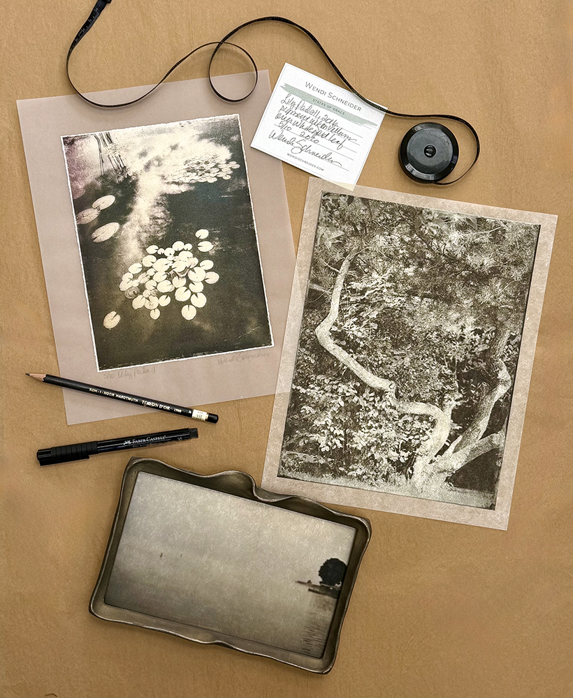
Lily Pads II, 2016 from the series States of Grace – pigment ink on kozo over white gold leaf, 5/10, 2020 – editioned, titled, signed in pencil recto (back of frame label shown); The Twisted Pine, 2024 from the series The Weight of Light – pigment ink on kozo over white gold leaf, 1/10, 2025 – editioned, titled, signed in pencil recto; Morning Mist, 2017 from the series The Patina Collection – pigment ink on kozo over white gold leaf, 1/10, 2023 – title, date, paper, precious metal, edition, date of print, archival ink signature on label frame verso
Signing, Numbering, and Documentation
Each print in an edition should be signed, numbered, and dated in order to preserve its legacy. Signatures may appear on the front margin or the verso (on the back), depending on presentation and artist preference. Pencil is widely favored for works on paper due to its permanence, resistance to fading, and its difficulty to replicate digitally. Some paper substrates, like chromogenic prints, will only hold ink. In that case, use an archival ink and be sure that it dries for a proper amount of time. If signed en verso, make sure the ink does not bleed through to the front. It’s always a good idea to test signature materials, spacing, and placement on a sample print prior to signing a final print.
Each work should include:
• Artist name
• Title (and series, if applicable)
• Year the image was made
• Edition number
• Year printed
• Printer’s name (if not the artist)
Signature labels affixed to the back of framed works provide additional verification, confirm the artist’s approval of the final presentation, and ensure information is not lost if the work is reframed. Some artists choose to sign the matte surrounding the image. This is fine as long as there is also a signature on the print itself just in case the matte and print ever get separated from one another in the future.
Certificates of Authenticity (COAs) are strongly recommended, especially for large-format prints or works produced by professional labs. A COA should be a high-quality letter page that includes:
• Artist/Studio identification, such as a logo
• Thumbnail image
• Image title and series, if applicable
• Image size and date created
• Year printed
• Printer’s name (if not the artist)
• Edition number
• Media used
• Artist signature
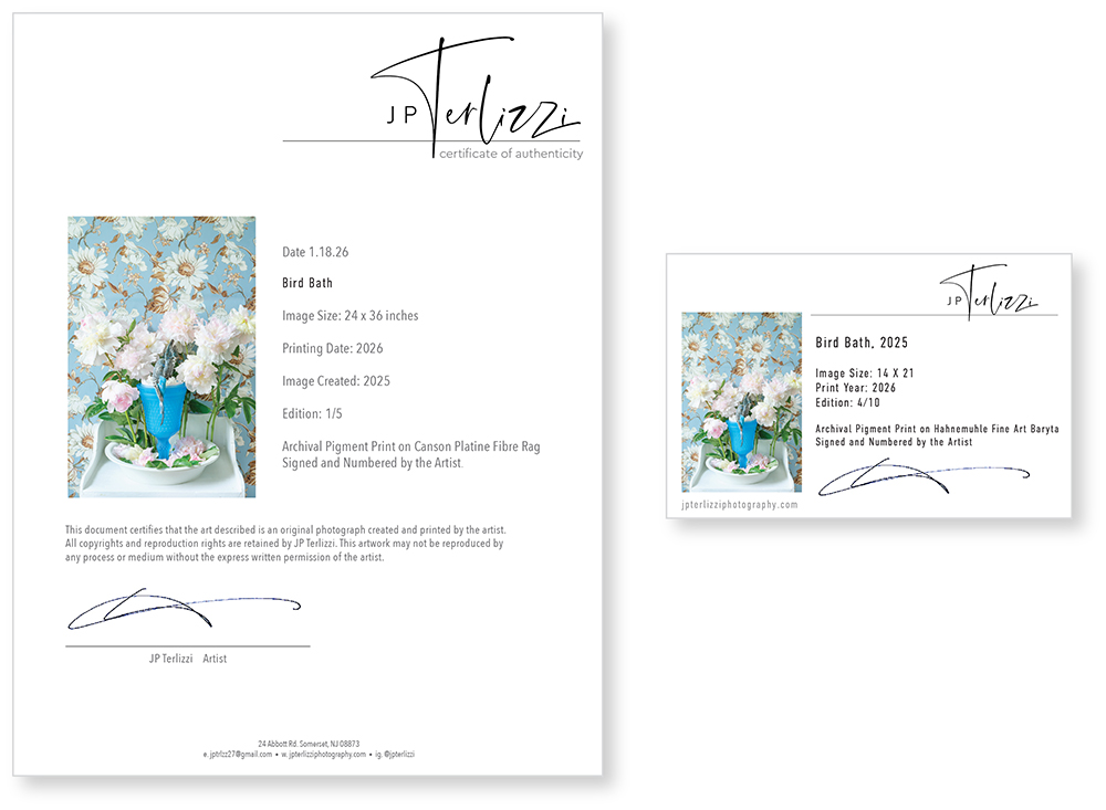
© JP Terlizzi, sample Certificate of Authenticity and signature label
Record Keeping and Transparency
Meticulous record keeping is essential. Track every print produced and sold, including edition size, purchaser information, and current availability. Clear documentation reassures collectors, supports gallery relationships, and protects the artist’s archive over time.
Many artists use inventory software, such as Artwork Archive, to keep track of records in one location instead of relying on multiple spreadsheets and manual tracking that can possibly lead to mistakes. Artwork Archive keeps you organized and provides a secure platform to manage your editions, availability, sold works, inventory and even exhibition history. However, it is only as good as the information that you put into it.
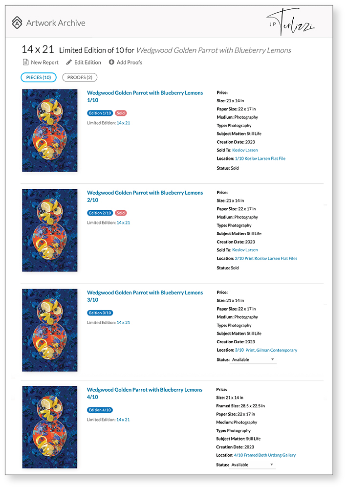
© JP Terlizzi, Screen grab from Artwork Archive of Wedgwood Golden Parrot with Blueberry Lemons from the series The Good Dishes / Creatures of Curiosity, 2023
Supplementing your behind-the-scenes record keeping with visual documents to be shared with galleries to confirm availability, sold-out editions, and remaining sizes shows professionalism. The documents can be color-coded to show collector acquisitions, educational/fine art institution acquisitions, and even donations. Saving the file as a PDF with the date in the file name allows galleries to see instantly where an edition stands at any given moment in time. Adobe InDesign is a great software program to create these documents.
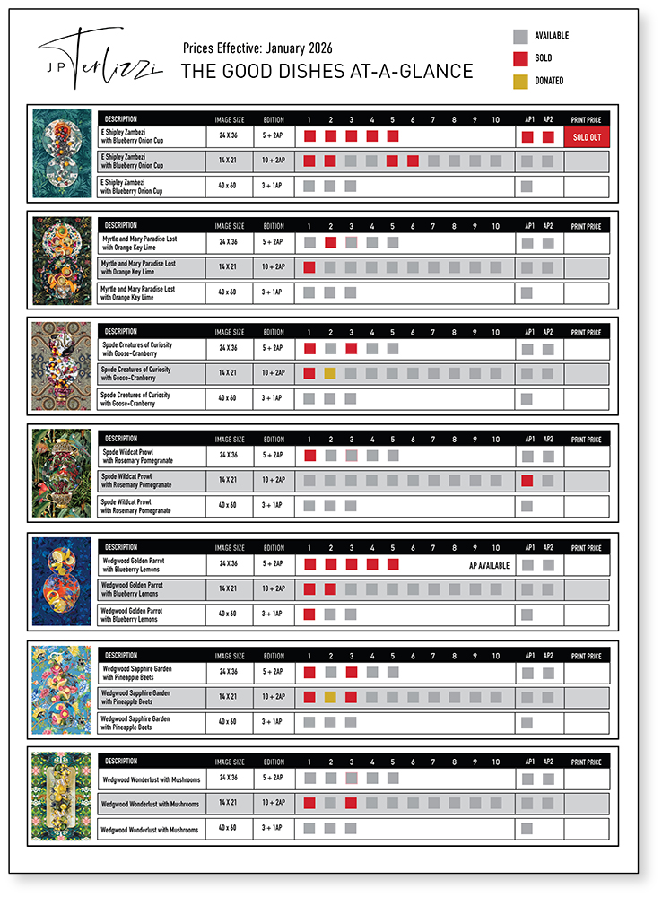
© JP Terlizzi, At-A-Glance Document of The Good Dishes, 2026
Final Thoughts
There is no single editioning strategy that fits every artist or every body of work. Some images benefit from rarity and strict limitation; others can sustain repetition without losing meaning. The key is intention.
Editioning should serve the artwork—not the other way around. When decisions about size, quantity, materials, and variation align with an artist’s vision, editioning becomes a framework that allows the work to live clearly, ethically, and meaningfully beyond the artist’s studio.
“Art for me is the expression of an individual or group through their medium of choice. Their creation, hopefully, has the power to impact the lives of other humans. The best art resonates over time even when the viewing context changes.”
—Tom Gitterman, Gitterman Gallery, New York, NY
After a successful 20-year career as a creative in advertising, Jeanine Michna-Bales transitioned to become a full-time artist. A visual storyteller working primarily in photography, Michna-Bales (American, b. 1971) explores the profound impact of cornerstone relationships on contemporary society—the connections between individuals, communities, and the land we inhabit. Her work sits at the crossroads of curiosity and knowledge, blending documentary and fine art, past and present, and disciplines like anthropology, sociology, environmentalism, and activism.
Michna-Bales’ artistic practice is rooted in thorough, often primary-source research, which allows her to explore multiple perspectives, grasp the complexities of cause and effect, and understand the socio-political context surrounding the subjects she examines.
Posts on Lenscratch may not be reproduced without the permission of the Lenscratch staff and the photographer.
Recommended
-
Beyond the Photograph: Editioning Photographic WorkJanuary 24th, 2026
-

The Next Generation and the Future of PhotographyDecember 31st, 2025
-

Spotlight on the Photographic Arts Council Los AngelesNovember 23rd, 2025
-

100 Years of the Photobooth: Celebrating Vintage Analog PhotoboothsNovember 12th, 2025
-

100 Years of the Photobooth: The Photobooth Technicians ProjectNovember 11th, 2025


