Sean Perry: Fairgrounds
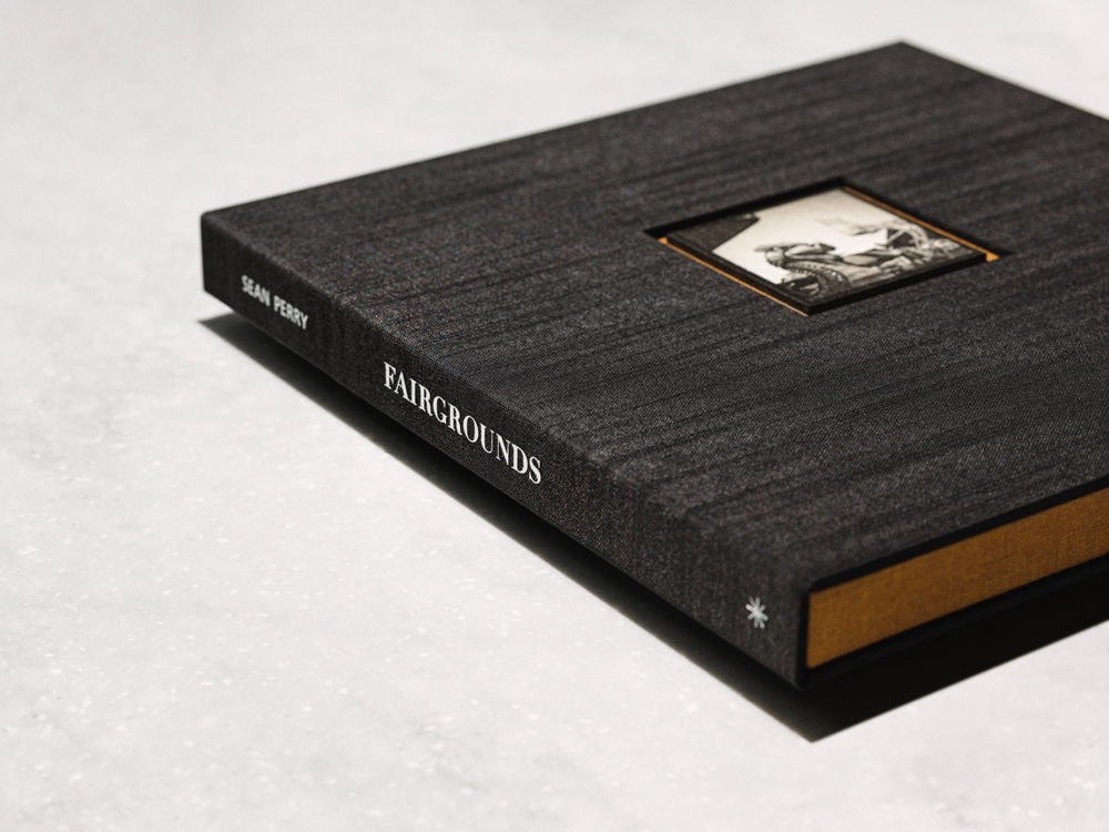
© Sean Perry, Fairgrounds: The Box Sets (2025)
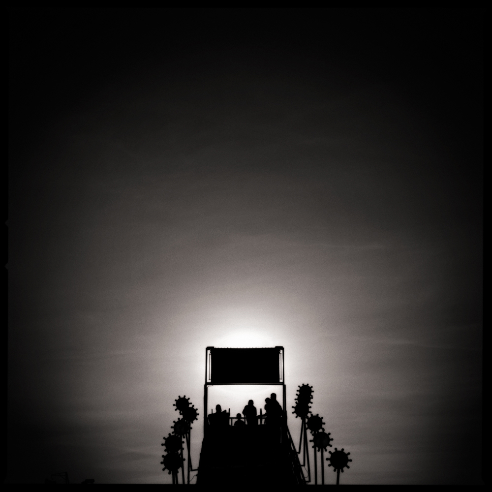
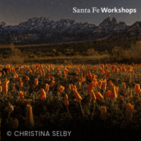
© Sean Perry, The Last Ride, from the series Fairgrounds
I first met Sean Perry in Austin at Photobook ATX, a gathering that celebrates the photobook as both object and conversation. Co-hosted by my friend Bryan Schutmaat, the event invites artists to share their work with a robust local community. I had been invited to present my own project there, and Sean served as my discussion partner, a perceptive interlocutor who generously made space for deep looking. It feels fitting to continue that exchange here, this time turning our attention to his long-evolving project Fairgrounds.
Originally published in 2008, Fairgrounds lives in that charged space between dusk and dark, where light slips into memory and the real gives way to the remembered. Now reimagined as a 2025 box set, the work gathers Perry’s photographs, luminous and suspended in time, inside a handcrafted object that celebrates both material and memory. In our conversation, Sean speaks about the persistence of atmosphere, the tactility of the photographic print, and his ongoing fascination with the fleeting spaces that hold collective memory.
The following is a conversation between Tracy L Chandler and Sean Perry.
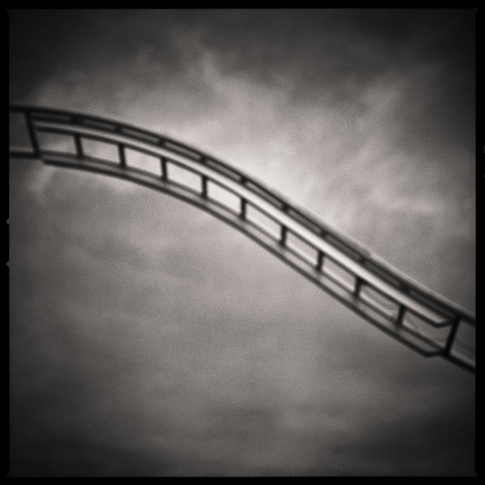
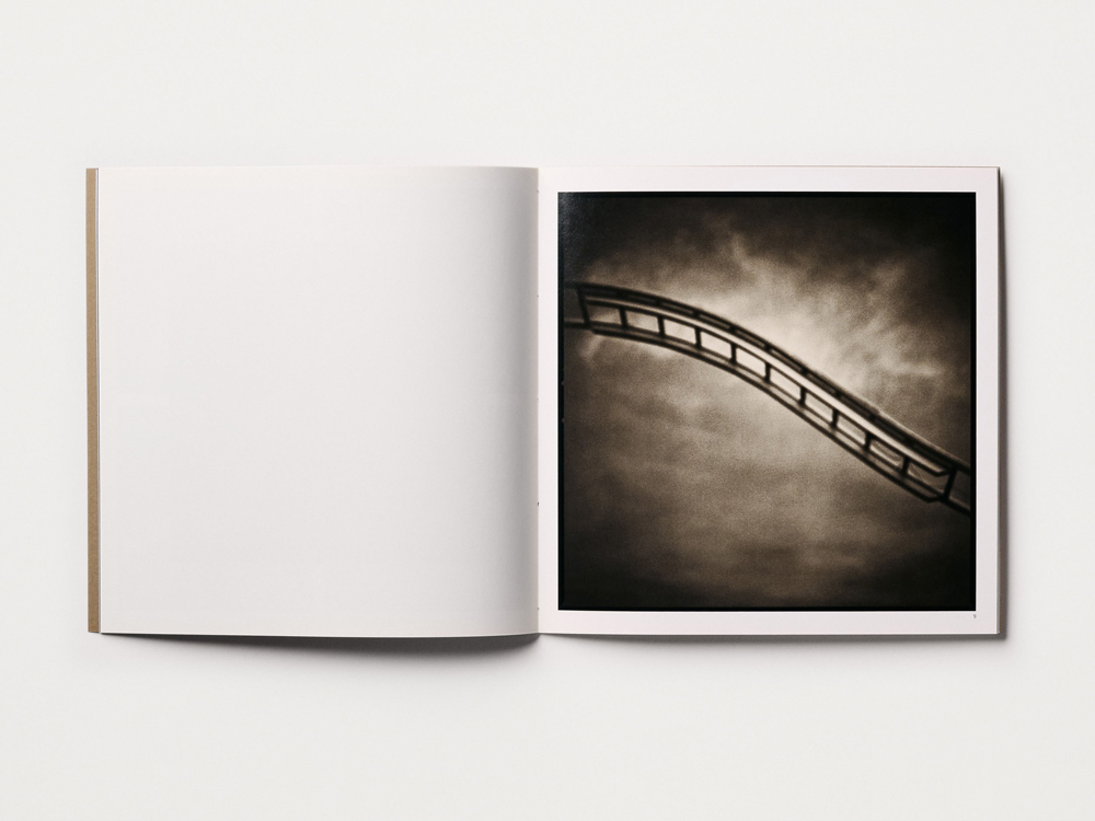
© Sean Perry, Up the Ladder Down, from the series Fairgrounds
TLC: It’s been nearly twenty years since Fairgrounds first came out. What drew you back to this body of work now?
SP: In a way, I never really left Fairgrounds. I’ve kept making pictures in that atmospheric space, so this feels more like a continuation than a return. The portfolio is far larger than what made it into the 2008 book, and I’m still drawn to the same resonance.
Earlier this year, the Griffin Museum of Photography selected Fairgrounds for its Fifteenth Annual Photobook Exhibition, which ran from July through September. That invitation felt like a natural moment to pause and honor that original publication. We’re down to the last pristine copies from the original run of five hundred, and I didn’t want them to simply trickle out. Rather than reissue or chase a second edition, I wanted to reimagine these remaining books as small, delightful objects. Each box is its own little world.
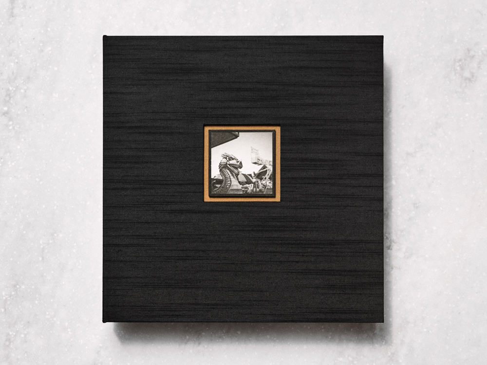
The design was a wonderful collaboration with my wife, Kaoru—an artist and professional bookbinder. Together we created a custom drop-spine box covered in Japanese Asahi book cloth with a foil-stamped spine. We inlaid a two-inch-square washi print of Ryujin into the cover like a small jewel. Inside are the original hand-sewn publication, a new colophon, and a carbon ink print titled Crazy Dance, a photograph mentioned in the foreword but not included in the 2008 book. The edition is intimate: twenty-six sets, lettered A–Z, plus four artist’s proofs.
I still make prints from the expanded portfolio for collectors and exhibitions, and each time I find something new in the work. This box set brings fresh eyes to Fairgrounds while honoring the place that first pulled me in. It feels like a graceful way to close one chapter and open another—ideally a trade edition that follows the full arc of this long conversation with temporary environments.
© Sean Perry, Fairgrounds, Cloverleaf Press (2008)
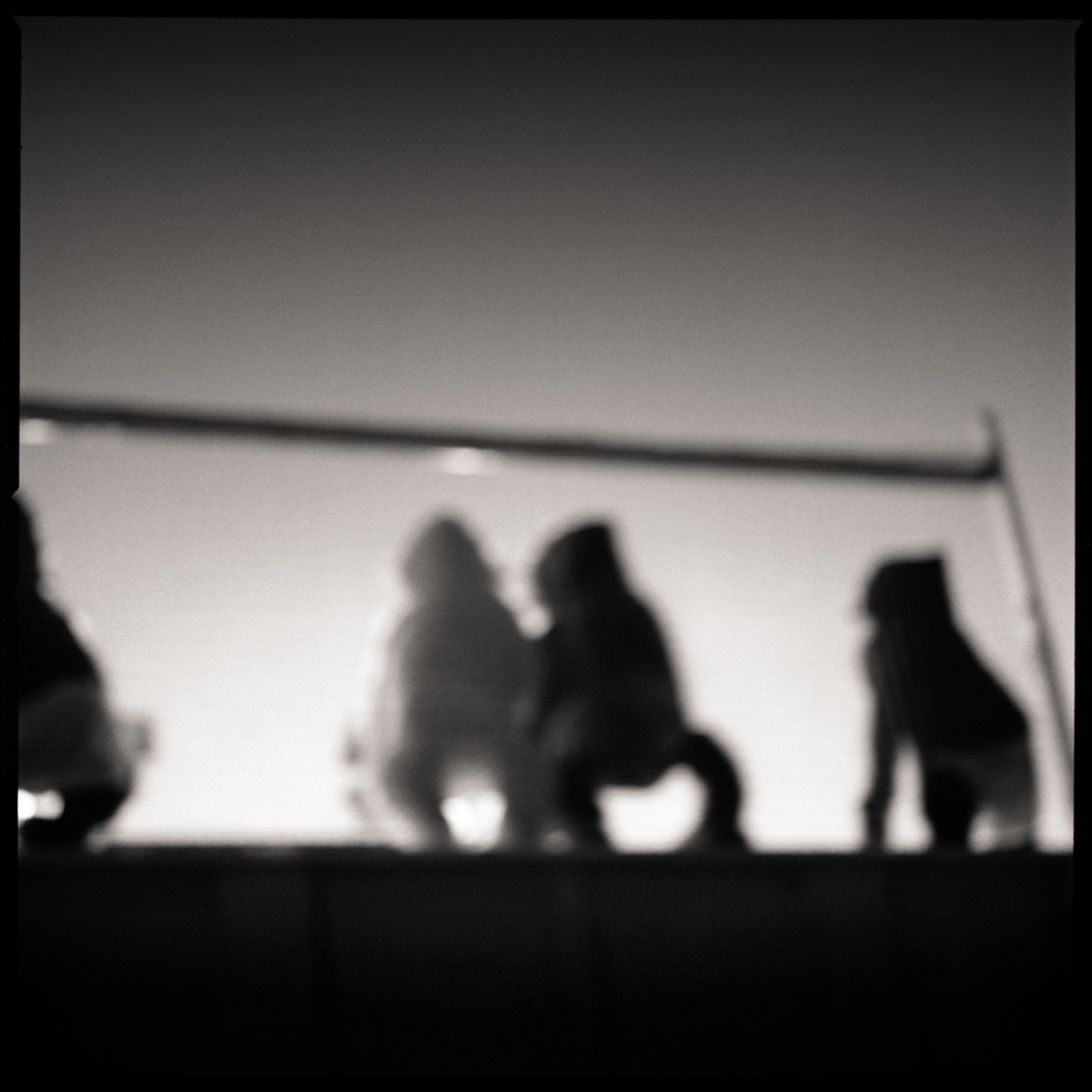
© Sean Perry, The Mariachi We Met, from the series Fairgrounds
TLC: This process you are describing is reflected in the themes of the work… memory never really leaves us, we just revisit and revise. The photographs themselves give us a taste of something familiar but without crisp detail, a notion of a lived experience. Can you talk about how memory is working for you in these pictures? How did this work originally come about?
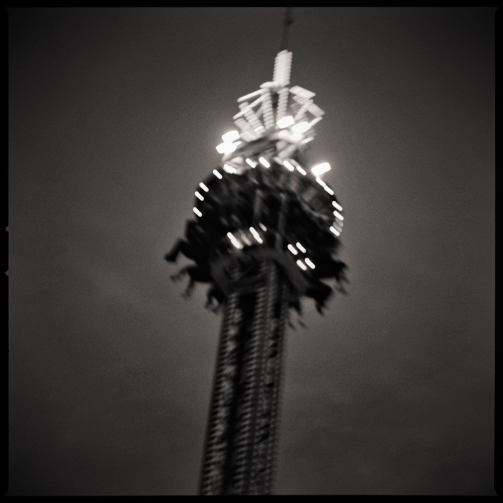
SP: That’s a lovely way to frame it; memory is the landscape where these photographs live. I grew up on the East Coast, just a few miles from a seaside amusement park. The architecture of the rides, the particular sounds of a midway, the drift of light over metal—settled in early. That spectacle felt like pure magic. I’ve always been drawn to the idea of being fully immersed in those temporary environments, of finding a passage into an adjacent reality.
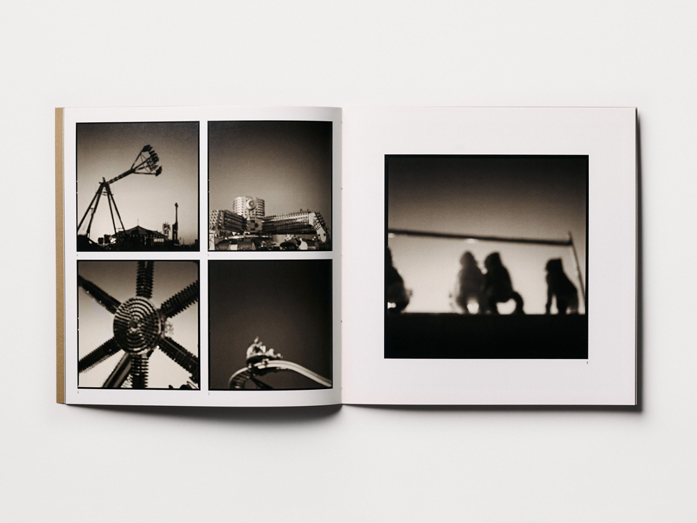
From the outset, Fairgrounds was never about documenting a specific place so much as building an entryway out of the memory of all those places. I wanted to express the world of the machines—to create images about the atmosphere you can almost hear. Like memory, it isn’t always crisp; it’s more resonance than detail. Many of the pictures are intentionally soft or out of focus to disrupt a viewer’s sense of time, scale, and place—a conversation that Hiroshi Sugimoto opened for many of us. This visual language plays with our preconceptions, encouraging a different way of seeing. A massive steel ride could suddenly feel like a small tin toy, and the present moment could dissolve into something more potent. The pictures work to get beyond the physical form and convey the essence of a thing, almost like hearing the reverb of a scene rather than the scene itself.
© Sean Perry, Zira’s Dream, from the series Fairgrounds
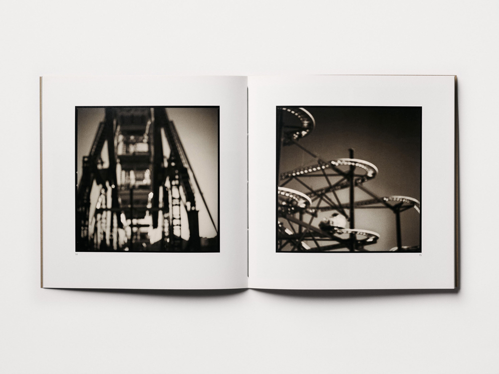
© Sean Perry, Fairgrounds, Cloverleaf Press (2008)
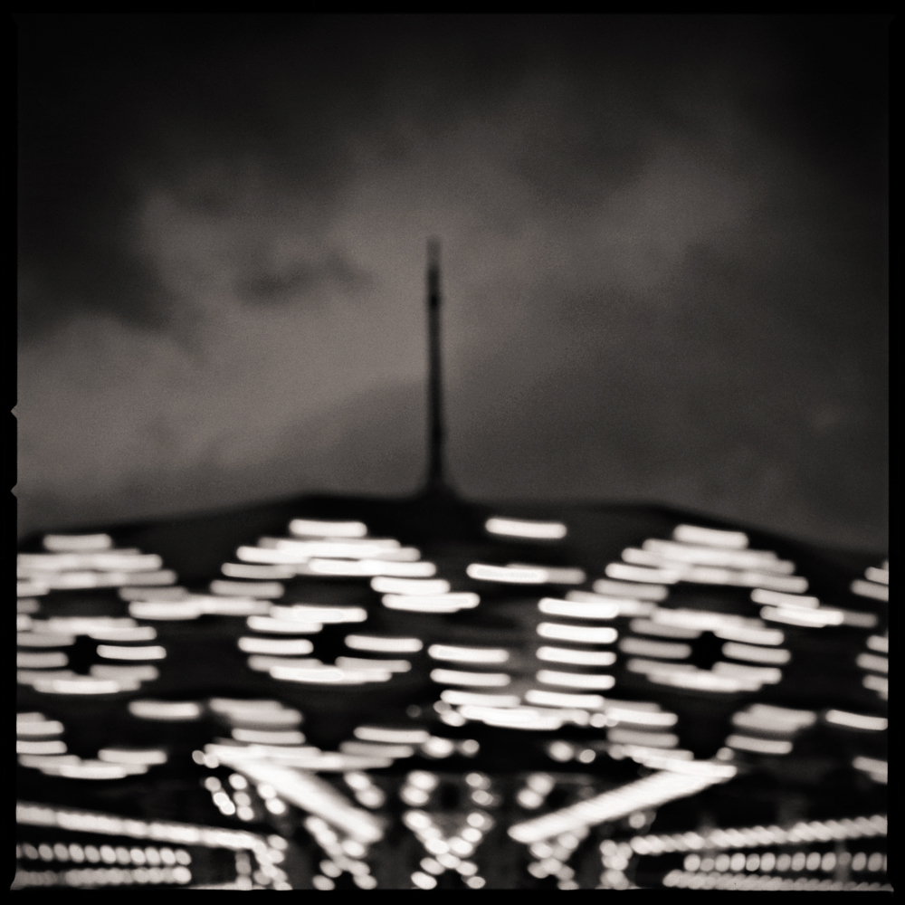
© Sean Perry, The Watchman, from the series Fairgrounds
TLC: I love the way you describe being “fully immersed in these temporary” environments. These places are expressly built to serve as an escape from our day-to-day life and they profit off our need for this reprieve. The fact that they are often temporary makes them even more alluring as we want to get in our kicks before the whole place picks up and moves on. This elusiveness in both the lived experience, and in the memory of it, is reflected in these photographs. The artistic choices you make soften the edges of these clacking metal objects. How does materiality play into your process beyond how you shoot, like in the way you present the work as an object? The book and the box are deeply tactile.
© Sean Perry, Fairgrounds: The Box Sets (2025)
SP: For me, the process begins and ends with the object. I fell in love with printing long before I committed to making pictures. It was the books themselves, those tangible artifacts, that first compelled me to make work of my own. That physical connection is especially true for Fairgrounds. The softness you describe is an invitation to feel the image as memory. I wanted to make prints that seemed to emanate their own light—to translate that sensation of looking into a dreamscape.
That’s not a romantic idea; it’s a technical problem to solve. In the original silver prints I used techniques like overdeveloping, bleaching, and split-toning in sepia and selenium to reach that particular luminosity. Today, I translate that analog sensibility into a contemporary workflow. I’m still chasing the same goal: to give light a kind of viscosity, making it a tangible presence in the final print. This pursuit is a long conversation with my heroes. From Irving Penn, I learned you can bleach back a dark print to find light; from the ParkeHarrisons, that texture can create impossible beauty; from Michael Kenna, that contemplative practice becomes visible in the print. What I love most about their work is how the final object feels inevitable, as natural as breathing. I’m always chasing that ideal.
This new box set is the most complete expression of that philosophy. The intention was to create an object that offers delight, a celebration of the simple pleasure of seeing. The box’s book cloth has a subtle texture that quiets your hands; the inlaid washi print of Ryujin invites touch; and the carbon ink print of Crazy Dance carries a warm depth and permanence that grounds the entire set. It resonates with a sense of collapsed time—as if it’s from 1950 and 2050 simultaneously.

© Sean Perry, Fairgrounds: The Box Sets (2025)
© Sean Perry, Fairgrounds, Cloverleaf Press (2008)
I’ve been exploring that collapsed timeline across several bodies of work—from my New York series, Gotham, to a newer project in Japan called Ukimachi (The Floating City)—but it feels most acute here. In our current moment, when so much of our experience feels accelerated and disposable, these analog mechanical rides become almost archaeological. They’re the last generation of public amusement that required actual steel, weight, and presence. The box set honors that physicality by creating a final, definitive home for Fairgrounds—a way to close the first edition gracefully.
It makes me think about your own relationship with the book as an object. I remember being struck by how A Poor Sort of Memory unfolds—not just cinematically in sequence, but physically in the hands. The tonal richness of your images seems to demand a certain material presence. Given how deeply personal that work is, and how it navigates between your own story and the audience’s discovery of it, I’m curious: Did you feel the physical materials themselves—the paper, the binding, even the weight of the book—needed to perform part of the narrative? Not merely hold the images, but actively participate in how memory reveals itself?
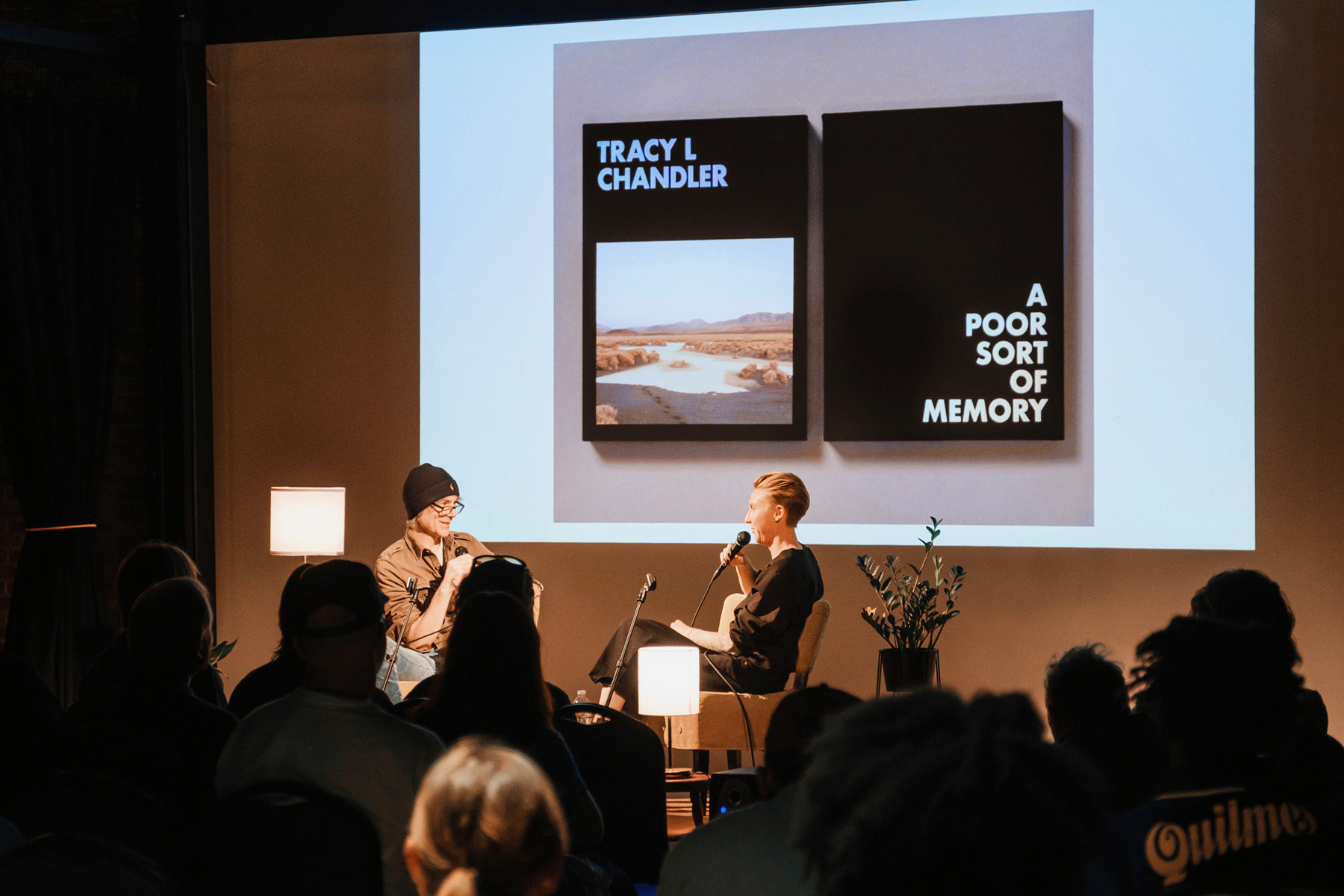
Sean Perry and Tracy L Chandler in conversation at Photobook ATX, Austin TX 2025
TLC: For me that memory unfolding comes in the sequencing, the time between images and what you remember (and don’t) as you move through the book. In A POOR SORT OF MEMORY there are images later in the sequence that call back to the beginning and characters that recur. It’s that conversation between images over time that the object-ness of the book allows for.
The materials themselves of course matter to me as well. I wanted this object to have weight, to feel heavy without being unmanageable. And with the cover, the cloth we chose was a deep black like the desert night and the foil stamp the pastels of the dusk sky, all connecting the images inside out to the container of the book. We make all of these decisions within the confines of the materials. I love that the choices are not infinite. I want guardrails. I love photography but I LOVE books, the object is an embodied, tangible experience.
I love what you said about giving light “viscosity”, that is, bringing a tangible aspect to something purely visual! Are there any new questions or obsessions that grew out of Fairgrounds and continue to thread through your current work?
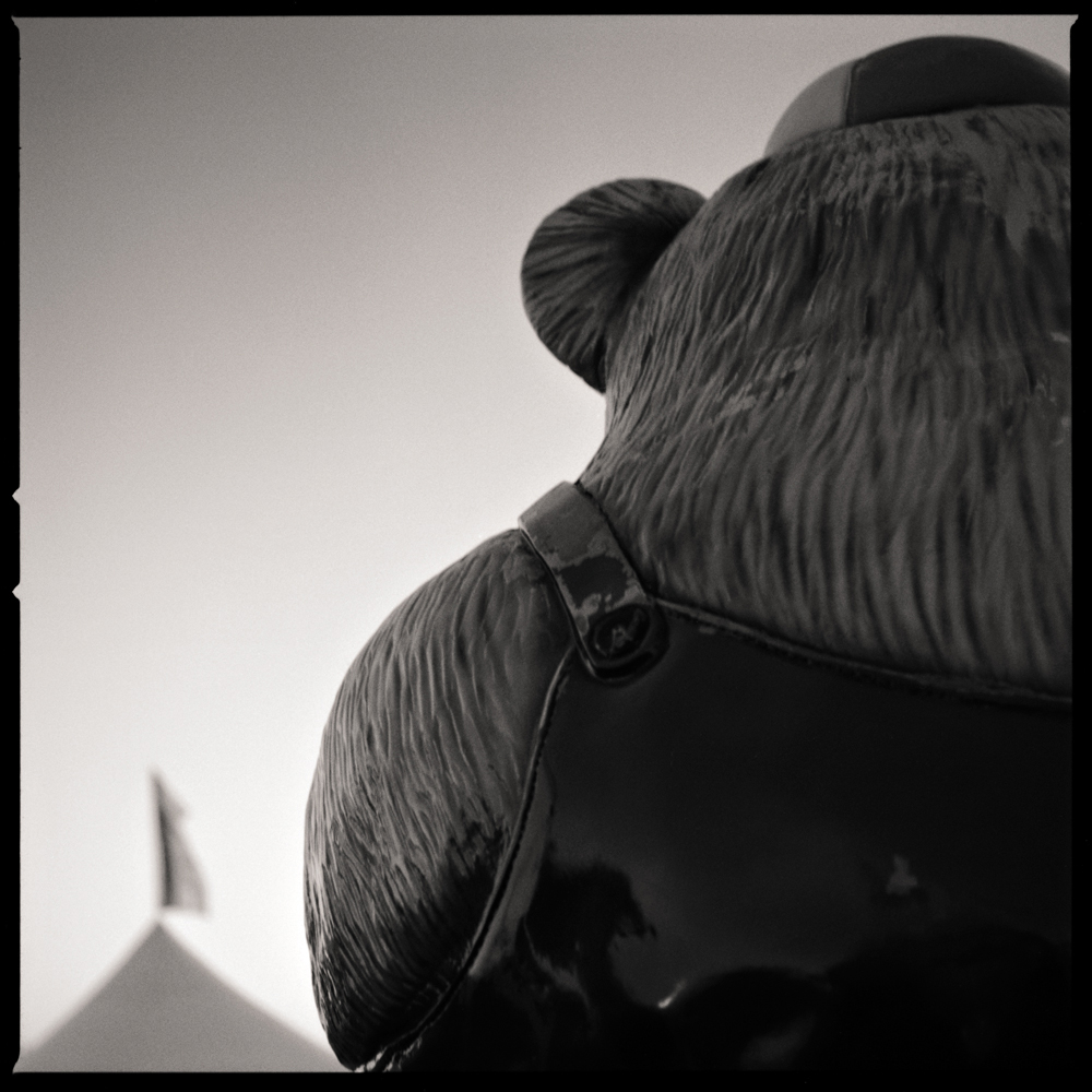
© Sean Perry, From Earth to the Moon, from the series Fairgrounds
SP: “I want guardrails”—that lands perfectly. The magic isn’t in infinite options; it’s in discovering what happens inside the constraints.
I’ve always been driven by atmosphere over information, but Fairgrounds was the project that gave me the language to explore it fully. It was the first time I really chased that sense of an adjacent reality—a world within the photograph where a backlit amusement ride becomes a clock marking no particular time.
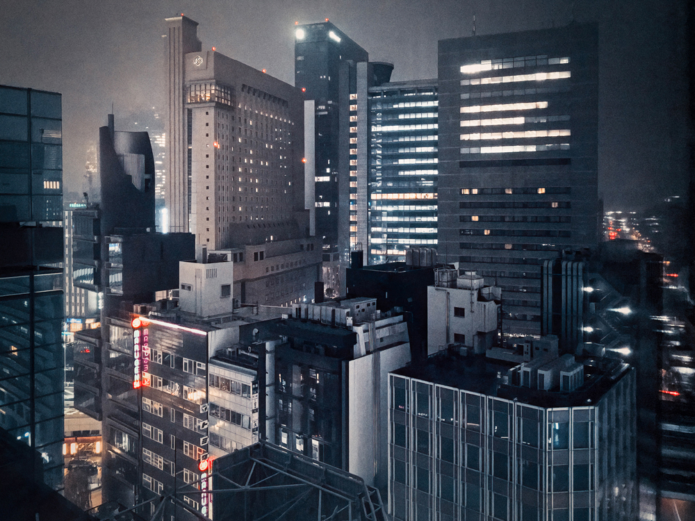
That same atmospheric current runs through my work in Japan. There’s a photograph I’m thinking of, looking out from a high window over the city at night through a hazy rain. It’s a dense tapestry of buildings, with grids of soft window light, and a few red neon signs bleeding into the facades. The entire scene feels held in suspension, both futuristic and strangely familiar. I love making pictures that feel like a frame from a film you can’t quite place. Less a single, captured moment and more recalled scenes—vivid but not quite solid.
The other thread from Fairgrounds is about the profound beauty of fleeting things. Recently, I’ve been working through my archive of Austin’s demolished Erwin Center—a monolithic arena that held nearly fifty years of the city’s collective memory, until demolition released it back into myth. Like those traveling carnivals, it was always temporary; we just pretended otherwise. Working with Kaoru again, we’re creating a portfolio where the photographs become artifacts of a place that no longer exists. Same impulse as the Fairgrounds box set: giving physical weight to something that was ephemeral.
I think we build spaces to hold time. A fairground may hold it for days, a city for centuries. The ambition that threads through everything is the attempt to compress a place’s entire felt history into a single, resonant image. But the image is only half the story. The print is where the experience resolves. It is the physical object that carries the full intention of the craft, where all that accumulated history becomes tangible. It’s the hope, I suppose, that a photograph can do the impossible: give time and memory a physical form you can hold in your hands.
© Sean Perry, Jewel Box Ginza, from the series The Floating City
Fairgrounds: The Box Sets (2025) are offered in a limited edition of 26, lettered A through Z and include a numbered and signed carbon ink print. The sets are designed by Sean and Kaoru Perry and fabricated at Cloverleaf Studio.
Sean Perry is an Austin-based photographer creating atmospheric portraits of the built environment across Texas, New York, and Japan.
His photographs and books are held in permanent collections including the Museum of Fine Arts Houston, Amon Carter Museum of American Art, The Menil Collection, Seattle Art Museum, Harry Ransom Center, Yale University, and The Wittliff Collections. Transitory (2006) and Fairgrounds (2008), both published by Cloverleaf Press, were featured as case studies in Publish Your Photography Book (Princeton Architectural Press, 2011/2014). A finalist for the Hasselblad Masters Award, his work has been commissioned by The New York Times Magazine, Billboard, and New York. His major series Monolith (2006–2018) comprises eighty photographs of Manhattan.
Current projects include Fairgrounds: The Box Sets (2025), The Erwin Portfolio (with work in the 2025 AMoA Biennial), and The Floating City, an ongoing series in Japan.
Follow Sean Perry on Instagram
Tracy L Chandler is a photographer based in Los Angeles, CA. Her monograph A POOR SORT OF MEMORY is now available from Deadbeat Club.
Follow Tracy L Chandler on Instagram.

© Sean Perry, Ryujin, from the series Fairgrounds
Posts on Lenscratch may not be reproduced without the permission of the Lenscratch staff and the photographer.
Recommended
-

Ryan McIntosh and Yogan Muller: Tracy HillsJune 19th, 2026
-

Andrea Birnbaum: Spilt MilkJune 14th, 2026
-

Amy Gaskin: Marilyn Forever! Marilyn Monroe—A Symbol of HopeMay 30th, 2026
-

HANDMADE ARTIST BOOKS WEEK: VERONIKA SCHÅPERSMay 29th, 2026
-
HANDMADE ARTIST BOOKS WEEK: Ryoko AdachiMay 28th, 2026


