Cyanotype Week: Annalise Neil
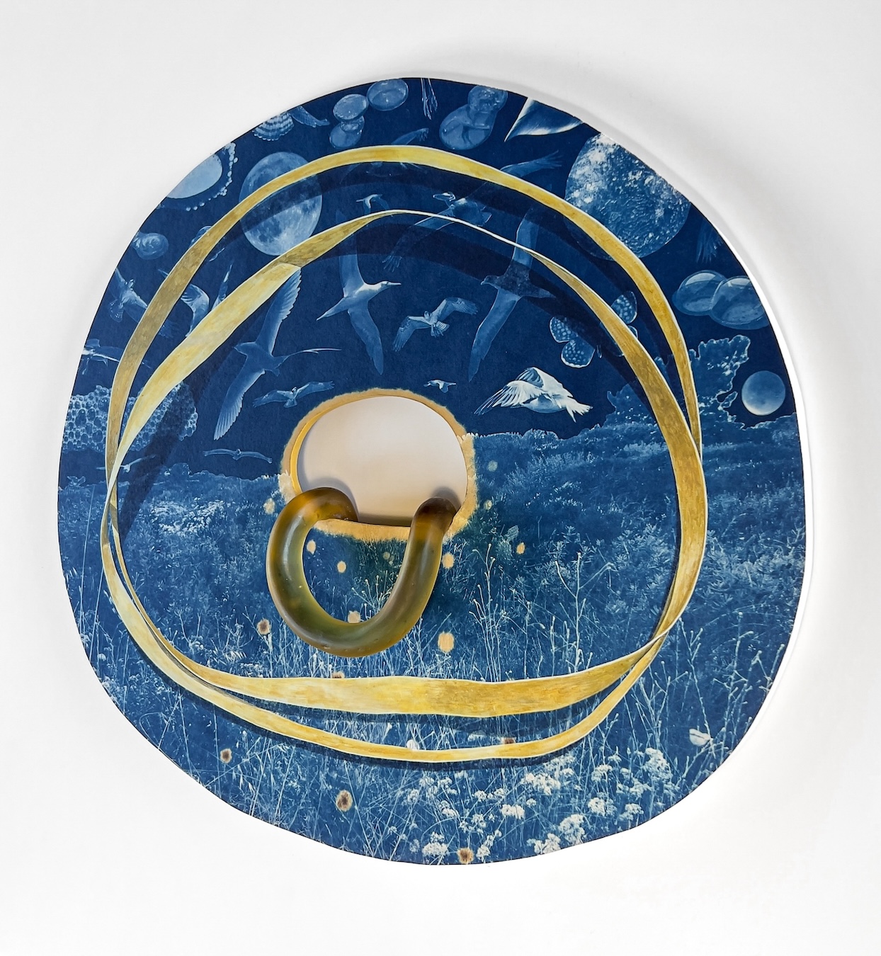
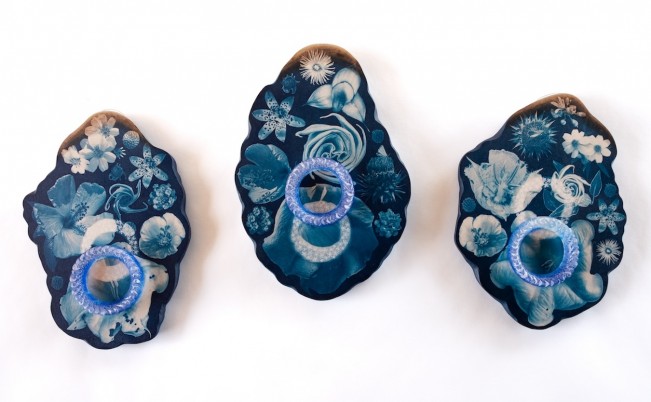
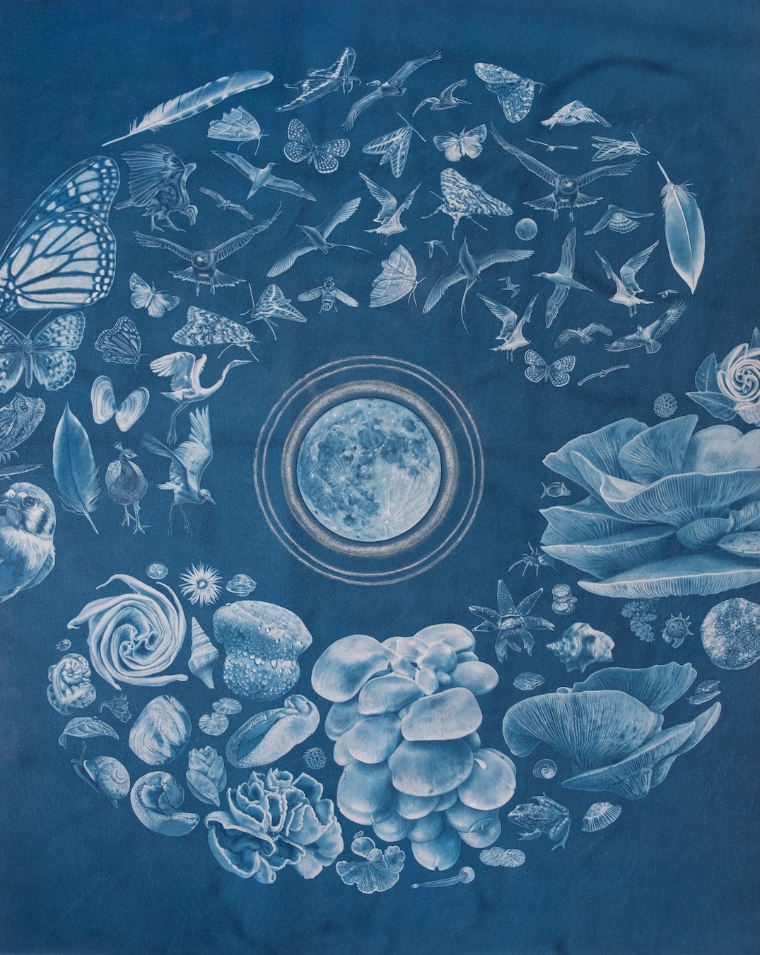
©Annalise Neil, Loophole
This week we are celebrating the artistry of five unique artists exploring the frontiers of cyanotype. This eclectic cadre takes the medium into energetic and unexpected directions through innovative, experimental approaches. First off, we have Annalise Neil, whose playful three-dimensional works reveal a unique understanding of the interplay between image, surface and perspective. Her practice is an inquisitive exploration of metaphysics, quantum theory, and the mysteries of the natural world. An interview with the artist follows.
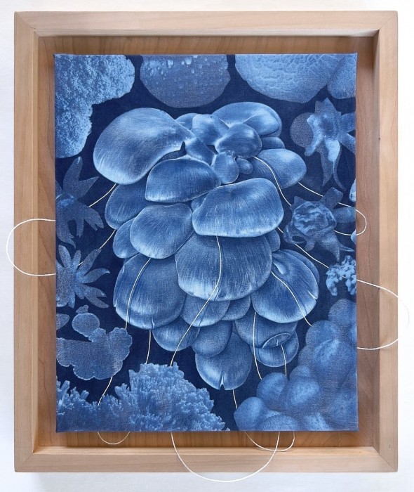
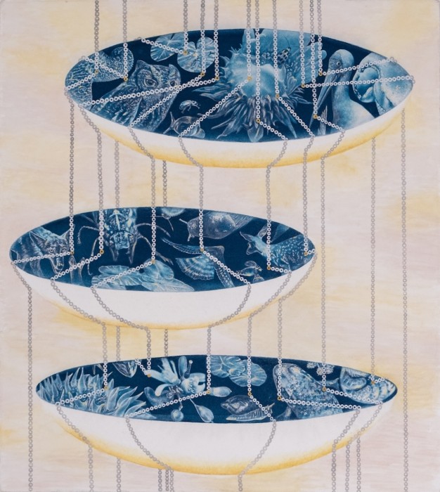
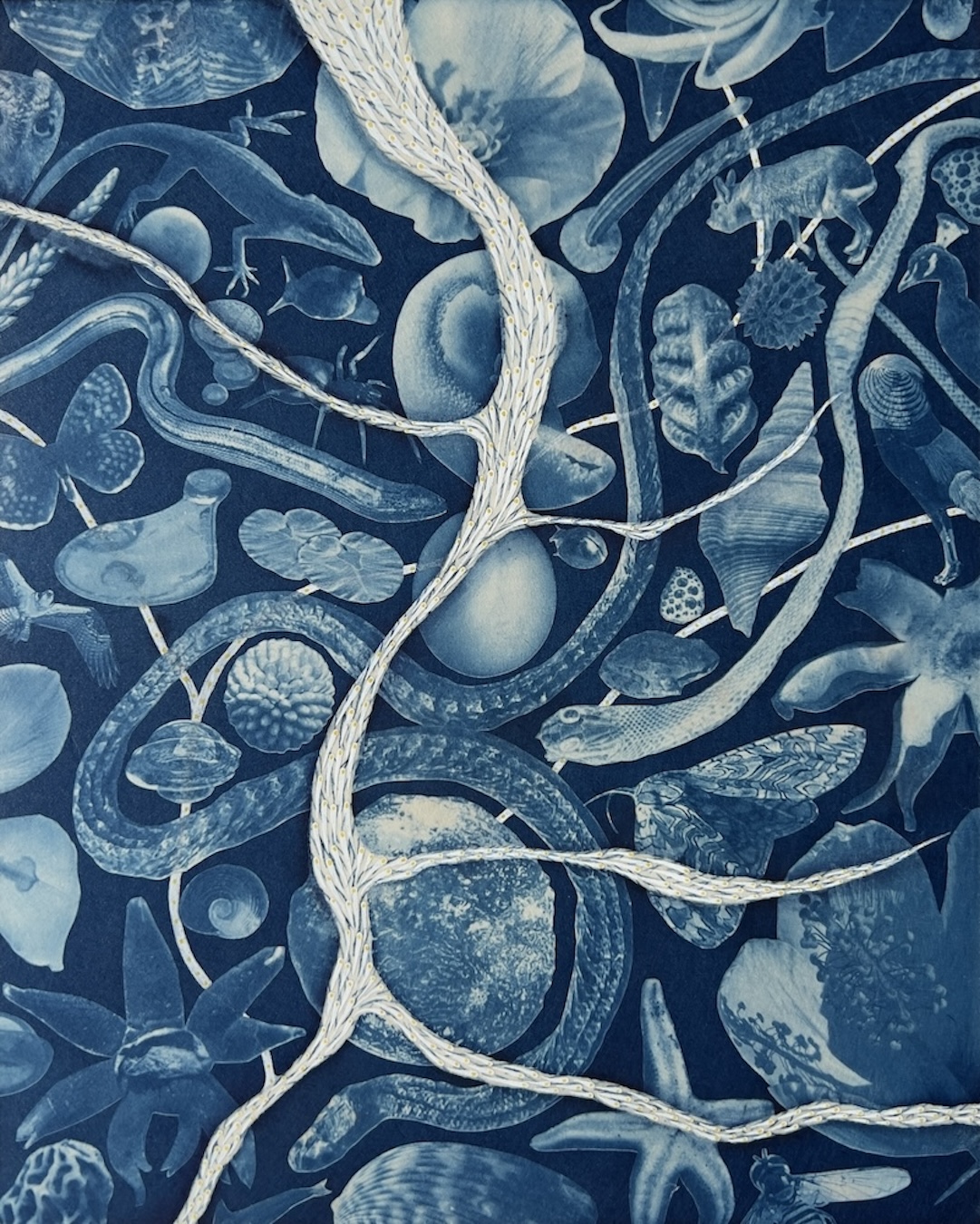
©Annalise Neil, Transformation Through Inquiry
Annalise Neil has a BFA in Printmaking from the College of Saint Rose in Albany, NY, with a minor in Art History (summa cum laude). She has completed residencies at Playa Summer Lake in Oregon, with Mira Schor through the New York City Crit Club, and an Artist Residency in Motherhood. Her work has been exhibited nationally at galleries and museums including Field Projects, NYC, The Irvine Fine Arts Center, and The Oceanside Museum of Art. Neil’s work has been featured in publications such as ArtMaze Mag, Colossal, The On Being Project, Emergence Magazine, All She Makes, Resurgence and Ecologist Magazine, and New Visionary Magazine. Her work resides in public and private collections across the U.S., Europe, and Asia.
Follow Annalise on Instagram: @annalise_neil_studio
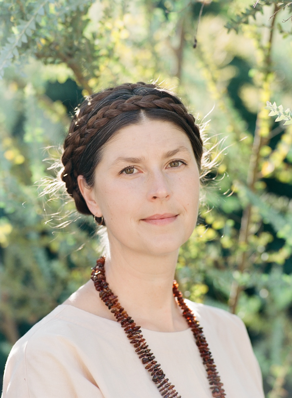
Portrait of Annalise Neil, Courtesy the artist
Artist Statement
With nature imagery as a visual framework, my cyanotype and watercolor work considers ideas such as perception, the unknown, quantum theory, and ecology. Metaphors that come from researching these scientific and philosophical tenets are woven into my pieces. The concepts and the images they lead to can be used to help interpret living as one species amongst wildly complex, interconnected social and natural environments. I am keenly interested in discussing states of awareness and connection. All properties of all things are relational, and life is only possible through a collaborative symphony—nothing exists independently. Every living thing is a complex, multidimensional universe that interacts with others to form a prismatic web of energy. I endeavor to create work that will lead to contemplation and reflection, and that invites a thoughtful examination of our relationship to reality and our surroundings.
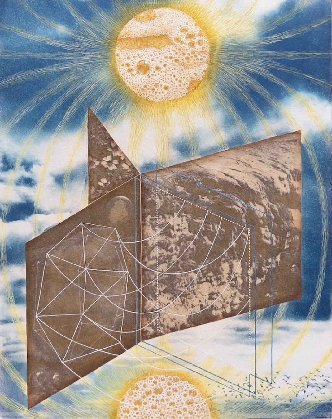
©Annalise Neil, Gravity
Why cyanotype?
Annalise Neil: The intensely gorgeous Prussian blue appeals to me, as does the ability to tone the prints with botanical teas. I prefer to work on paper and to integrate watercolor, so the kinship of cyanotype and this kind of paint is a natural fit for me. I also appreciate the ease of production and direct-print aspect.
©Annalise Neil, Auguries
©Annalise Neil, Ancestral Accretion
When was the first time you encountered the medium?
AL: About five years ago, a photographer friend suggested we try it together. It was truly a cupid’s arrow from my first exposure, and my mind quickly surged into being enamored of the boundary-pushing and alchemy that the medium affords.
©Annalise Neil, Pattern Formation
What about this photographic process interests you the most?
AL: I am drawn to visual communication that weds science with philosophical or metaphysical ideas. Being able to incorporate photography and hand-done mark-making covers both. I also love that I am collaborating with nature at every stage of my work.

©Annalise Neil, Harmony II
How do the particularities of the medium relate to your overall artistic philosophies?
AL: A few key concepts in my work are perspective, a consideration of time, and an exploration of the relational network of our reality. As my work is built from years of spending time in the wilderness, and with a medium that is itself a form of nature and that evolves on a gradient, there is a clear bond between concept and process.
©Annalise Neil, Nimble Articulation
Have you developed your own process working in this medium? If so, can you guide us through it?
AL: All the images in my cyanotypes are direct prints of my photographs. As I move through the world, I take pictures of compelling things I discover and turn them into negatives that I print on transparency film and then cut out. I weave this harvested imagery into my works on paper, which I later embroider with watercolor paint that enhances conceptual or formal qualities. I also integrate other mediums such as kiln-cast glass, woven pine needles, woodworking, and cuttle-fish-cast metals.
©Annalise Neil, Tidal Acceleration
Although you usually depict natural forms in your cyanotypes, you also deal with abstract shapes in a very unique way. What abstractions in the natural world/the universe inspire you?
AL: An ongoing fascination and area of inquiry of mine is the space between things, the energy and information exchange that may not be visible to our eyes. I am informed by many different scientific fields and theoretical physics as well metaphysics, and explore ideas from these realms to visually consider the natural world and the human species. For example, I often use the shape of a cone as a metaphor for the passage of time, which is a shape I pulled from traditional physics. I am also inspired by the patterned graphic visual aspects in nature, as well as the softer, more loose ones. I find it natural to fall into a trance-like state when in the wilderness, and can pass long stretches of time staring at minute details of a plant or rock until even the most organized aspect can fall into abstraction.
©Annalise Neil, Confluence
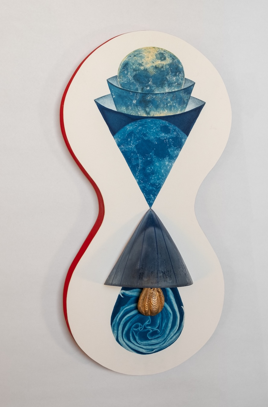
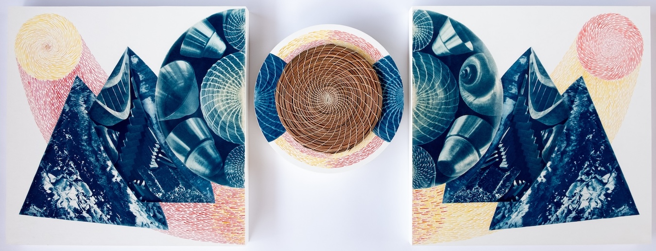
I love your piece Locus. How did you achieve that color on the print? And what are the materials you used for the three-dimensional part of the work?
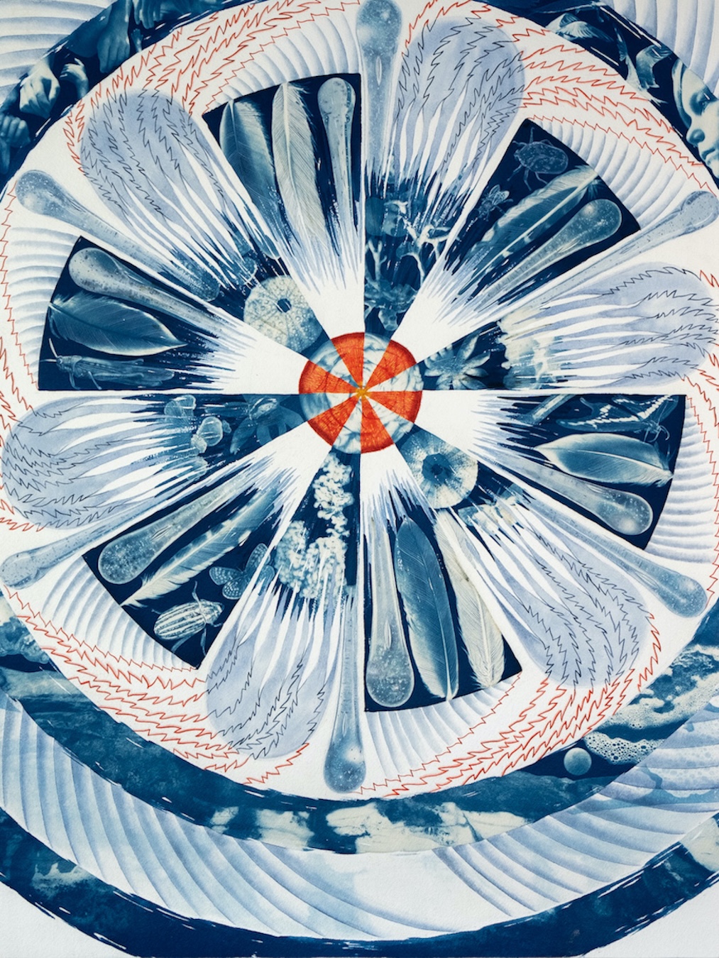
AL: Locus is perhaps the most complex piece I have ever created. For the cyanotype portion, I toned it with alternating chestnut tannin and soda ash baths. The primary structure is composed of three layers of wood that I hand-carved, spanning geometric to organic shaping. I then painted grey palm shadows and pops of color with flashe and watercolor. The center circle holds a drop of cuttlefish-cast bronze, which is one of the most ancient forms of metal-casting. Near the bottom of the work is a sculpture that I hand-formed from wax and then cast in glass, (it is an abstraction of lymph nodes) which is held in place by bronze wire.
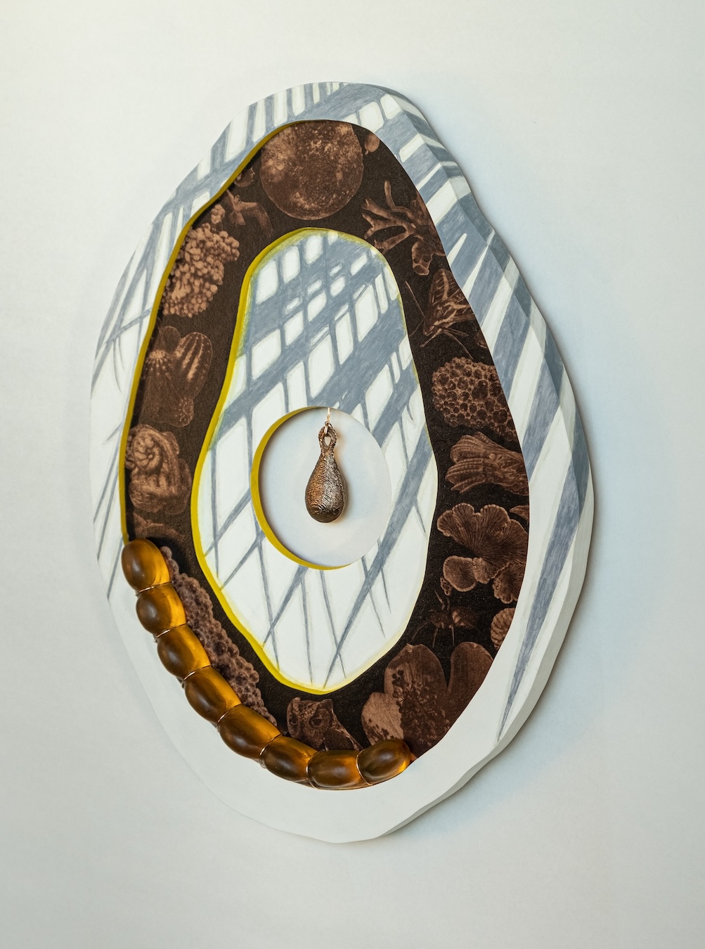
©Annalise Neil, Locus
Have you encountered limitations with the medium, and if so, what were they and how have you tried to overcome them?
People often ask why I like blue so much, without knowing it’s just a natural chemical reaction. In a way making so much work that is one color can seem off-balanced when looked at from a distance. Because I print each negative and cut it out, I am limited by that physical size. Though I do think that’s a generative restriction and pushes my creativity and innovation. Even though I live in a sunny corner of the world, I work seasonally as my best results come from the sun’s quality between March and October. I have adjusted to make exposures in those months, and to do the more sculptural aspects during the rest of the year.
©Annalise Neil, Memory Trace
How do you think the public perception of cyanotype has changed in the art world?
It has really expanded in the public’s awareness over the last several years. Since it’s such an approachable medium, more and more people have been able to try it from kids crafts to alternative process classes in a more formal setting. I suspect there is still some hesitation from the traditional art world, since it’s photography and prints often on paper. But I do think people are considering it in a different light as practitioners continue to innovate and evangelize.
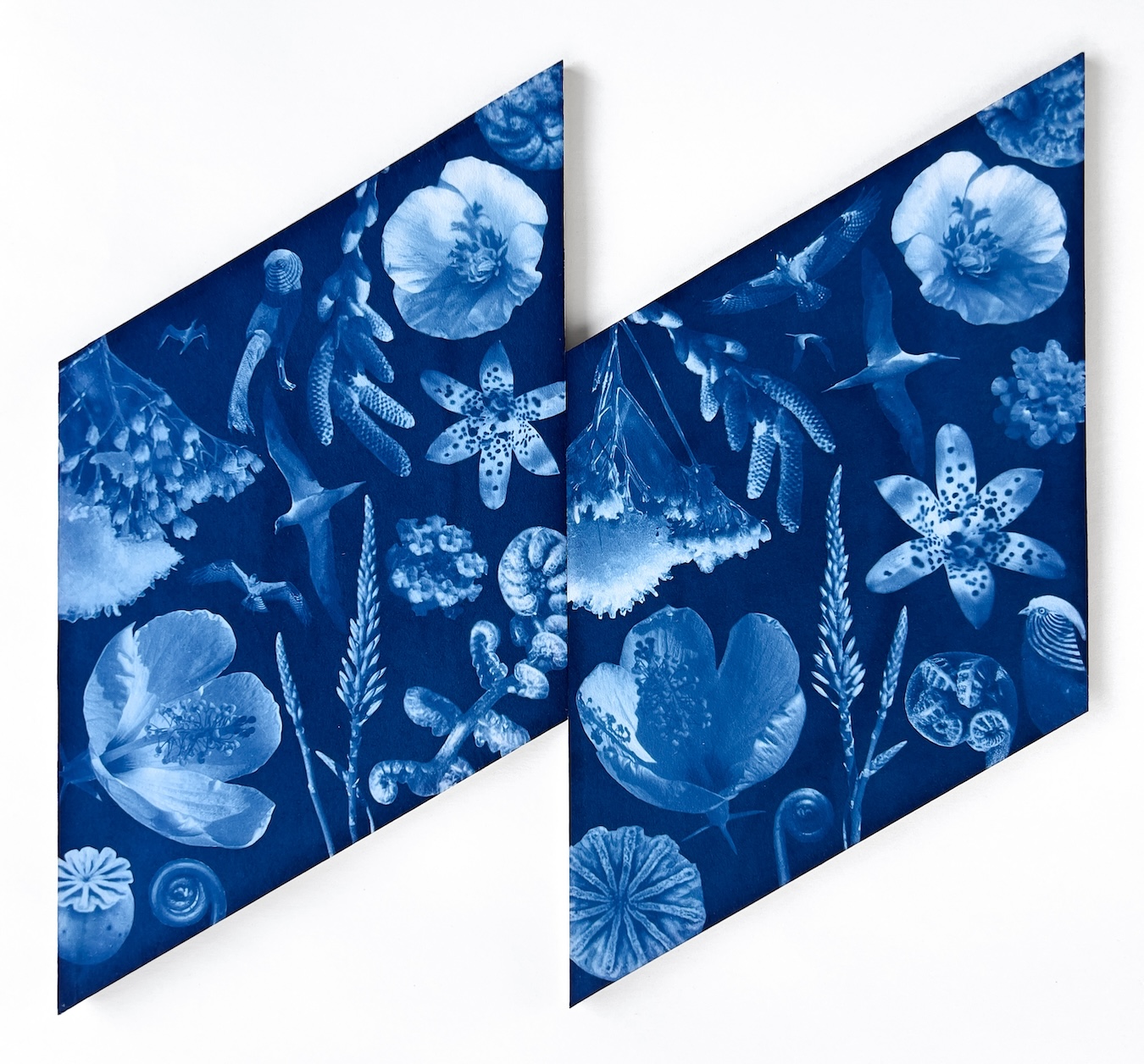
©Annalise Neil, Recalibrate
Posts on Lenscratch may not be reproduced without the permission of the Lenscratch staff and the photographer.
Recommended
-

Craig Easton: An Extremely Un-Get-atable PlaceJuly 6th, 2026
-

The 2026 Paula Riff Award Winner: Angélica ArbulúJuly 3rd, 2026
-
The 2025 Paula Riff Award Winner: Marni MyersJuly 2nd, 2026
-
The 2024 Paula Riff Award Winner: Minwoo LeeJuly 1st, 2026
-

The 2023 Paula Riff Award Winner: Paula McCartneyJune 30th, 2026


