Kyle Agnew | Our Cheeks Blush Amidst Prairie Grasses
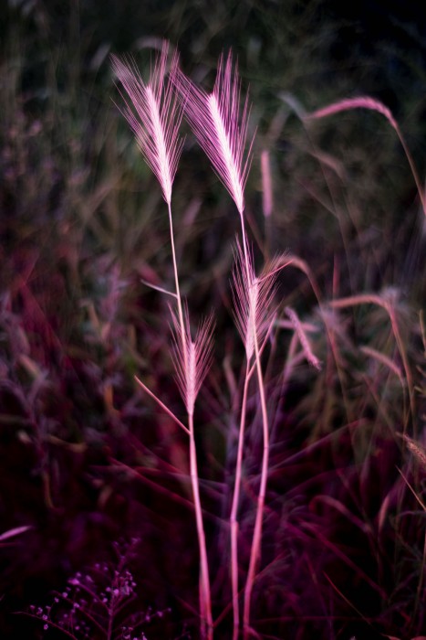
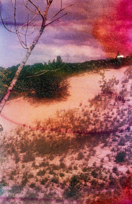
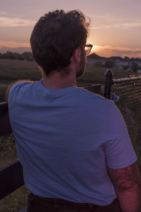
©Kyle Agnew, I See You In The Mirage Of The Prairie, from Our Cheeks Blush Amidst Prairie Grasses, 2023. All images courtesy the artist.
This week on Lenscratch we present an eclectic survey of photo-based artists exploring issues of Queer identity and representation. These exceptional artists expand our appreciation for diverse photographic techniques, directing our attention to critical issues of bodily autonomy, reclamation, and belonging.
Today, our focus is on multidisciplinary artist Kyle Agnew.
An interview with the artist follows.
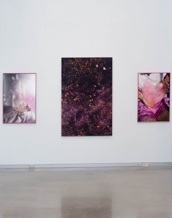
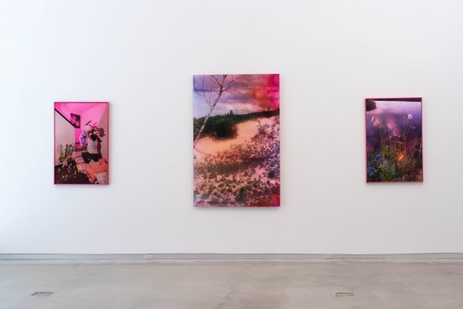
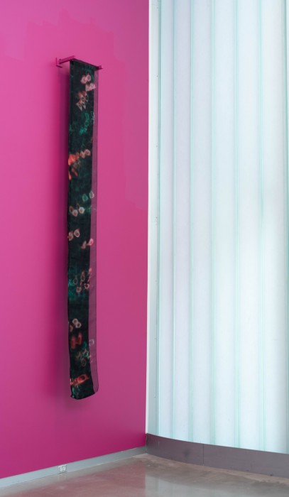
The title of Kyle Agnew’s recent MFA Thesis at the University of Iowa, Our Cheeks Blush Amidst Grassy Prairies, reads like a TMC Midwestern gay telenovela. It is easy to envision the artist obviously lying amidst the tall grass prairies, coyly moving their feet, completely absorbed in a moment of bashful affection in the heartland of the country. Exhibited from April 1–5 at the University of Iowa’s Ana Mendieta Gallery, the colorful show has many remarkable highlights and showcases a wide range of techniques and fun experimentation. Armed with pink gels and sourcing varied familial and personal materials to create “new Queer fairy tales,” Agnew has created a vibrant and electrifying visual codex of flamboyant kitsch and whimsy in the lines of a new Prairie-Futurism that feels fresh and exciting. The exhibition shows an artist absorbed in the quest to express a multidimensional idea of Queer love and a retelling the history the Indiana landscape under a new light. It is with exuberant generosity that he welcomes us into the tenderness of his glittering Little Gay House In the Prairie.
Kyle Agnew is an Indiana native and received his BFA in photography from the University of Indianapolis in Indianapolis, Indiana. Kyle’s practice is a colorful, sentimental, cluttered closet where dreams can be written into reality through our imaginations. Kyle often works from a large archive of collective familial objects passed down from their grandmother to his mother, and now to him. They ponder this collection and its authenticity to all aspects of his identity, as well as using it as source material to create new queer fairytales and express a more multifaceted idea of queer love. Through exploration of the motifs and symbols these kitschy objects hold Kyle implores their audience to meditate on ideas of gender signaling, heteronormativity, and the nuances of queer love.
Follow Kyle Agnew on Instagram: @kja_photo
Our Cheeks Blush Amidst Prairie Grasses
In the cannon of photography when queerness is invited to the table to be discussed, it often is observed through the voyeuristic lens of a queer male photographing a fellow queer male in the nude. Though rejoicing in the body and sexual experience that comprises a slice of queer life proves valuable, an over glorification of these images minimizes
the complexity of the queer identity. Growing up in the Midwest, queer love was reduced to a purely physical and sexual presence – something deemed disturbing by the hegemonic gaze, I transgress this to propose an expanded view of queerness in the landscape as an embodiment of my experience.
bell hooks puts it best when stating that “[being] Queer’ [is] not as being about who you’re having sex with (that can be a dimension of it); but ‘queer’ as being about the self that is at odds with everything around it and that has to invent and create and find a place to speak and to thrive and to live.”
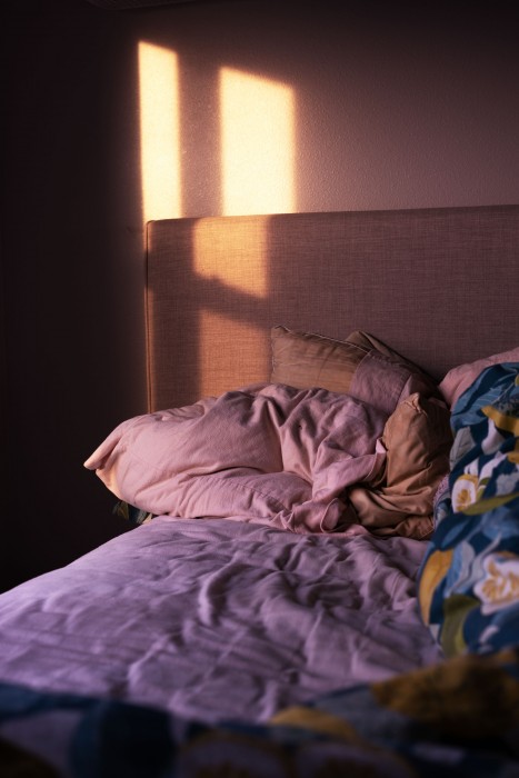
What does queer love look like? How can we position queer love as a natural component within our more than human world? How do I tell my partner I love and long for him across hundreds of miles of distance? Through the photographic investigation of the Indiana Dunes, the site of my engagement, and the Iowan prairie, the place me and my partner now reside, I challenge oversimplified views of queer love by expanding naturalist heteronormative narratives of the landscape. Furthering this conversation, my partner and I perform still-lifes in our interior domestic space in search for a view of queerness that implores the romantic, complex, effeminate, and saccharine. Queerness isn’t detached from the landscape but is innate to our world and its inhabitants, from the cellular to the sunset.
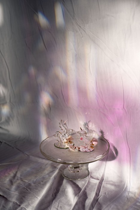
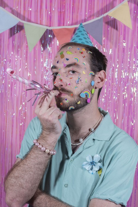
©Kyle Agnew, Portrait As Unicorns & Sea Shells, from They Remember Everything, from Our Cheeks Blush Amidst Prairie Grasses, 2022.
Vicente Isaías: Can you tell us a little bit more about how this project originated?
Kyle Agnew: This project I’ve been working on for around two years now. It all happened when I was at the Indiana Dunes. I’m originally from Avon, Indiana, which is just a small town outside of Indianapolis. I’ve been dating my partner currently for around six years, but at the time, for four years, we went to the Indiana Dunes, which is a location on the shore of Lake Michigan, at the very top of Indiana. I’d never been there before, but it was a place I always wanted to visit because I had worked for three years at the Indianapolis State Museum, in which we have a large collection of paintings by an artist called Frank Virgil Dudley, who was a large conservator of the Indiana Dunes through painting performance and kind of like guided tours of people. We went there and I brought my film camera with a roll of film called “The Bubble Gum Film.” It’s supposed to add notes of sweetness to whatever you’re photographing. And I just knew that I wanted to take pictures of the place because I’d been so inspired by the images.
But little to my surprise, my fiance now proposed to me at this location. And so when I was photographing in the Dunes, I was really thinking about how this experience is now held by the land. As long as I return to it, this is something that I will remember. So, how can I incorporate the land in the creation of this image and collaborate with them instead of dominating it, like kind of how past landscape painters have done and enforcing their own narrative on them? I really love Frank Dudley. I love his paintings and I like his perspective. But he was a scientific naturalist, that was his perspective. Under that scientific perspective, they view queerness as inappropriate due to the fact that it is “sex for the sake of sex” versus the sake of reproduction, which is a taboo to them. I wanted to digress and show how queerness is and meets the landscape, and the needs of the creatures beyond the land.
VI: It’s so interesting to know about the process. Have you always worked on film?
KA: No! So, one of the main reasons I went to grad school is because I wanted to work with film. I hadn’t had the opportunity [before]. I didn’t have a dark room of any sort. I knew I wasn’t done learning when I finished undergrad and wanted to dig my teeth further in photography. I had been doing a bunch of 4×5 work and this is my first time really being experimental with that process. For this series, all of my images are printed on a photo rag or metallic paper. So they have a pearlescent sheen to all of them. They’re not just a flat print, but they slightly glow. It helps have conversation with the images that have foil on them. So there’s like still a material connectivity throughout all the pieces. And even the frames that I’m using are a metallic like shimmery pink around the whole image too. There’s this constant idea of shimmer. I finish the images when I print them as large as a romantic landscape painting. So, roughly 44 by 60. And then I hand flail the entire surface of it using cake decorating tools. I apply a sieve and then take foils to apply a light shimmer across the whole entire image, mimicking the dots of the sand that was on it. But then also the dots that the printer makes when we’re enlarging 35 millimeter.
VI: You’re exploring with different media, various materials. You’re also working with ephemera or archives from your own personal life.
KA: I’m a print maker as well. I primarily work in photography, but in my undergrad, I did a lot of letterpress, and then coming to grad school I knew I wanted to be a part of the printmaking department but didn’t know how that fit into my work. We had this amazing professor back in the eighties, I believe, named Virginia Meyer, and she invented this process called foil printmaking. I read all her books and had conversations with her in my mind. She always said that she hates when foil is applied really brazenly because she views it as being too sentimental and saccharine. And that’s exactly what I want my images to do. I’m taking this idea of hers and applying these dots. They’re just to try and bring this sentimental, saccharine quality to the images.
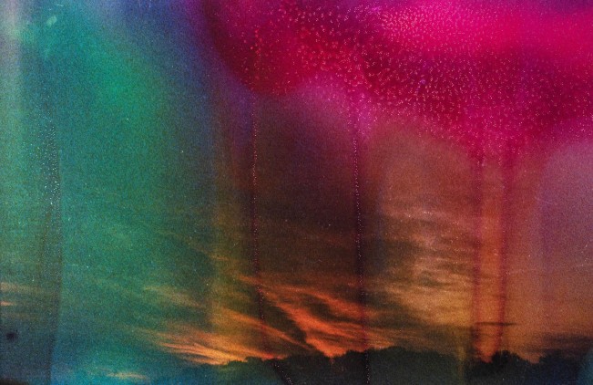
©Kyle Agnew, As The Waves Wash The Shore ,They Remember Everything, from Our Cheeks Blush Amidst Prairie Grasses, 2022.
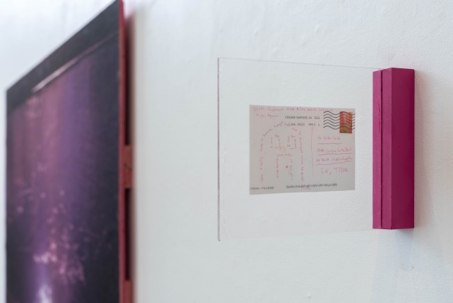
This process also has its own history in greeting cards and postcards. That’s where it originated. So then to not only represent the return to this medium but to try and capture this idea of distance as me and my partner, which I feel is pretty common for people, especially in the Midwest, to be long distance. I did that by making postcards as well as just postcards and sending them back for a year. I printed off a bunch of images, cut them down, and then I made some postcards with foil, and I foiled all of them to because of the history of postcards having foil. Then I gave them a stack. I had a stack, and then for a year I was just like, Whenever you miss me, write me…. I want to bring this to you. I’m going to write you. They range from concrete columns of text to — one time I just put on a bunch of lipstick and kissed a card all over and I was like: sending you kisses like.
He did one where he drew a rose and was like, “I should be getting an MFA instead.”
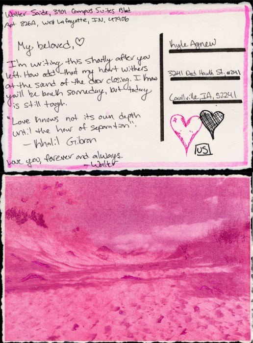
©Kyle Agnew, Even The Shimmering Sand Cannot Forget, Iowa, from Our Cheeks Blush Amidst Prairie Grasses, 2023.
VI: What has been the biggest challenges during the creation of this work and the exhibition?
KA: Moving forward from things and being away from my partner and making work about him. That was really weird at first. It felt very one sided. But now that he’s here with me, it’s become a lot more collaborative. … I guess also piecing it together and sequencing it has been difficult, just as there’s a lot of things, a lot of broad concepts I’m touching on. So that’s why the exhibition kind of diverts and all these slightly different paths. But to me it feels really connected and about the same subjects as well as related through color.
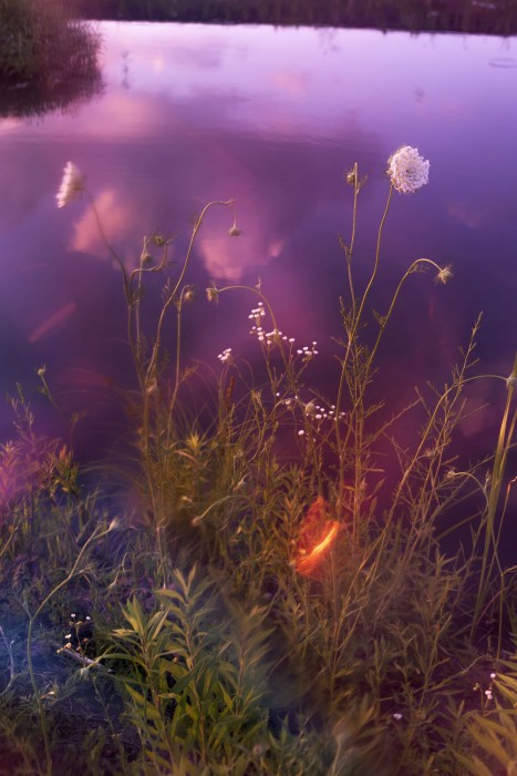
©Kyle Agnew, A Scattered Approach To Making A Sunset, from Our Cheeks Blush Amidst Prairie Grasses, 2023.
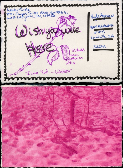
©Kyle Agnew, Like The Sun,There Is A Sense Of Warmth, from Our Cheeks Blush Amidst Prairie Grasses, 2023.
VI: I love the pinks in the work.
I use pink in all my work. I think this is kind of important to touch on. I refer to it as like magenta. Magenta is kind of like not a real color, it’s a mechanically produced color. And to me that’s like really queer coded in nature as trying to fit into these other colors, as well as being a component of the work. A really large part of it. I originally just did it because I liked the color and to me it’s just like this artist stamp of mine, but also this reclamation of the feminine.
I had received some critiques from portfolio reviews that were like, You should stop doing this. They said I was making myself into a stereotype and I agree with that. They also told me I was really hopping on the Barbie trend, but I’ve been making pink work for four or five years. I’m focusing on the trends or, it’s just happening.
VI: I think it’s really important to talk about these things because, when you think about portfolio reviews, reviewers aren’t perfect people free of biases . It’s a quite banal critique, to be less gay. Many do end up boiling down their work in a way that it becomes palatable to a wider audience. A wider audience that is, of course, heteronormative and also has greater control of larger means of visual cultural production.
I think the nature of your work is what makes it strong, what makes it distinctive, and what caught my attention in the first place.
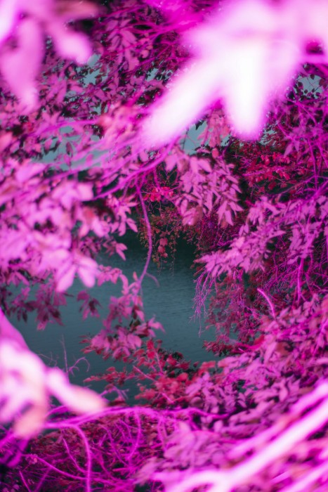
©Kyle Agnew, To Covet The Dunes, Lake Mcbride, Iowa, from Our Cheeks Blush Amidst Prairie Grasses, 2023.
Posts on Lenscratch may not be reproduced without the permission of the Lenscratch staff and the photographer.
Recommended
-
BEYOND THE PHOTOGRAPH: Q&A WITH COMMERCIAL PHOTOGRAPHER ANDY MAHRMarch 22nd, 2026
-
Bryan Whitney: The Spiritual LightMarch 17th, 2026
-
The 2026 Lenscratch Student Prize is OPEN!March 16th, 2026
-
The 2026 LOVE Exhibition, Part 2February 14th, 2026
-
The 2026 LOVE Exhibition, Part 3February 14th, 2026

