Cover the Book: Edition Two, Words and Pictures
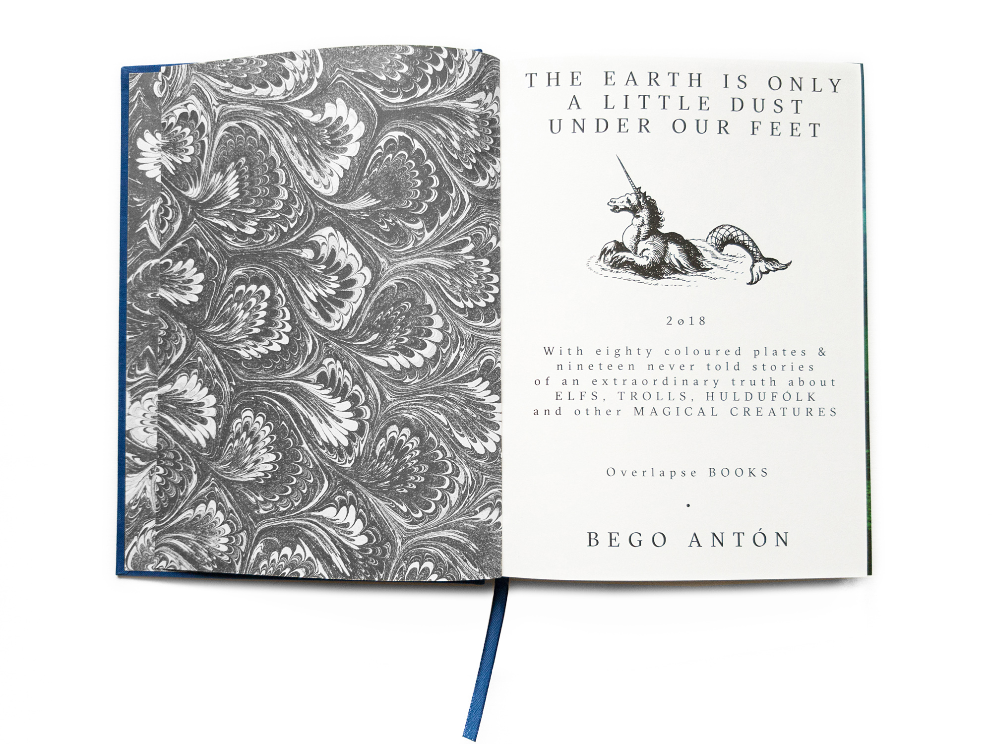
©Bego Antón, courtesy Overlapse, The Earth Is Only a Little Dust Under Our Feet
I have been thinking about words. Words that make someone stay, words that make someone go, words that heal the heart, words that make us feel guilty, words that make us love, words that make us angry, words that explain. In Japan recently, I listened. I cannot speak Japanese, so I listened. I heard an artist talk about a photographer’s work, the oft dreaded artist statement, the elevator pitch, the photographer-loathed way that we explain or apply meaning to our world, to our images. The cadence of Japanese is fast, much faster than in English. There is a brevity at times, yet at others I am surprised at is a lengthiness of the statement where I wonder how many nuanced phrases or words I am losing by not knowing the language and when I know the language, how much would I lose not knowing the person. A TED talk that I watch recently, How Language Shapes the Way We Think, starts with the description of an Australian indigenous culture that spoke only in cardinal directions when orienting themselves and did not use the terms left or right: There is an ant on your southwest foot. This is, as the speaker explains, based in the experience of growing up in this culture which teaches an animal knowledge of orientation that many in the Western world believe to be innate in animals, but lacking in humans. There is an awareness of their place in the world not understood by many more cultures. This is what is taught and demonstrates the power of words to change our minds or views. Words, as with images, are imperfect, but they are one of the only tools we use communicate. Words apply meaning, they speak directly and, yet, do not always state what we want them to mean.
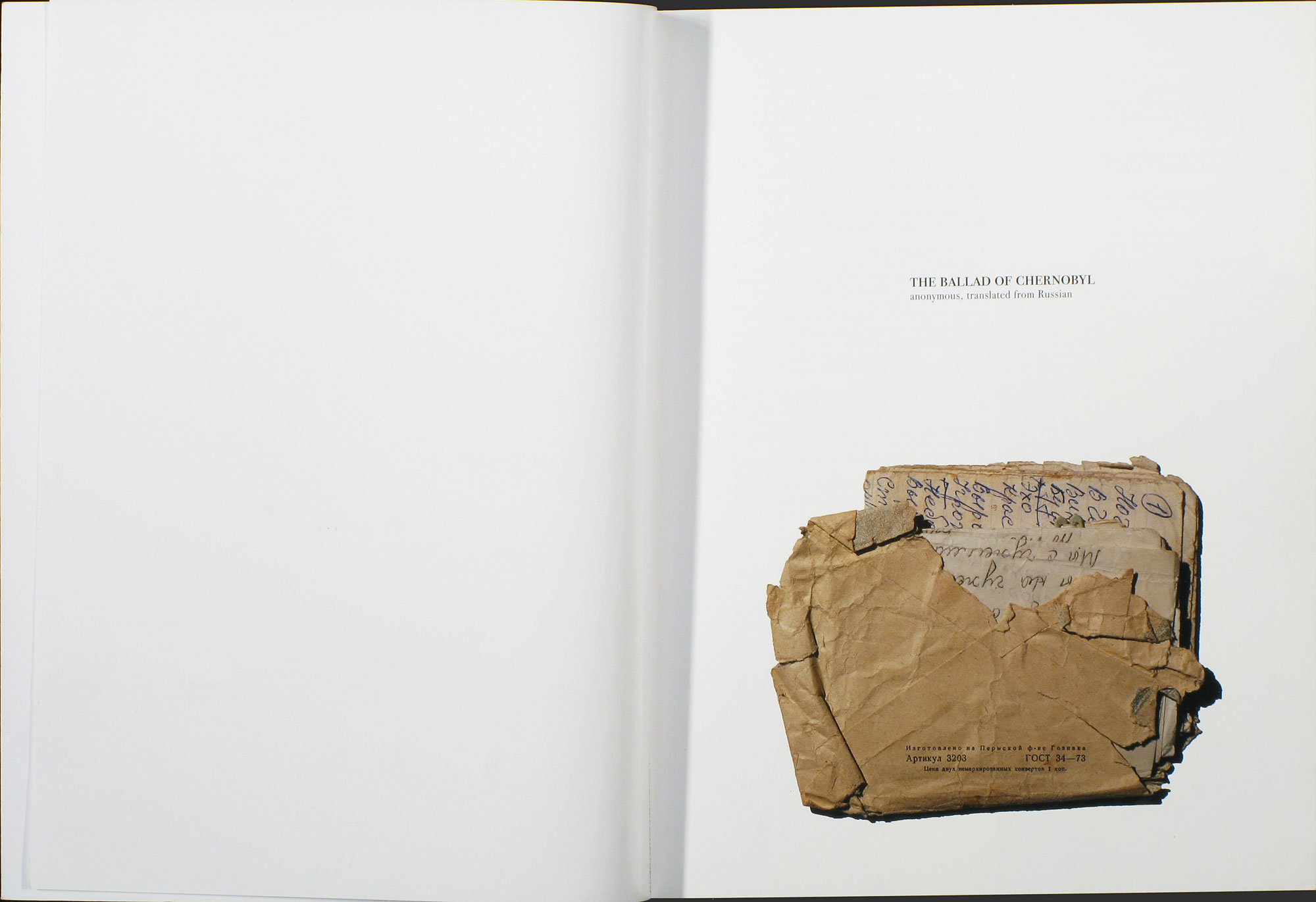
©Jim Krantz, page spread from Homage featuring the found letter, available from photo-eye Books
Now we talk about photography. Just as with words, visuals perpetuate our world. We are bombarded with images. Our minds, or maybe my mind, works in scenes. I feel as if I flow through the world navigating in a stream with the waves passing by my body, my mind, and my eyes. Then, I see it. Whatever it is… I stop, I look, and sometimes I capture in a fixed medium. Thus, the practice of seeing and of photographing. As Shomei Tomatsu says, “The photographer is both a passerby and a dweller… [she] can merely look.” As photographers, if I may take the liberty of calling myself one, we are often so driven by the sense of sight that the cognitive firing is devoid at the time of exposure. I usually don’t think in the left-brain sort of cerebral fashion, I perform and I compose. There is thought, but first there is feeling, perceiving. Photographers for this reason think that the visual image is the language. They often does not have a regard for words – for descriptors, for definitions, for explanations.
I have been asked how important the text is in a book. From a personal preference, I an advocate of text in a photobook, with careful usage and thoughtful application. I have seen some books with no colophon page, no title page, no information at all. Many have text and it is an accompanying essay that speaks about the credibility of the artist as a photographer, her ability to perform said task and how the viewer should take it seriously. The book initially must speak for itself and if the text is a side element then the work must be the mule that carries the text on its back over the arduous mountain journey that is the marketing and sales of photobooks in today’s market and some are not strong enough to make the journey and never sell to completion. The work and the design must hold up the project in most cases, but text can be an incredibly important element.
Another type of text that is often seen is the essay that speaks about the project. For this, I like to use Jim Krantz’s book Homage to speak about how useful text can be in defining a project and its many varied elements. With Homage, a project inspired by a trip to Chernobyl where the artist finds a long-abandoned home after the nuclear reactor meltdown in 1986, and within this home, he finds an old wooden dresser. Inside the dresser is an envelope with folded papers and a love letter to Chernobyl. Krantz reproduces the poem in the book, translated into English, and thus the first piece of text. He then intersperses other pieces of writings including an essay by a man struggling with his own addiction to alcohol, thus highlighting the issues with its abuse in Russian. The other texts include a young American whose father left a Soviet satellite country many years ago for a life in the United States. The writer accompanied his father to visit his grandfather’s grave, and the resulting essay describes this sojourn about disconnection and loss of place as we or our ancestors leave home. The other pieces include a scientific description of the nuclear reactor meltdown, and an afterword from the head of the nonprofit that focuses on nuclear non-proliferation and whose organization receives the proceeds from the book. Homage is a perfect vehicle for Krantz’s emotional images of a place once beloved by many, and now occupied by few who struggle with the daily life after the environmental disaster. The text is appropriate and message-driven without being heavy-handed.
As with last week’s feature in Lenscratch, you can see how Matt Shallenberger uses an epic Hawaiian poem as the basis for the project/book The Leaping Place and how Lara Shipley and Antone Dolezal use Ozark folklore as the starting point for a project based in their home region. All three photographers have a direct connection to the locations of their books. These places are the places where they grew up and the projects are aesthetically attractive, but based in the personal and the familiar. Yet, each artist expands the projects by including text that pulls in the viewer. Humans love stories.
There are many examples that I have illustrated in this essay so far, and for this feature, I want to focus on three more of my favorite books that successfully blend the words and images to form the book object.
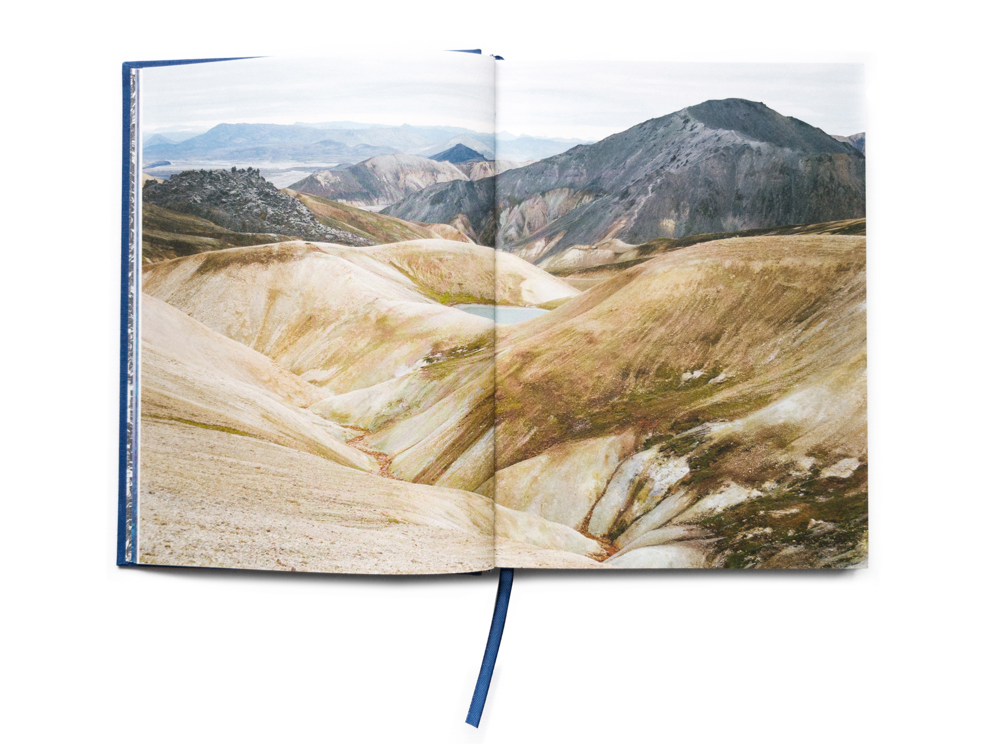
©Bego Antón, courtesy Overlapse, The Earth Is Only a Little Dust Under Our Feet
The Earth is Only a Little Dust Under Our Feet, Bego Antón
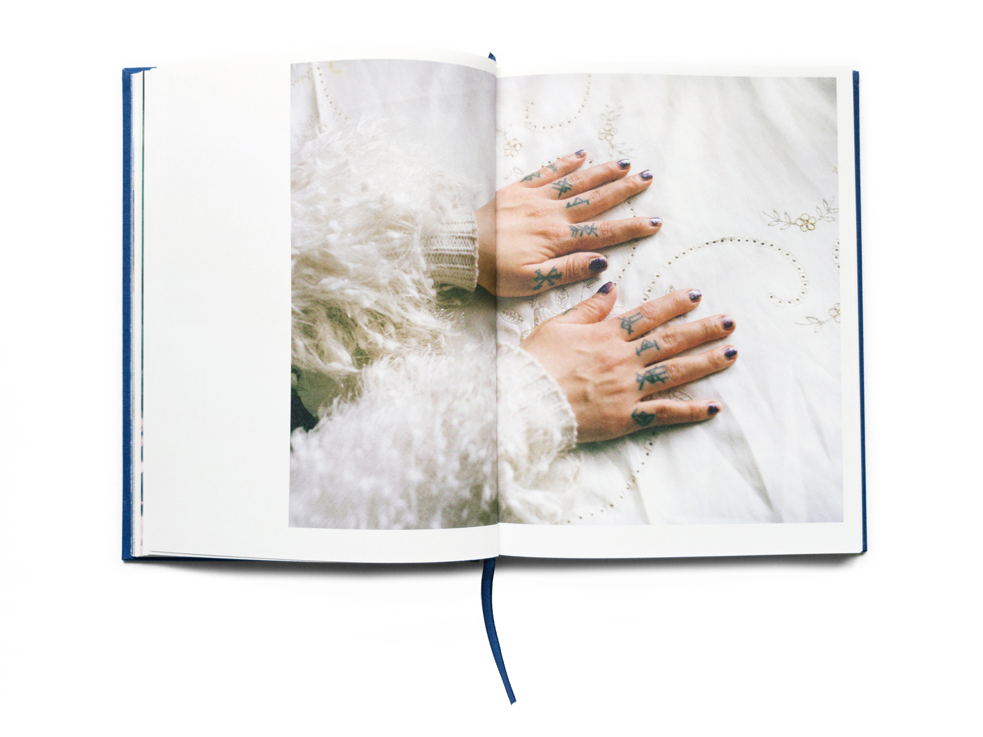
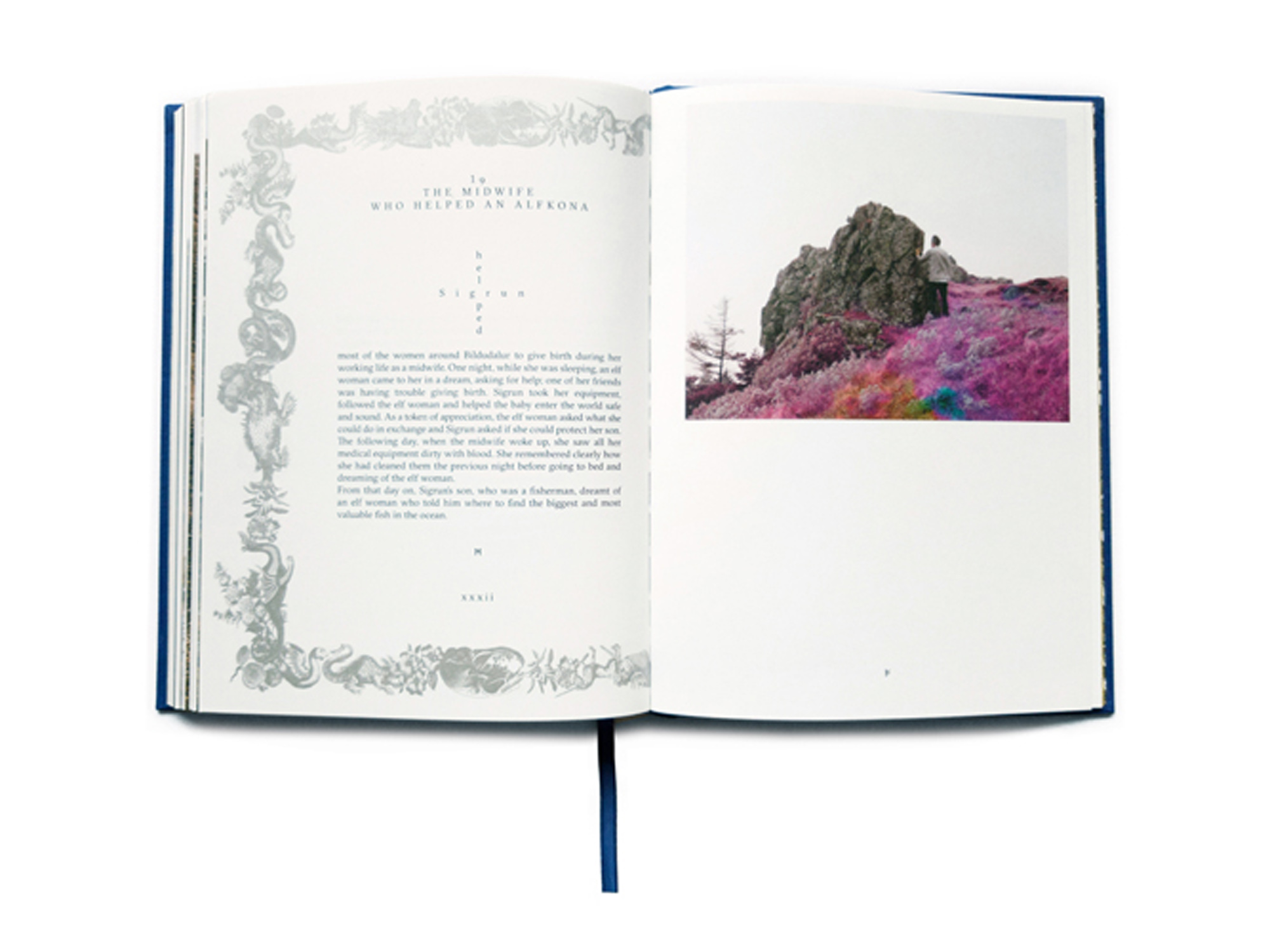
The Earth is Only a Little Dust Under Our Feet is a new book by the UK-based publisher Overlapse. The publisher’s focus on books is heavily based in the integration of text and images, and concept and design. The Earth is Only a Little Dust Under Our Feet contains Bego Antón’s photographs from Iceland. Antón took a class at The Elf School in Reykjavik that educated her about all the “fairies, unicorns huldufólk, trolls, beach dwarfs, water sprites, mountain spirits and ghosts” that inhabit the island and the brief, anecdotal tales that permeate all islander’s lives. Icelanders do not jump on rocks for fear of disturbing creatures. Some are in touch with the dead.
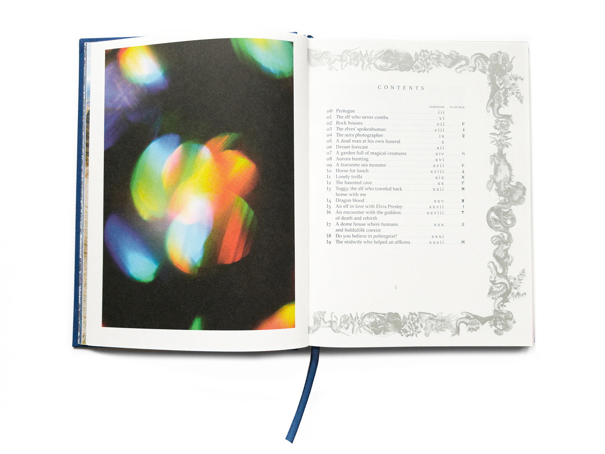
©Bego Antón, courtesy Overlapse, The Earth Is Only a Little Dust Under Our Feet
©Bego Antón, courtesy Overlapse, The Earth Only a Little Dust Under Our Feet
©Bego Antón, courtesy Overlapse, The Earth Only a Little Dust Under Our Feet
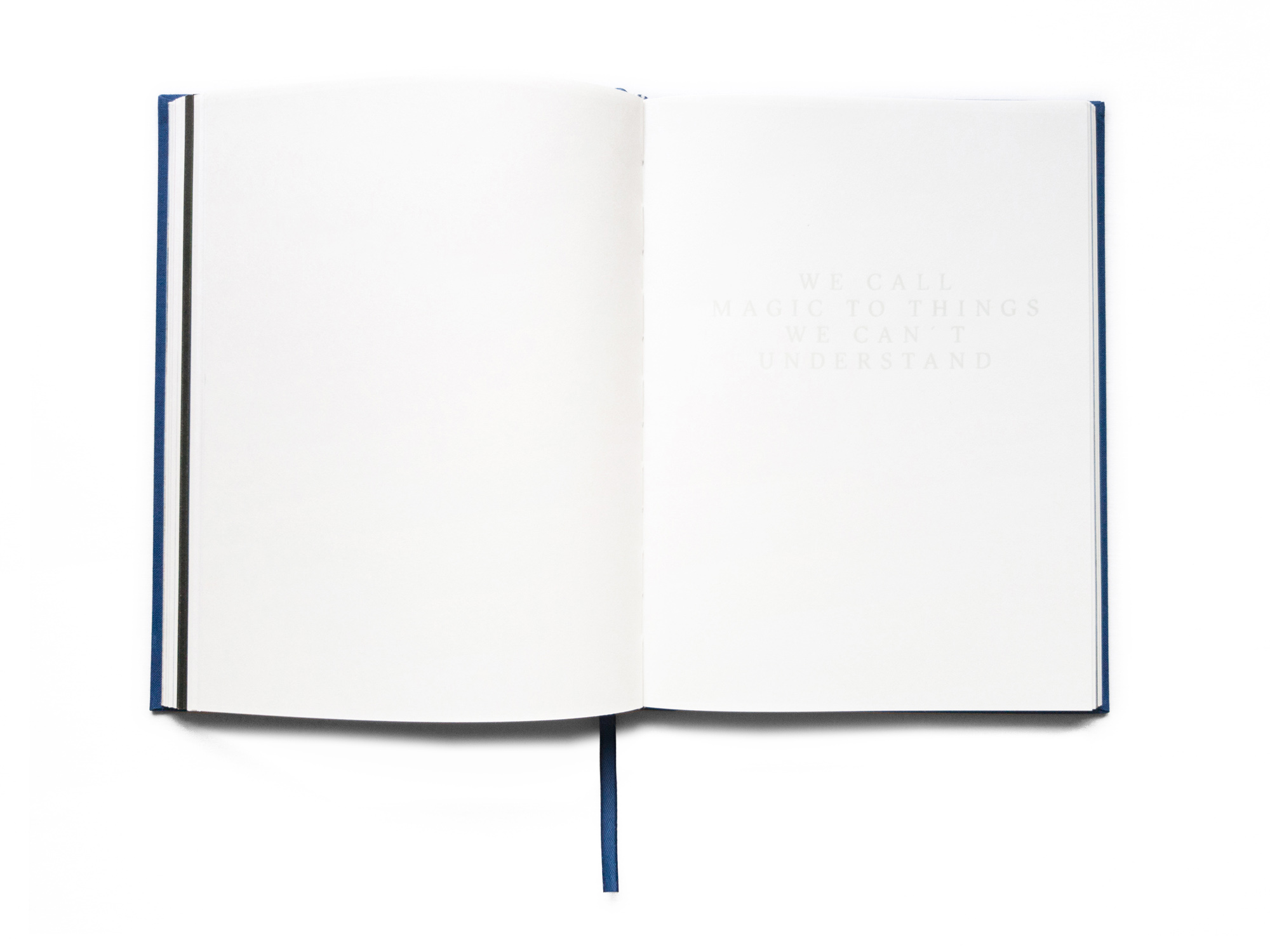
As an extension of her exploration of the otherworldly, Antón sought the guidance of a fortune teller. She received a prediction that she would have a book two-fingers thick containing her tales of Iceland. This photobook, as the prediction notes, shares her many varied narratives from the Iceland with graphic elements of mythical creatures, large serif font and a layout of the letters that introduce each chapter set to model after symbolic elements. Seemingly blank pages, when tilted a little to the side or grazed with a finger, reveal statements with stippled, varnished text that relates to the project: “We do not see things at they are. We see things as we are.” The dimensions perfectly relate to a book of fairy tales or fables, and it is wrapped in deep blue cloth with a foil-stamp on the cover showing with a flower-adorned unicorn. This is a book where I question whether the text illustrates the images or the images the text or if this is a perfect symbiotic relationship where one could not live for long without the other.
©Bego Antón, courtesy Overlapse, The Earth Only a Little Dust Under Our Feet
©Barbara Bosworth, The Meadow, courtesy Radius Books
The Meadow, Barbara Boshworth and Margot Anne Kelley
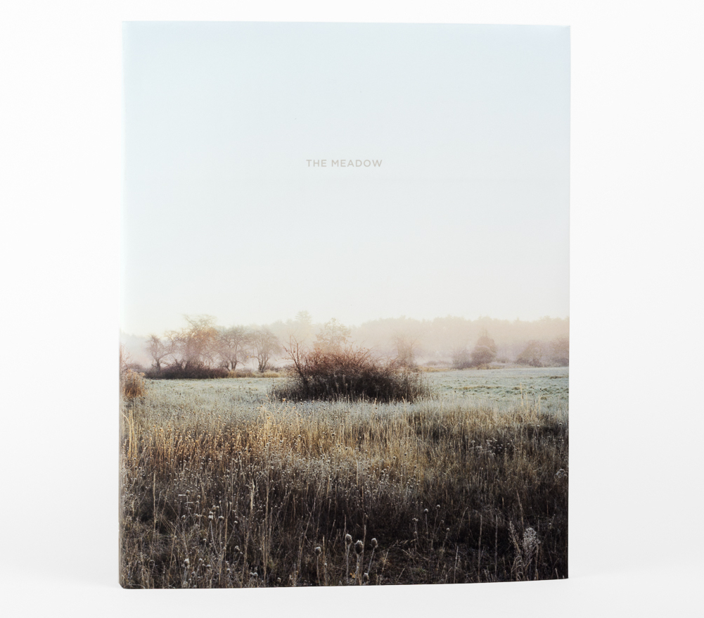
Barbara Bosworth and writer Margot Anne Kelley worked for years on The Greenough Property near Carlisle, Massachusetts. The product of this massive and multi-year data and image collection is a 200-page, 60-image book, The Meadow, published by Radius Books and contains Bosworth’s images and Kelley’s poetry and other texts. The artists took notes on ants, birds, forgeable foods, lichens, mushrooms, and pebbles that now reflect titles in appendix and the text pages featuring Kelley’s writings are interspersed and printed on delicate, creamy white inserts, lightly shorter than the illustrated pages with Bosworth’s photographs.
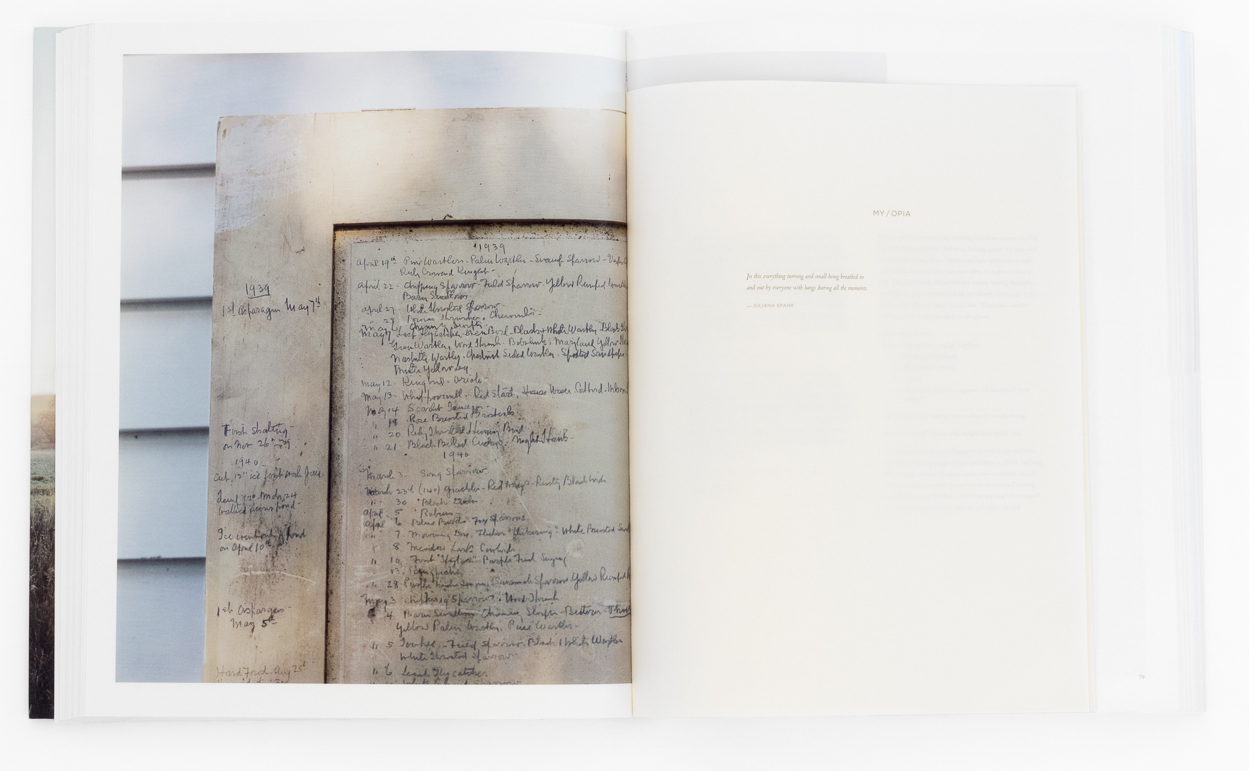
©Barbara Bosworth, The Meadow, courtesy Radius Books
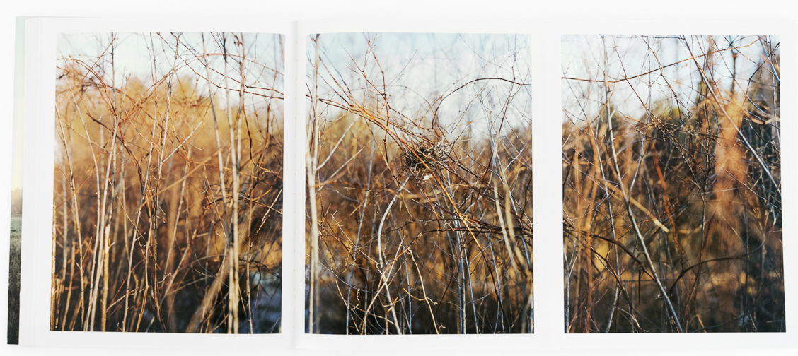
©Barbara Bosworth, The Meadow, courtesy Radius Books
The book also includes a 1794 survey with a 2014 Google Map overlay and a book of erasure poems by Kelley inserted into a slit in the back dust-jacket. This is a book about process. It lives in the world of photography books, yet, uses the texts to cross boundaries and not limit the book to one niche. It is now out of print and the limited print run, quality of reproductions and design are two reasons for its unavailability. Its existence beyond the art world, verging on nature journal, expand its appeal.
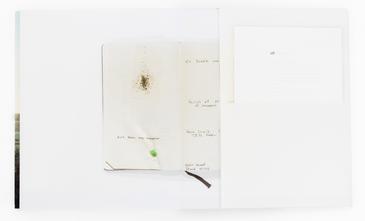
©Barbara Bosworth, The Meadow, courtesy Radius Books
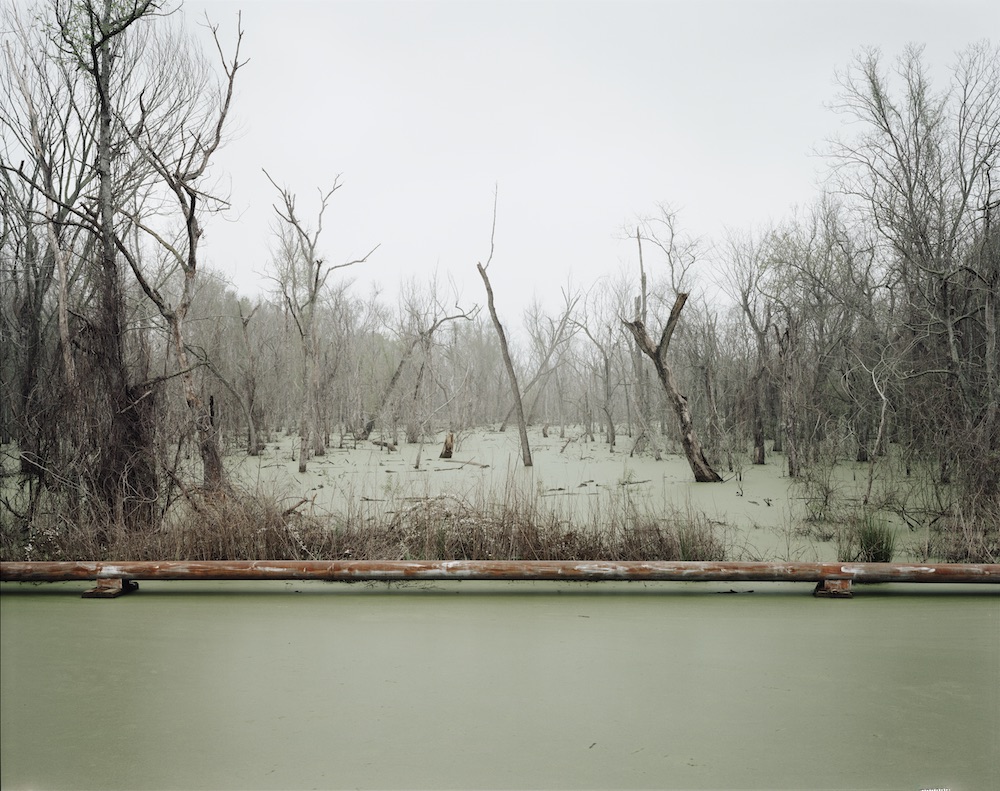
©Richard Misrach, Petrochemical America, courtesy Aperture
I tend to champion books over-and-over when there are strengths. Petrochemical America is no exception. This book, published by Aperture in 2012 in an oversized hardbound edition and, again later in paper, is one of the most important photobooks of contemporary times. It is a resource in the guise of an art book. Many in the photography community are very familiar with Richard Misrach’s extensive and diverse bodies of work and he has demonstrated that he is not afraid to venture into political or environmental activism. His co-contributor for Petrochemical America is landscape architect Kate Orff.
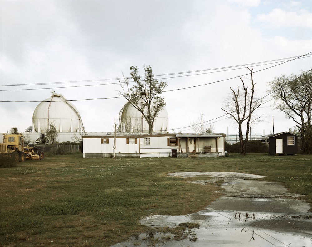
©Richard Misrach, Petrochemical America, courtesy Aperture
Orff’s section (three images below) is eloquent, non-proselytizing, showing how we utilize petrochemical products in our life and its effects of use or discontinued use has had or will have on social, economic, and environmental issues. Her team’s graphics show salt domes that house ethylene; the compressed gas used to manufacture plastics, petroleum, oil, and gas; Louisiana’s coastal wetlands that Orff notes are disappearing at the rate of a football field every thirty-eight minutes; many of the products that reside within the contemporary home; an index of common petrochemicals and the contributors’ use of these products in the research of the project—a wealth of information in over 90 full-color pages of text and illustrations. The book finishes with a helpful booklet titled Glossary of Terms & Solutions for a Post-Petrochemical Culture.
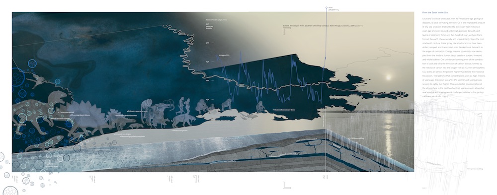
©Richard Misrach and Kate Orff, Petrochemical America, courtesy Aperture
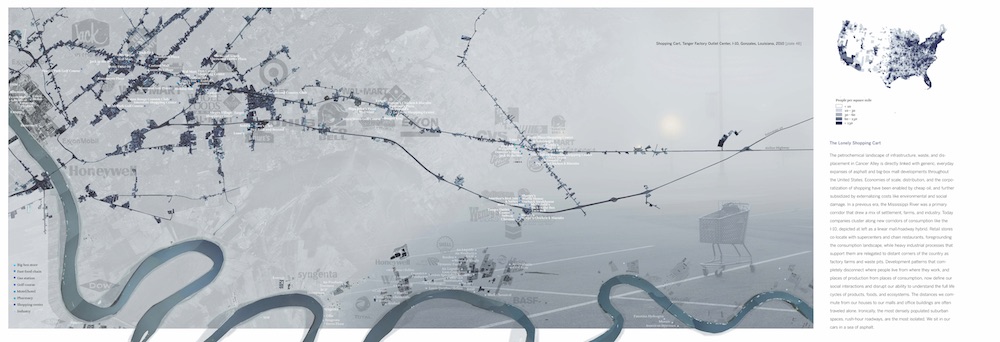
©Richard Misrach and Kate Orff, Petrochemical America, courtesy Aperture
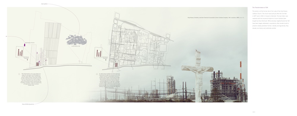
©Richard Misrach and Kate Orff, Petrochemical America, courtesy Aperture
With these examples in mind, I will finish with a few words of note and suggestions for the uses and purposes of text:
- Captions and titles have a place on occasion, but useless, extraneous titles do not. Save the title for a plate listing in the back of the book them.
- Page numbers are text: They are a good reference, but use with caution and most often a light-colored font as they can be distracting.
- Text can be a design element, and an ornament and still serve a larger purpose of informing about the project or book.
- Don’t fear your own words, but keep in mind that you may not be contributing to your photographs with a personal essay.
- Look for notoriety, but also expertise. I would argue that rarely does an art book sell because of the name of the writer(s), but the depth of a book can be expanded with an essay by a writer in a related field.
- Text should inform and compliment the work, otherwise, consider leaving out the words or opt for brevity.
Melanie McWhorter has been consulting with photographers for almost two decades. After moving to New Mexico in 1997, she managed the internationally recognized photo-eye Bookstore + Project Space until 2016. Learn more or contact her at melaniemcwhorter.com.
Posts on Lenscratch may not be reproduced without the permission of the Lenscratch staff and the photographer.
Recommended
-
Richard Koenig: Field Notes: View from a Hotel WindowFebruary 13th, 2026
-
Beyond the Photograph: Editioning Photographic WorkJanuary 24th, 2026
-
The Next Generation and the Future of PhotographyDecember 31st, 2025
-
Spotlight on the Photographic Arts Council Los AngelesNovember 23rd, 2025
-
100 Years of the Photobooth: Celebrating Vintage Analog PhotoboothsNovember 12th, 2025

