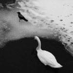
Frank Hamrick: Harder than writing a good haiku
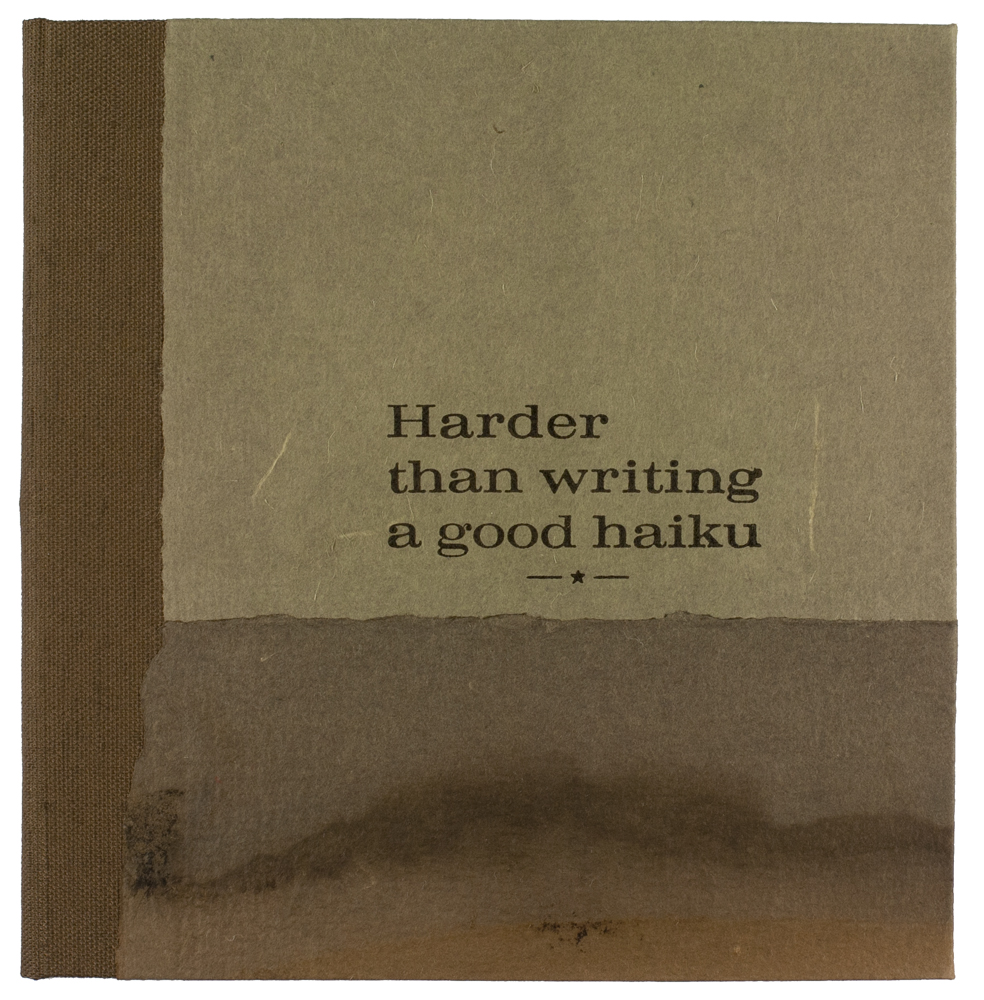
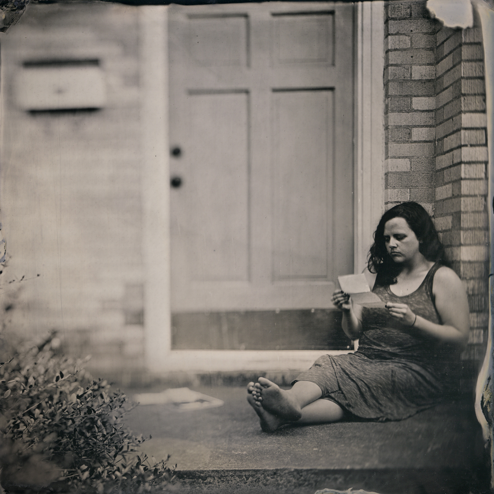
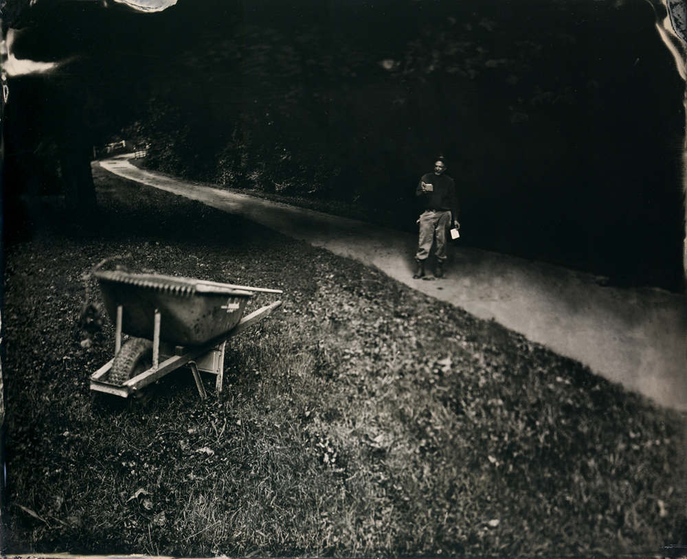
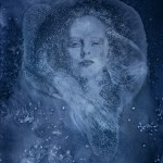
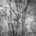
Attending PhotoNOLA is always a treat, and as a reviewer, the range of work brought to the reviews continues to be inspiring and exciting. I met with photographic artist, book maker, and 2017 HCP Fellowship Recipient, Frank Hamrick, and spent some time going through his wonderful offerings. Frank came with a stack of artist’s book, his latest, Harder than writing a good haiku, a beautifully bound collection of open ended tintypes, that elevate the ordinary — small moments that are unrehearsed and open to interpretation. Frank will have an exhibition of this work at the Houston Center of Photography from May 12-July 2, 2017. With an opening reception on Friday, May 12 5:30-8:00pm and an Artist at 6:00pm.
Frank Hamrick is an associate professor of photography and book arts at Louisiana Tech University. Frank received his BFA from The University of Georgia and his MFA from New Mexico State University. NPR has written about Frank’s handmade books and Oxford American Magazine listed Frank as one of the 100 Superstars of Southern Art. His work is housed in collections including the Amon Carter Museum of American Art, The Art Institute of Chicago and The Ogden Museum of Southern Art. Frank was recently selected for the Houston Center for Photography’s 2017 Fellowship for his limited edition artists’ book of tintype images “Harder than writing a good haiku”.
Harder than Writing a Good Haiku
For the steadfast hills
of Whites Creek, Tennessee and
the fight to save them
The phrase “Harder than writing a good haiku” was an analogy I spoke of while guiding my senior photography students as they struggled to edit their BFA portfolios to a slim number of prints that would fit into their allotted wall space while at the same time still conveying their original concepts.
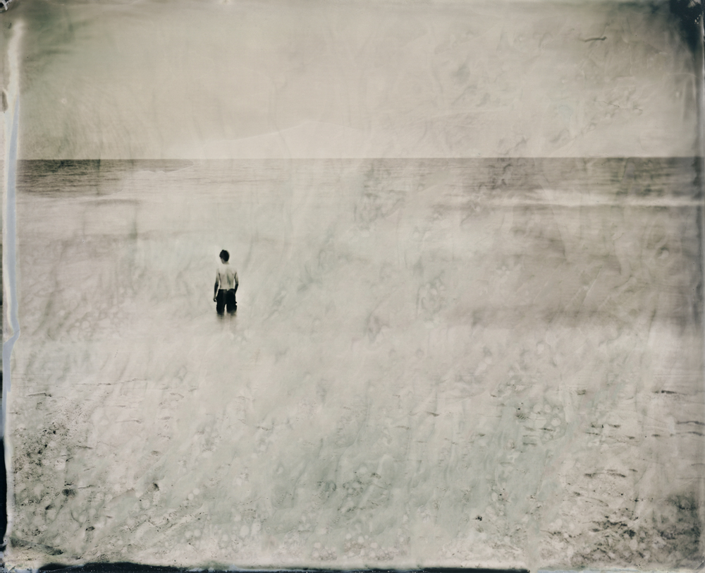
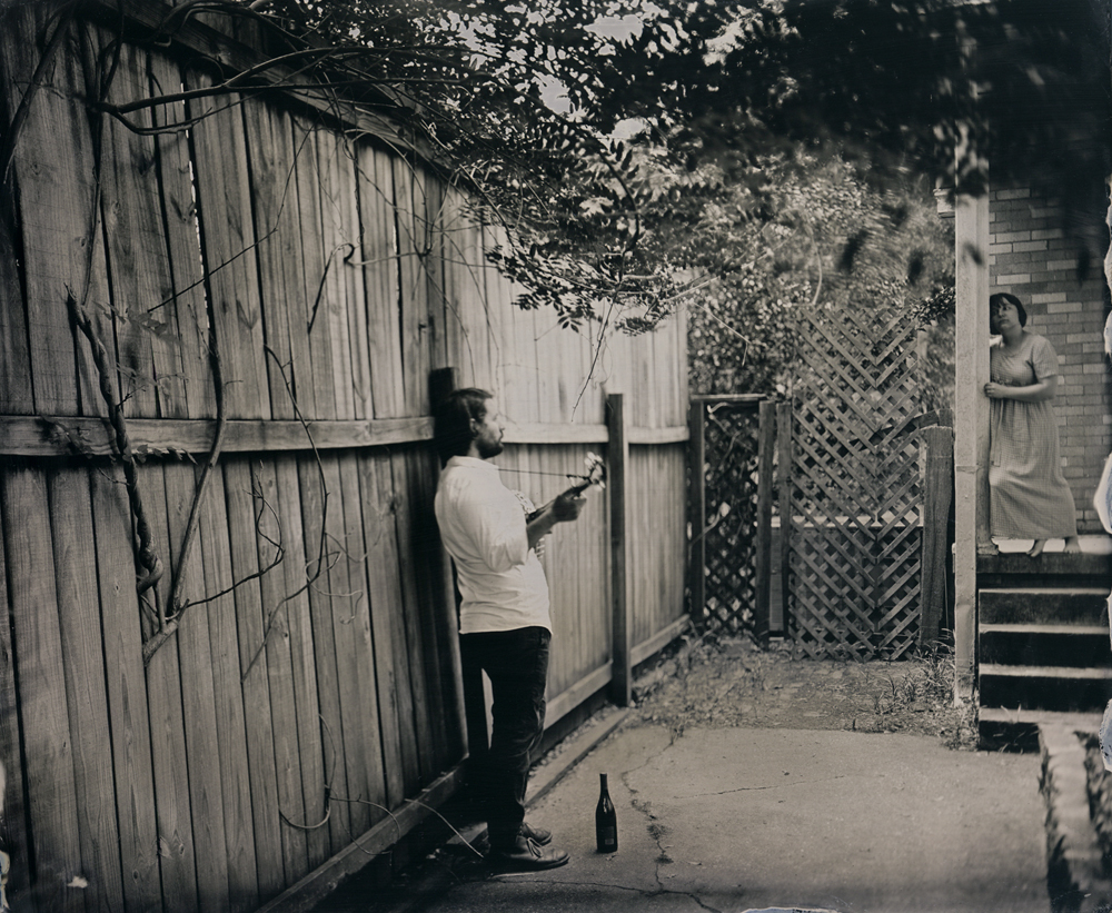
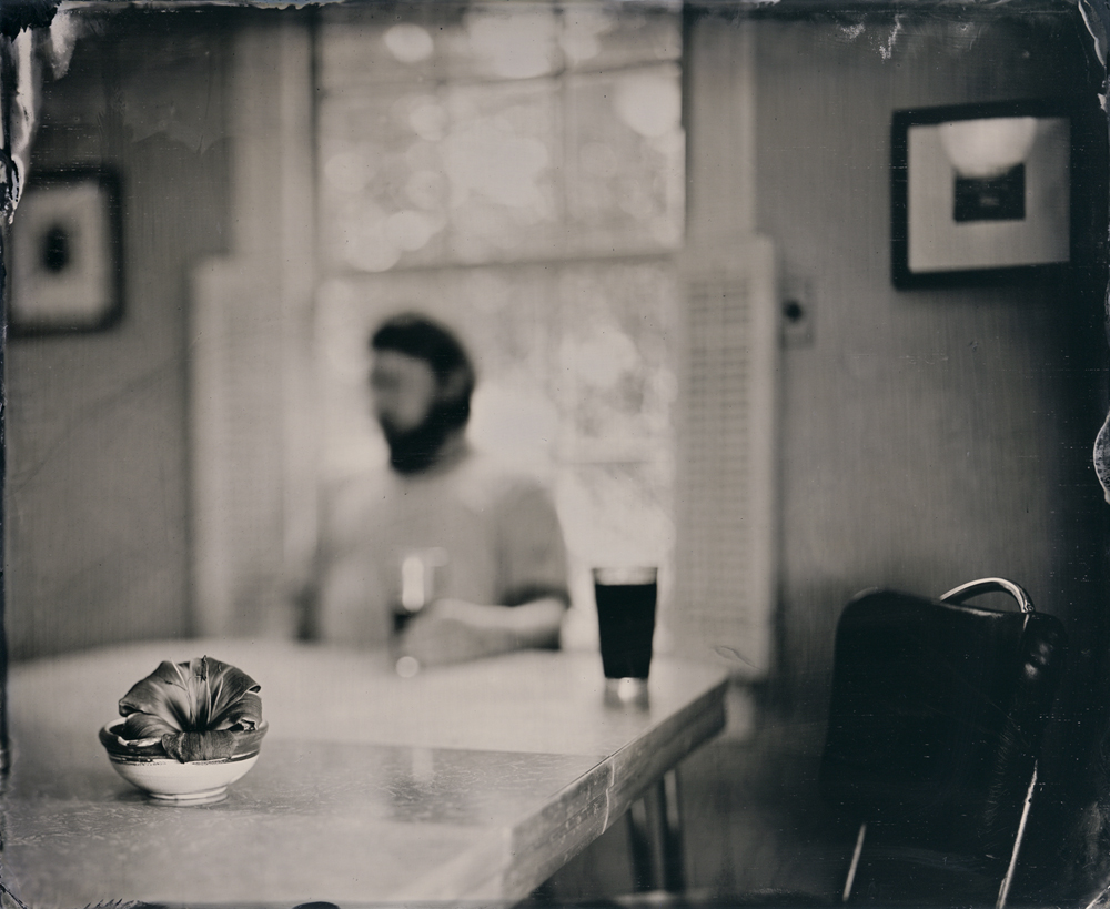
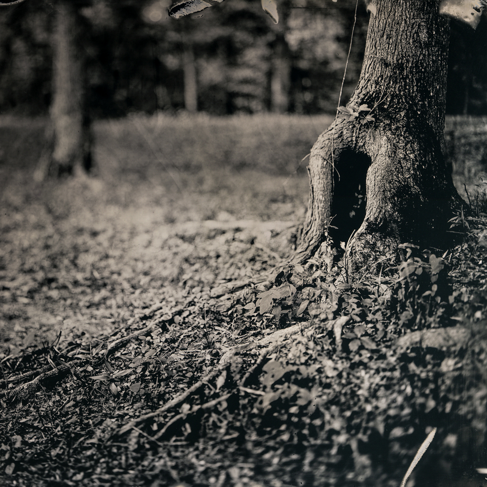
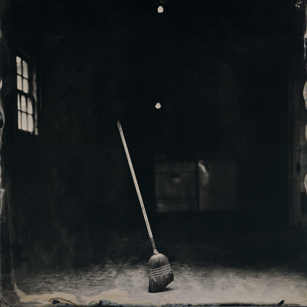
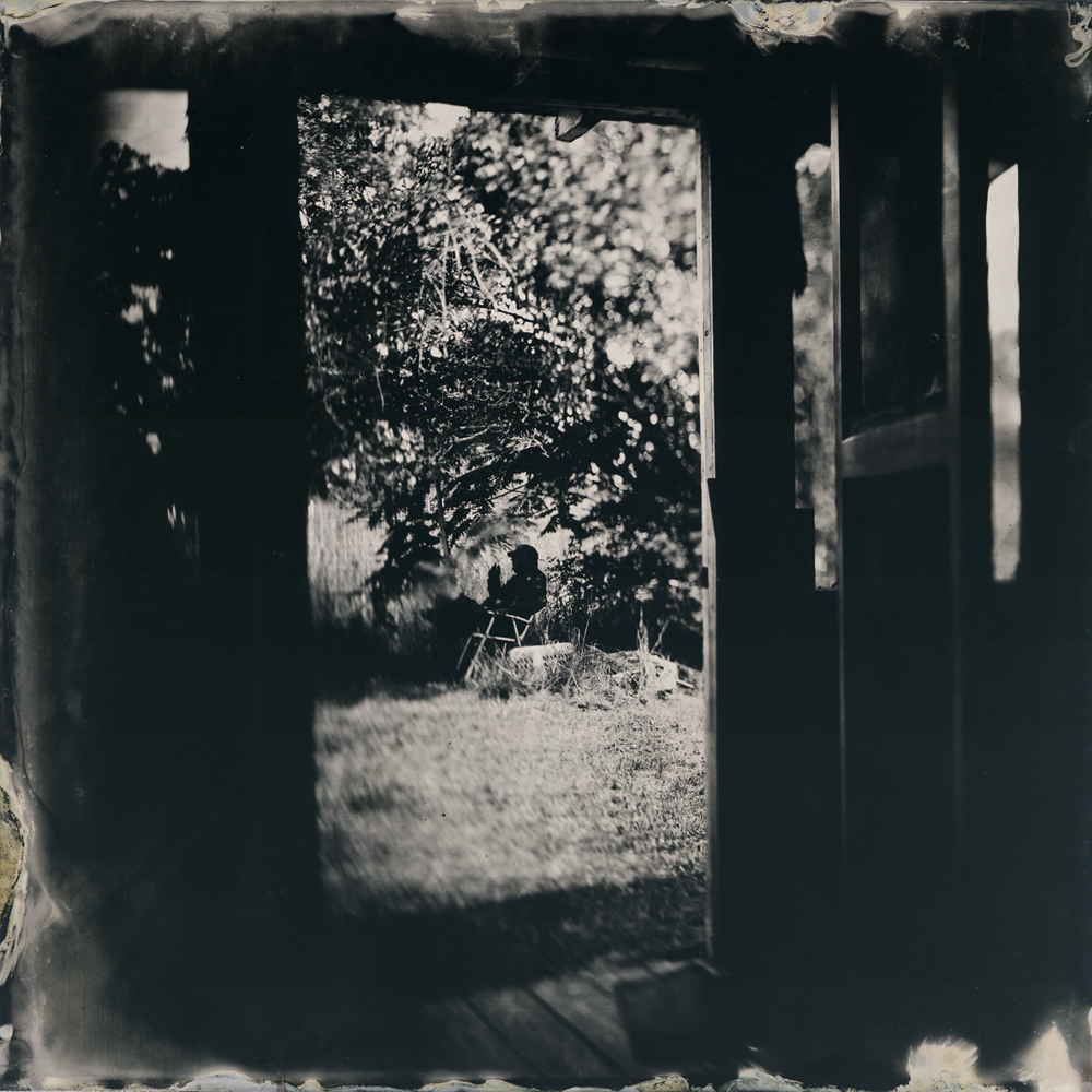
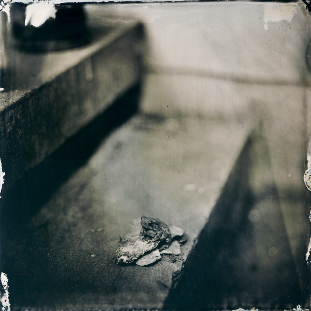
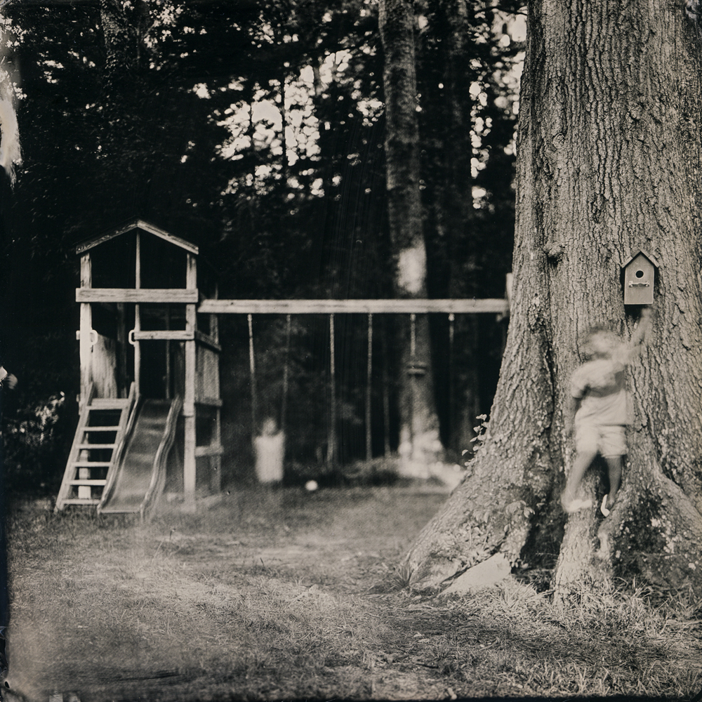
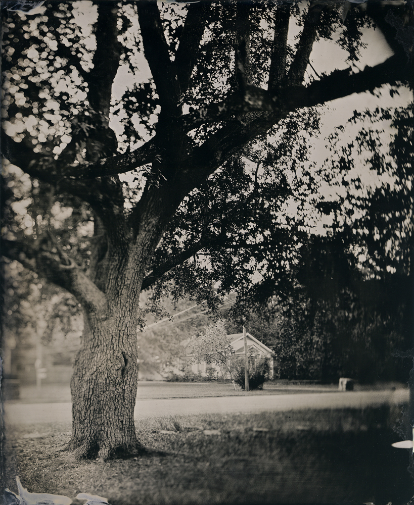
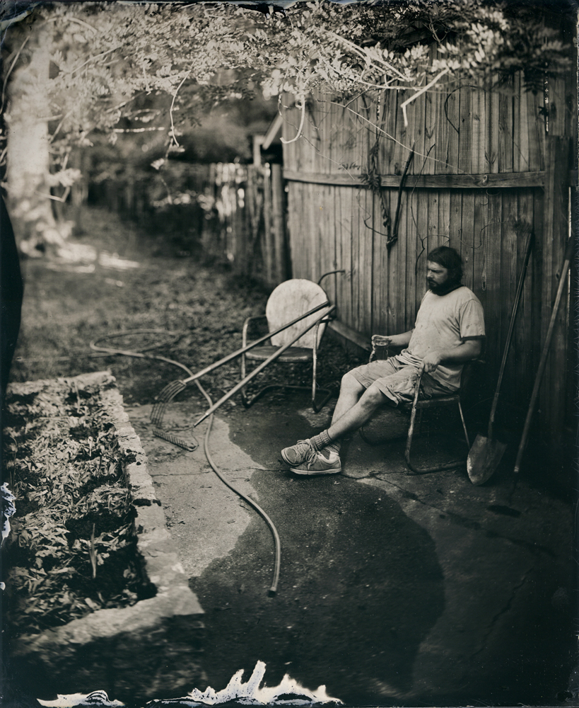
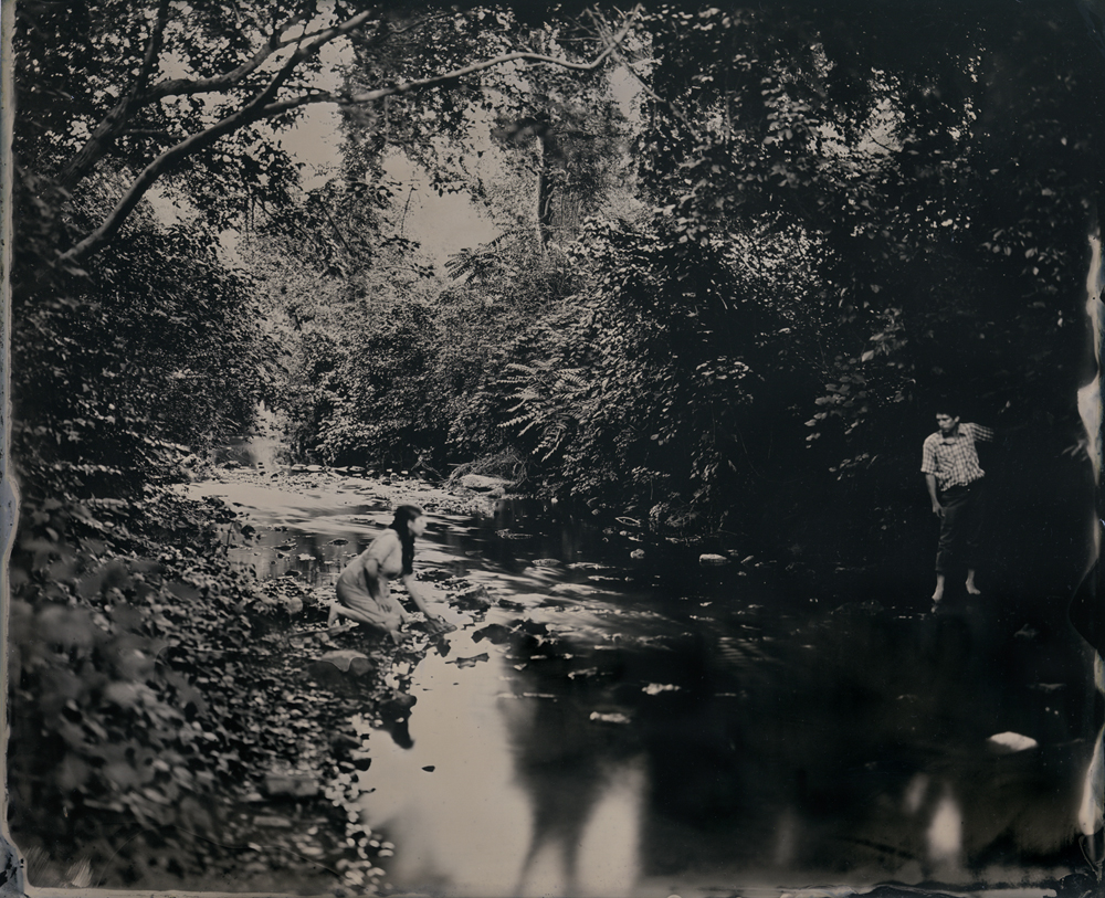
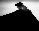
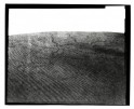
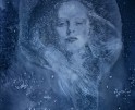
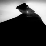
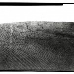
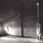
“Harder than writing a good haiku” is a limited edition artists’ book featuring inkjet reproductions of seventeen tintypes created during the summer of 2016. The hills around Whites Creek, Tennessee inspired the tea stained landscapes appearing on the book’s cover, which is wrapped in handmade paper with the title letterpress printed on the front along with my Old Fan Press logo on the back. The color scheme is limited to shades of brown to remain in step with the tonal range of tintypes.
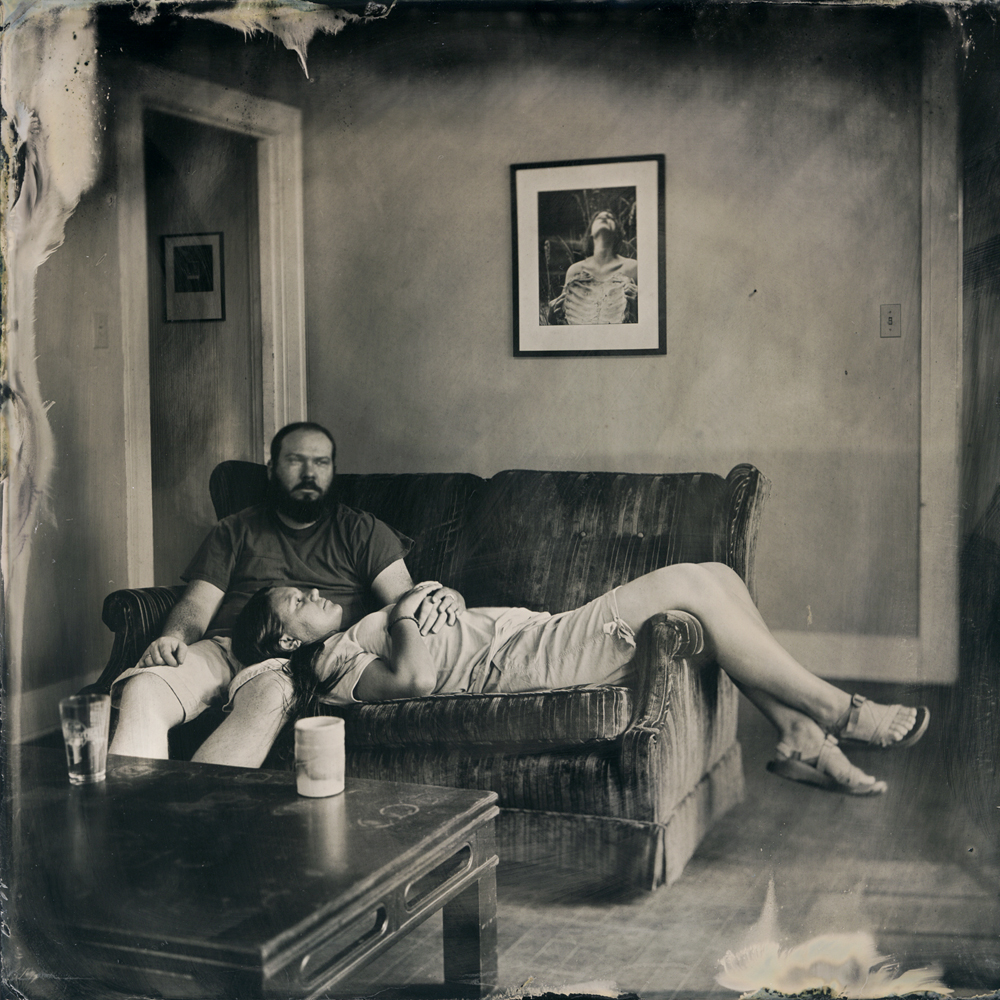
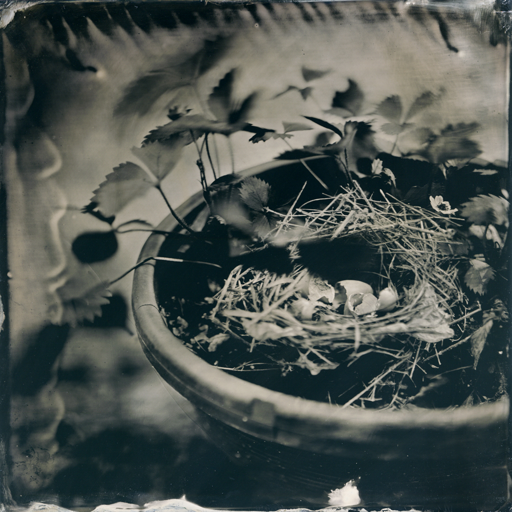
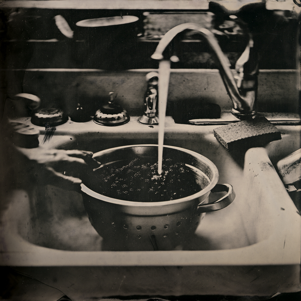
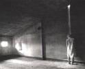
These photographs, created as 8×10” and 8×8” tintypes, were conceived as select moments from stories where the hint of a narrative open to the viewers’ interpretation is more important than the specifics of the characters’ identities or where they are located. The scenes depicted are designed to engage whether they are totally familiar or curiously exotic, depending on each viewer’s background.
The pieces I make have particular meaning to me, but I understand other people will see them in their own way. My photographs are not necessarily created to illustrate or provide answers. If anything, I would prefer for the images to generate more questions. I do not see them as endpoints, but rather starting places where I give the viewer ideas to ponder and allow room for their imagination to create the rest of the story.
Posts on Lenscratch may not be reproduced without the permission of the Lenscratch staff and the photographer.
Recommended
-
Jonathan Silbert: InsightsFebruary 19th, 2026
-
Olga Fried: Intangible EncountersFebruary 18th, 2026
-
Anne McDonald: Self-PortraitsFebruary 17th, 2026
-
Review Santa Fe: Elizabeth Z. Pineda: Sin Nombre en Esta Tierra SagradaFebruary 6th, 2026
-
Carolina Baldomá: An Elemental PracticeJanuary 5th, 2026

