South Korea Week: Kdk: Space and Dimension
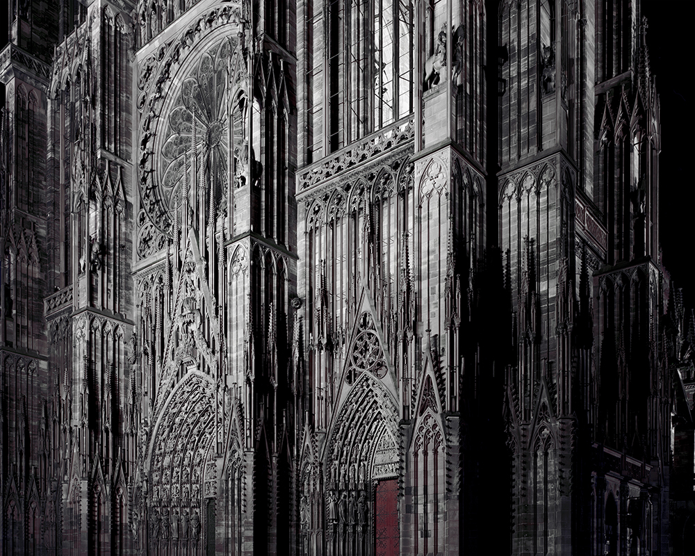
This particular interview hits a very special chord with me as I’ve been a longtime admirer of photography. On the day of the interview, it was pouring rain. and I remember being filled with excitement and nervousness. Kdk’s studio is in a renovated industrial factory in the narrow streets of Seongsu-dong, which is located in the outskirts of Seoul. Seongsu-dong is historically known for automobile and hardware industries. In just a simple glance, I was able to spot the entrance to his studio. On the front of the door, he had an iron signboard that wrote ‘ㅋㅋㄹㅋㄷㅋ kkr+kdk.’ (Note: ㅋㅋㄹㅋㄷㅋ are Korean letters that spell out kkr kdk.) The lettering on the signboard use both English and Korean to creatively spell out the initials of two artists’, Dokyun Kim, and Kim Gyeongran, an architect and kdk’s older sister who shares the studio with him.The inside of the studio encompasses 2 stories with a very considered layout. All the walls are completely filled up with tools, paper drawings, and photos of the artists’ work. However, his work isn’t only displayed on the walls; they can be found on various furniture items. His photograph that captured Cologne Cathedral from the very front of the building is used as a long table and his work of containers is used as a stool. Both the long table and stool were also manufactured by Kdk. His work pervades the 2D space of a wall and is applied to the multi-dimensional materials and spaces of our lives.
His studio is a window into the artist’s unique creativity; it is a space that is customized to the artist’s taste. He has a high-tech computer monitor and other tech accessories on the long table that runs along one of his walls. There you can also find 3 of his interns, hard at work. In the middle of the studio, one will find a 3D printer — an item that personally caught my eyes. In other words, his studio space feels complete yet comfortable, and embodies a warm and welcoming feeling. Just by being in his studio, I was able to capture and feel kdk’s gentle and sincere, creative and hardworking spirit that he brought to the world of art.
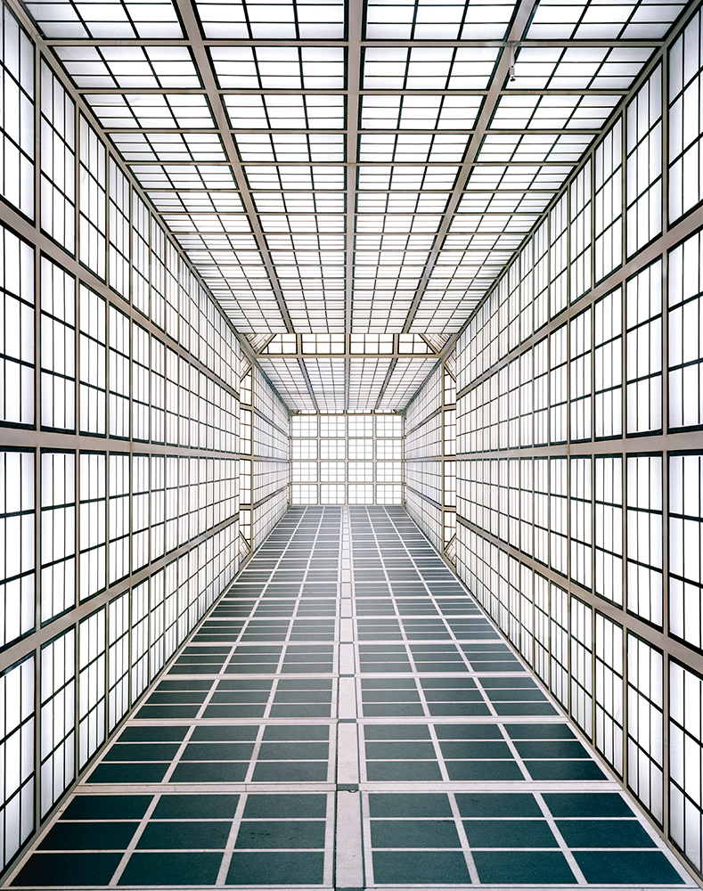
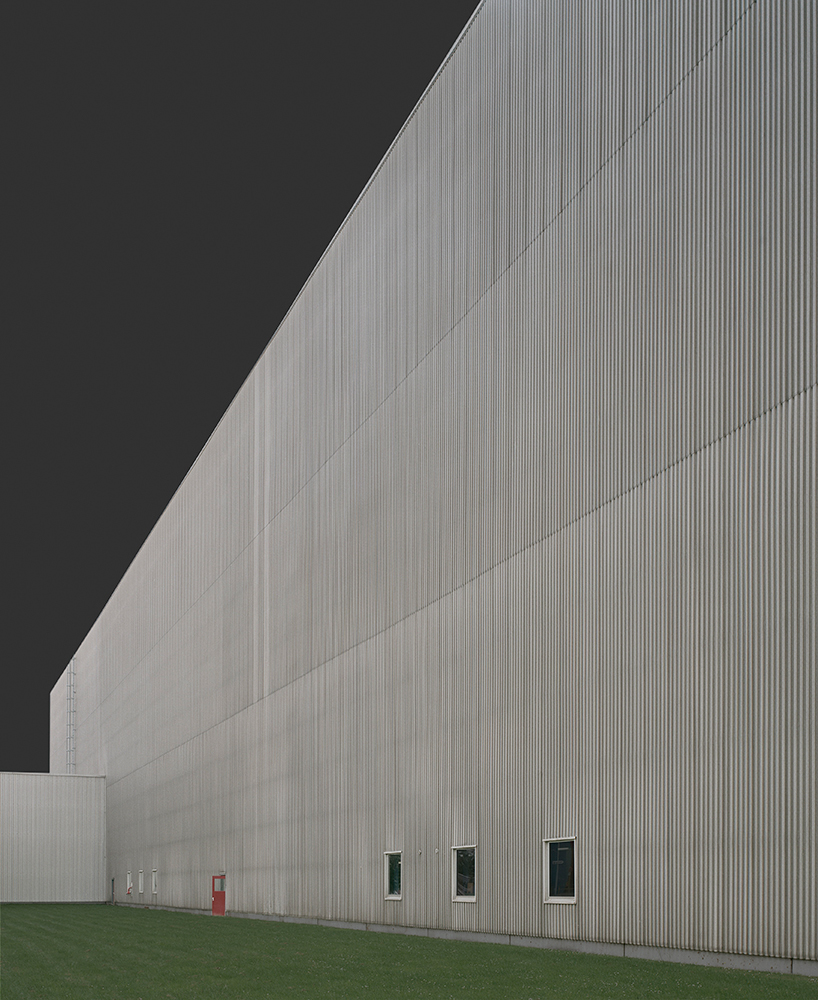
Kdk, a prominent Korean photographer, is also an alumni of Germany’s Düsseldorf Academy. His primary work consists of capturing the different angles of buildings (the interior and exterior) as well as discovering the unlikely and unreal spaces of everyday life. The objects in his photos are perfectly aligned and simplified to basic shapes. All of the artist’s photography series is titled in initials and numbers. As an artist who developed their career in Korea, he believes his major artistic inspiration stems from a blend of his personal sense of aesthetics and his experiences from abroad.
For Kdk, he discovered his artistic identity through the realization that his specialty lied in his ability to showcase his Eastern cultural perspective and that there was something more to himself than just the influence of the Western arts. Kdk’s work is precise and rigid on the surface, but the layer underneath what lies on the surface is soft and comforting. Despite the fact that his works are reminiscent of German formal beauty and general typological photographs, Kdk’s photography series are published with the aim of crafting his own unique genre. Further, Kdk shows an incredible understanding of the medium that is photography and is able to uncover new perspectives using the conventional characteristics of photography.
The keywords for Kdk’s work are space and dimension. Through his own visual moderation, he is able to find and emphasize the basics of beauty in a variety spaces. He is able to find spaces in everyday places that would generally be hard to capture and is able to excellence in visual art. This is where he is able to show unrealistic, imaginary spaces through the shots of real-life sights.
Kdk’s photography, at its core, is rooted in structured and focused composition. He uses distinct photographic characteristics to draw the line between a dot and a line, as well as between two or more lines. His photography also takes from Donald Judd’s (1928-1944) minimalist sculptural work. Kdk’s photos are rid of any visual noise and clutter; they are simple and refined to the finest details of the physical properties themselves. He stacks or progressively arranges shapes, forms, spaces and color into to depict the depth of a space. Ultimately, he is able to expand a two dimensional plane into a three dimensional field through his work.
Most of his series can be divided into two categories: interior and exterior. <w>, <b>, <ktat> are depictions of the interior, whereas <ios>, <f>, <a>, <sf>, <lu> are shots of the exterior. Additionally, his work can be distinguished through time. His earlier works consist of the exterior series and his more recent ones are focused on the interior.
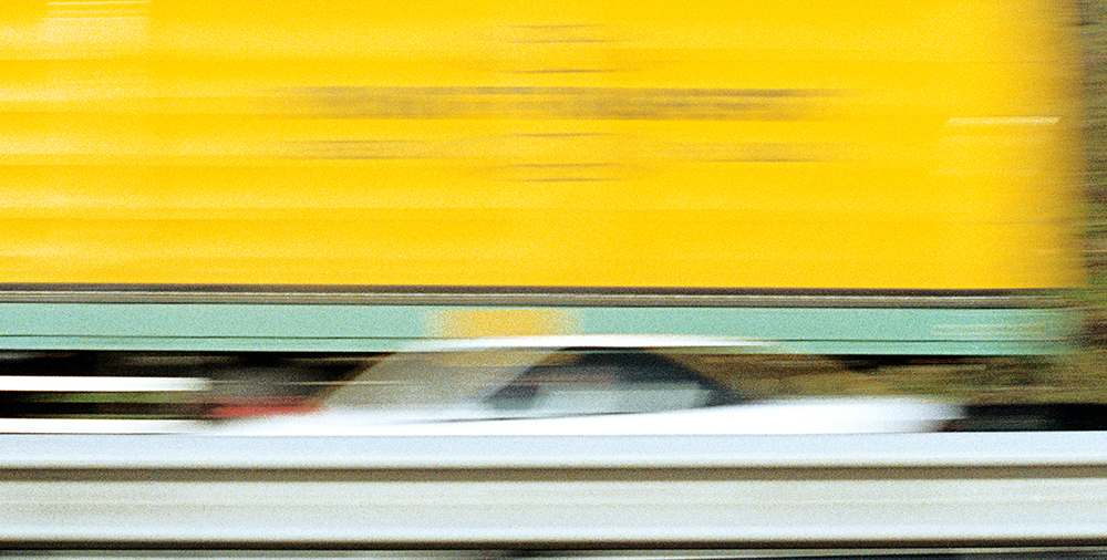
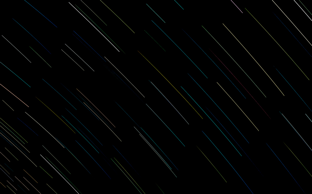
Kdk’s work inherently embodies different dimensions of space. It transcends the concept of time. This concept he illustrates of time changes can be seen in his <ios> series as he adopted this perspective during his early days from studying abroad in Germany. More specifically, this inspiration came to him when he was filming a racing German car on the autobahn inside a large truck. Capturing the automobile in fast motion meant that the shape disappeared but the color survived and this form of image simplification leads to an abstract form. In essence, Kdk’s work is like a tree trunk where his series are all intricately connected yet separated through different branches. Each series as a branch forms a whole tree, and it is evident that his work continues to grow taller and wider.
Known for his ongoing study of spaces, kdk(Kim Dokyun) explores an emotional, social and psychological encounter with the space beyond the visual and physical realm. He names his work with single English letters and these code like titles can have multiple meanings which can be open to extensive interpretations.
Like the titles of his series, his work shows an aesthetically minimalist approach to the forms and details of interior and exterior of spaces. Although there is no human presented throughout his work, the subjects have been man made structures or spaces where we can detect human presence even in an unconventional way. Since 2011, his interest in space has extended to the space of social network and new technology with his work instagram@kdkdk, a project based on his visual diary kept from March26, 2011 and 3dw, a series based on 3d printing works where dimensional space in his photographs are restored to 3 dimensional space.
Born in 1973, kdk(Kim Dokyun) studied photography at Seoul Institute of the Arts in Korea and Kunstakademie Dusseldorf in Germany where he studied under Christopher Williams and was a master class student of Thomas Ruff.
His solo exhibitions include instagram@kdkkdk at Sahngup Gallery in Seoul; <p> at Perigee Gallery in Seoul; Facility Skins at Michael Schultz Gallery in Berlin, Germany. Recently, his work has been appeared in group exhibitions, including Civilization: The Way We Live Now in UCCA in Beijing, China, Obsession, Arko Art Center, Seoul, Korea; A Photograph Rarely Stands Alone; Pairs, sequences and series from the Kunstbiblothek’s Collection of Photography at Museum fuer Fotografie in Berlin, Germany and Wisdom of the Earth-A homage to Korean Architecture at Leeum, Samsung Museum of Art in Seoul. His work is included in collections, including Kunstbibiliothek, Staatliche Museen zu Berlin, Photography Collection; National Museum of Modern and Contemporary Art in Korea and UBS Art Collection in Hong Kong.
He currently lives and works in Seoul Korea and is a professor of photography at Seoul Institute of the Arts.
SL: As a photographer living and working in Germany, what were some of your most significant influences that you can remember? Please tell me all about your early projects that you created there.
Kdk: As I was born and raised in Korea, I intrinsically felt a difference in the way I perceived aesthetics than what the Western culture exuded. As I was studying abroad in Germany, I started to become more curious about the Western artistic sensibility and attempted many times to take interest in such. However, I realized that I simply couldn’t succeed by trying to be something I wasn’t. Ultimately, I was able to find my genuine identity by combining my Korean heritage and the Western bits that stuck with me. An example of my duality in identity is: while a lot of my work may come off rigid and overly structured on the surface, the deeper layers and materials of my photography emit a soft and light feel to them.
During my study abroad days in Germany, I often felt lonely. I remember being alone and one instance as I was walking outside by myself, I took a quick snapshot of a scenery reflected through a moving car’s window. In other words, I took a photograph of a moving scenery. Objects far away seemed static, and things in closer view seemed to be in motion. From that, I was able to depict a time difference through a scenery picture and that very work is portrayed in m <ios> series, which stands for image of speed.
SL: Why did you decide to title all of your series and your name in initials and abbreviations? And what do they all stand for?
Kdk: The initials are symbolic of the images that appear in each work. By using abbreviated and initialed titles, I intentionally wanted to create a cryptic sense in order to allow the audience to widen their perspective and form their own feelings through observing my work. In other words, as an artist I wanted to exclude my subjective emotions in my work and wanted to maintain as much objectivity for my audience. I understand this approach could come off as ambiguous and at times confusing, but for me, I enjoy arousing curiosity and newfound interest for my viewers.
Let me give you some examples.
<a> stand for Artificial and Abend.
<f> stands for Façade and Farbe.
<sf> stands for Science Fiction and Space Faction.
<w> stands for Wall, Winkle, and White.
<p> stands for Package.
SL: What is one of the most important elements of your photography?
Kdk: I believe one of the most important elements of my work that I try to capture is the emphasis on beauty and the aesthetics of composition. All of my photos are stripped of unnecessary objects and subjects; I try to keep my photos very focused. By highlighting the specific aspects of composition I want to show, my work also naturally falls into minimalism.
SL: Now could you explain the concept of space that is pervasive in many of your work?
Kdk: My series of space is largely divided into the interior and exterior. A lot of my work focuses on visually emphasizing the man-made, artificial materials and objects that we often pass by in our everyday lives. Not only do I look at the exterior of an artificially created building, but I also observe the internal walls and corners of a museum or even the space between the walls. I’ve even dissected and captured the inside layers of a discarded cardboard box.
SL: The series <g> that you’re currently working on now has spanned almost five years now. Can you tell me a bit more about that work? I would love to know more about the 13 rules of photography that you’re using for this project.
Kdk: This series is a project that is designed to highlight the many facets of a photography’s unique characteristics, and particularly the formal aspects of photography. By incorporating an important standard in photography – the 18% neutral gray card – the photos depict a gray space rather than a single color tone. I’ve been strictly following 13 rules of photography standards through the past five years and counting. These 13 rules are meant to create a standard for my project and while those rules may be universal, the outcome of my photography are unique.
Here is the list of 13 rules I am following:
- Take a picture of a hazy sky: a hazy sky is defined as a sky covered in clouds.
- Using a reflective exposure meter, take a precise picture with an appropriate exposure value.
- Shoot with a large 4×5 camera.
- Use a 210mm
- Use a Kodak 160Potra for film.
- Shoot the exact scene with a phone camera as well.
- Open a compass app at the location where the scene is being filmed and capture the screen of the compass app as well as record the GPS information.
- Using a phone camera, take a picture of the value shown in the exposure meter.
- If there isn’t enough light, then end efforts to shoot.
- Use the filming day’s date, time, exposure value, and GPS information as the photography’s title.
- Take a picture of a hazy sky using these exact standards all across the world.
- Create a project notebook and organize the necessary data by date and time.
- Through a private Instagram account, upload all the pictures as a memo.
<a>
The idea for a series first came to the artist when he visited the Ruhr, Germany’s biggest industrial region.
He saw big factories and warehouses in practical simple design but at night, they turned into structures with minimalist aesthetics.
From there, he began a series focusing on buildings under artificial lights when the sun disappeared (abend).
With a long exposure, a building glowing alone in the dark and the contrast between the subject and the surroundings are captured from unusual perspectives.
Using basic functions of a large format camera with choices of the artist, this series shows what is real in an unrealistic way.
In 2001, the artist went to Germany to study and the German landscape with straight lines of endless horizon captured his attention.
KDK who was familiar with curve lines of mountains which cover 70% of Korea recognized the visual difference between curve and straight lines.
And with that in mind, he started to take photographs of Germany’s scenery outside the car window and large trucks on Autobahn from inside of a driving car for ios series.
Like the meaning of the title, image of speed, the series shows the abstraction of images when the speed captured by a camera blurred the form and left only color field.
© kdk, A3-1. 2003
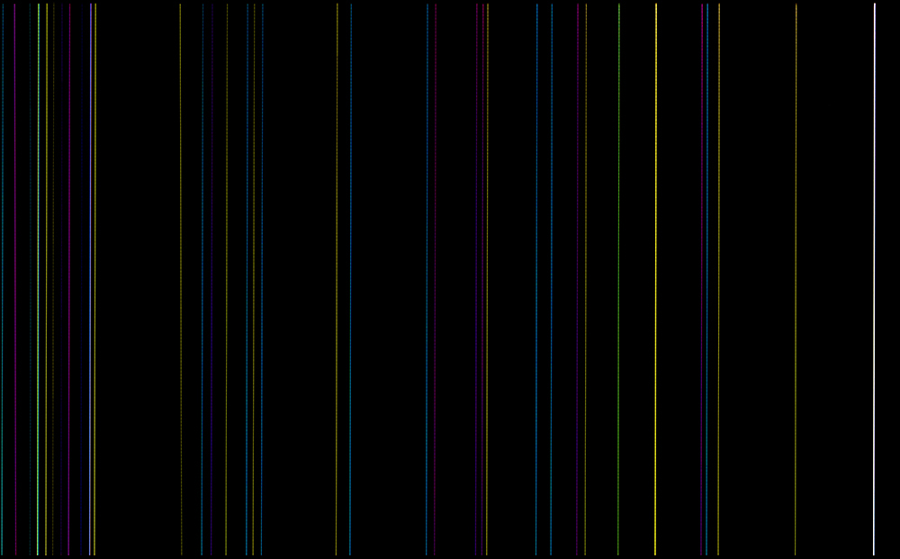
b series was shown for the first time at his solo exhibition in 2012, laying one work on the floor and hanging 5 works on the black wall at the gallery. The six works seemed to look like long exposure photographs of the celestial skies, until you realized that these are close up photographs of mundane objects such as a malfunctioning computer screen, back of an office chair and light passing through a hole in a curtain fabric except the one on the floor. The letter b from the title refers to black or between. The b series is highly abstract and suggestive even though it is photographs of actual space and objects. kdk also produced video b (running time 2’58”) in collaboration with video director Kim Intae and composer Lee jee reen (Humming Urban Stereo) for the series.
<f>
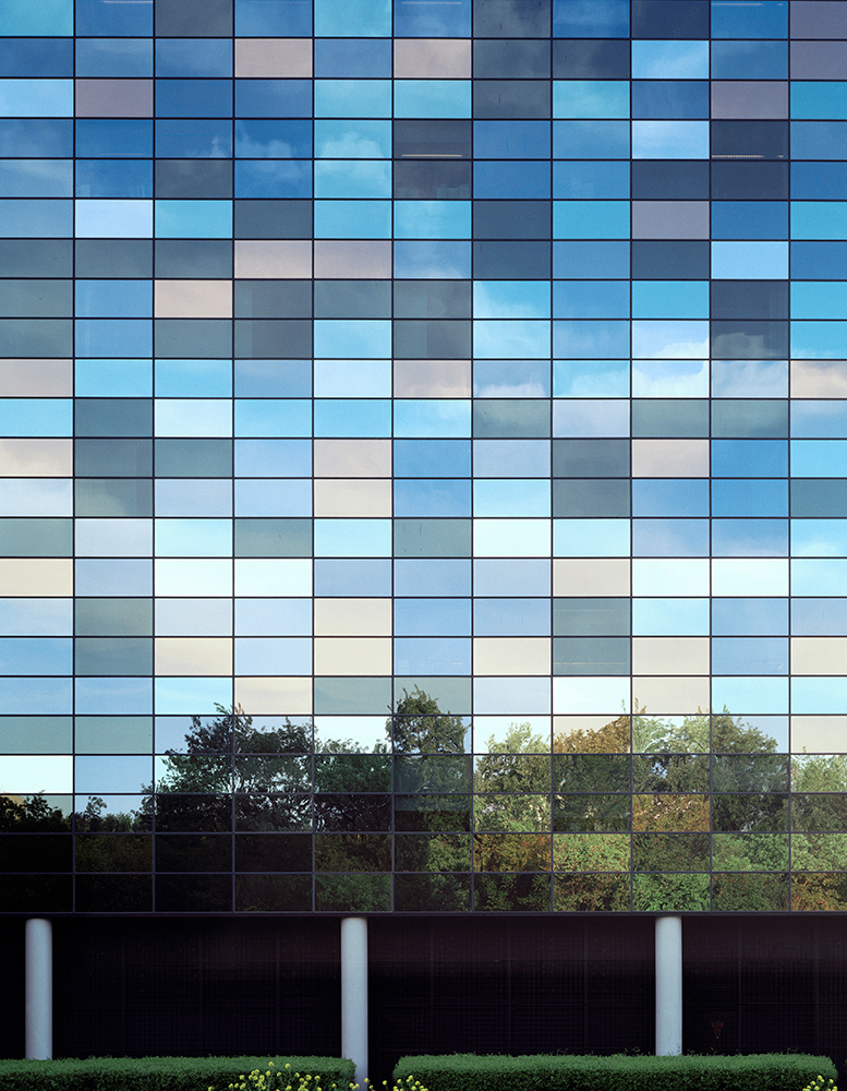
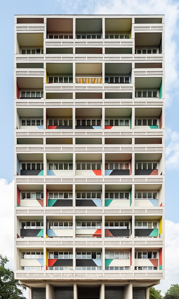
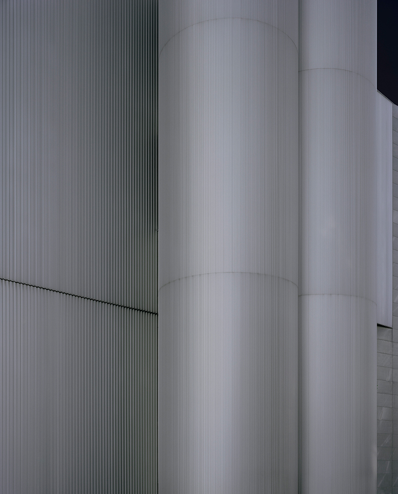
What the letter f from the title of this series implies include façade and farbe (color in German).
kdk who prefers ‘grains’ over ‘pixels’ uses film camera to explore exteriors of architectures In this series,
where zooming in on a particular section of the structure or boldly cropping the image of the chosen buildings turn three-dimensional structures into color fields and flattened geometric elements.
The outcome may appear impersonal at first glance, however what the artist attempt is reinterpretation of buildings through his own subjective vision and sensibility more than distant objectivity.
<lu>
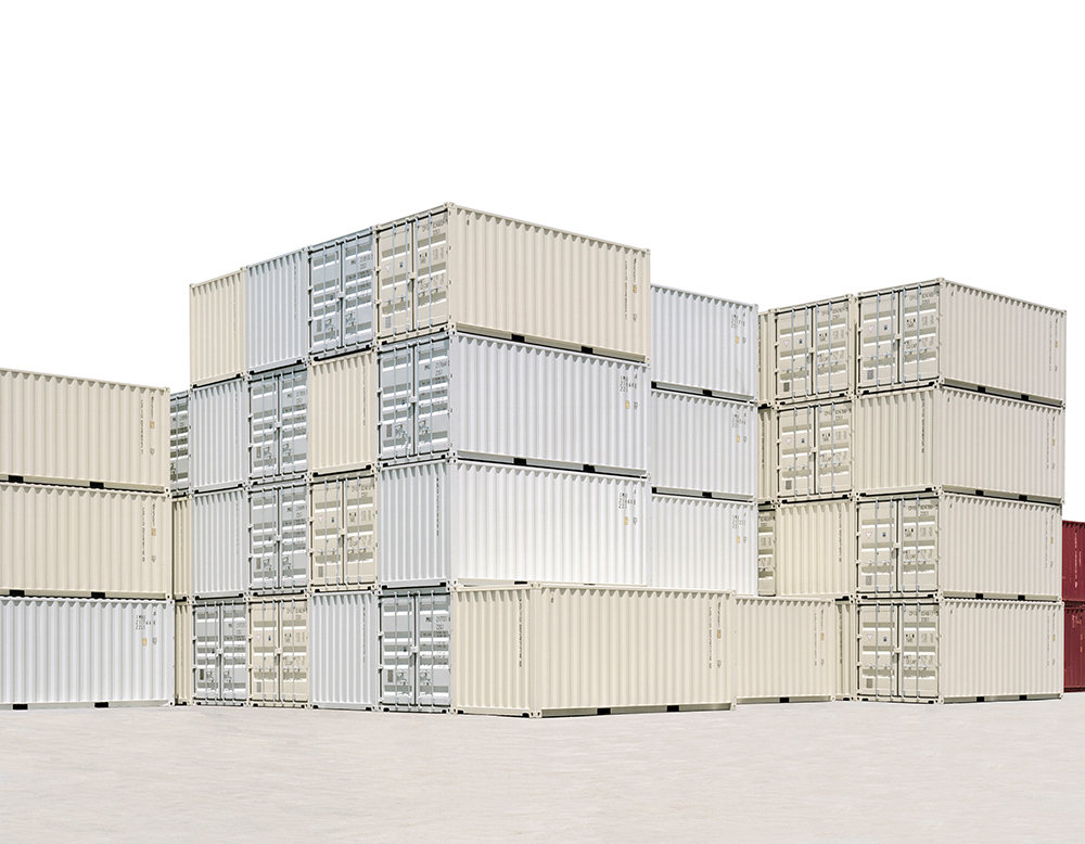
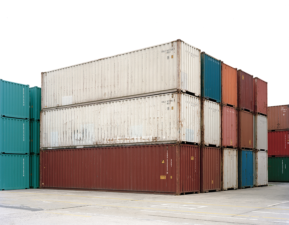
Line Up series began when kdk took a notice of geometric aesthetics of orderly lined up shipping containers at the harbor. In this work, the arrangement of colors is emphasized more than the huge scale or sense of weight of the cargo containers. Unlike his other series, the artist uses computer program on some photographs in the series, when the containers are used as a unit for spatial reconstruction and these cubic units are repeated and rearranged. This series also includes works taking the idea from a game titled Line Up on the iPhone in which he composes the container-units on the black background of the game screen.
<p>
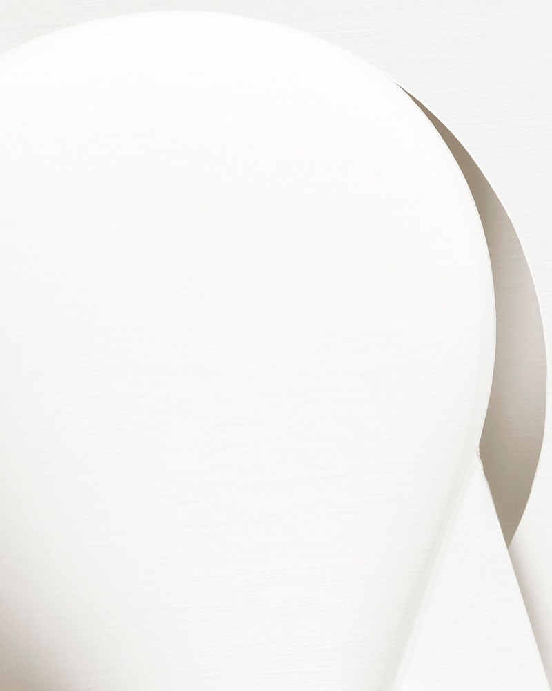
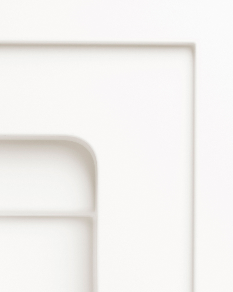
In this series, various types of white “packages” are captured from a microscopic perspective.
Unlike the products which have a variety of colors, their packages tend to have neutral colors, especially white as in this work. So, when photographing them, they look like black and white photographs, but they are in fact C-prints.
The internal packaging materials whose only job is to protect products are meant to be discarded after the products get into the hands of consumers.
In this work, the nameless subsidiary materials are collected and given names which reflect the list of products they are made for.
Then, the spaces inside the packages are photographed the way the camera explores spaces and structures of bigger 3 dimensional subjects in the artist’s previous projects.
The structures of packages are as solid as structures of buildings and when photographing them, they exude unexpected warmth and beauty of geometric abstraction.
<w>
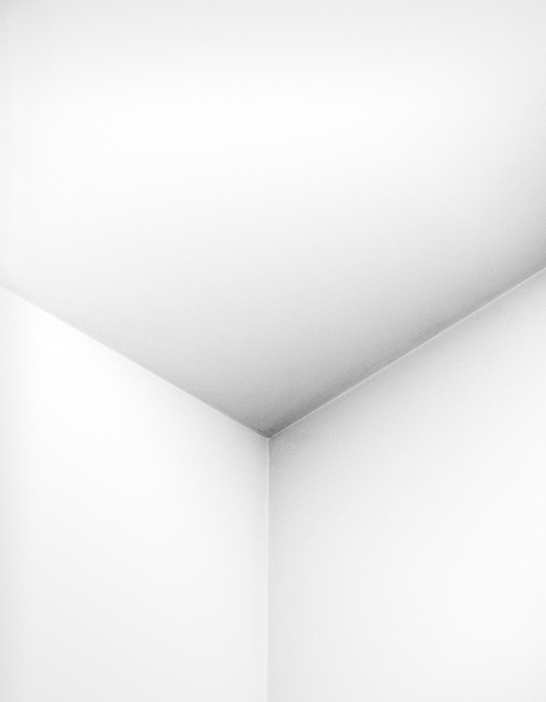
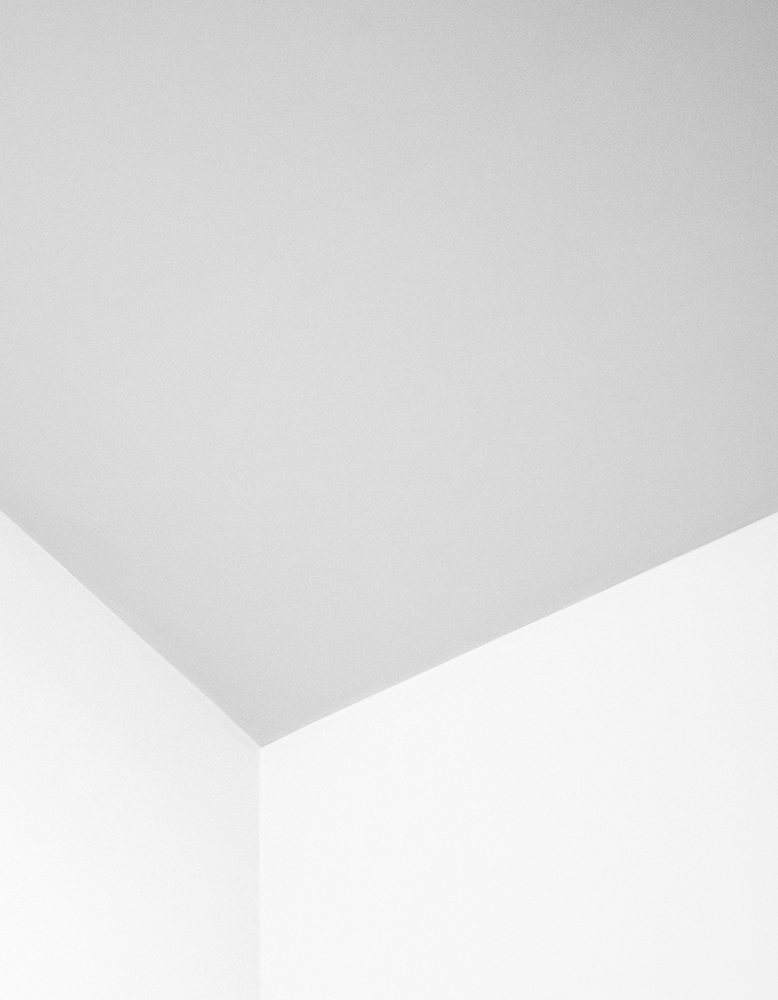
In w series, the letter w comes from wall, winkle and white. Focusing on the interior of an architectural structure for the first time, the idea of this series came to the artist when he woke up one morning and experienced bizarre confusion as to whether the wall had a corner that was protruding out or sunken in. Based on this experience, he started to explore illusory spaces by capturing corners where points, lines and planes meet. In the series, the optical illusion is maximized by adding shades to the lines, points and planes of the corner or with a close up shot, information about the scale of the original space has disappeared. However, some clues including a variety colors or patterns on the wall remind that they are parts of an actual architectural structure.
<sf>
In sf series, kdk transforms real architectural spaces into space beyond reality. Also inspired by the new terminology ‘space faction’, this series features spectacular and surreal images of existing architectural spaces that are reminiscent of the scenes in science fiction films. Using artificial light and dramatic compositions, the future as he imagined gradually entered his photographs overtaking the pre-existing buildings. By turning his imagination into reality and a real space into a virtual one, he moves beyond the boundaries of reality and illusion in this series.
“Dokyun Kim’s photography of a building’s interior depicts physical and materialistic elements that take on a similar approach to an architectural or sculptural photography. However, what’s unique and special about his work is that he is able to amplify and creatively sculpt the intricate details and the deeper layers of the materials. While his earlier work was intended to resemble a painting, he over time started to focus on the distinct elements of the photographic medium itself. Kim’s continued efforts in converting the three-dimensional space into a two-dimensional plane shows that he is charting an unprecedented territory in photographic innovations and I believe it’s breeding a meaningful body of work.” – Haeyoung Shin, curator
Instagram:
https://www.instagram.com/kdkkdk/
https://www.instagram.com/studio_kdkkdk/
Sunjoo Lee is a mixed media photographer based in Seoul, South Korea. Her work explores past, present, and future worlds in time and spatial perspectives. She received the Bachelor of Arts and Music at the Ewha Woman’s University, Seoul, Korea, a Bachelor of Fine Arts (Academic Credit Bank System) in Photography, Chung-Ang University, Seoul, Korea and is currently seeking her MA, Department of Plastic Art &Photography at Chung-Ang University Graduate School.
Her work has been featured in numerous solo and group exhibitions in the U.S. and Korea , including the Art Museum of Kim Bosung. Seoul, South Korea and the Griffin Museum of Photography in Boston, MA. Sunjoo’s photographs have been featured in publications worldwide.
She was a Critical Mass 2019 a top 200 Finalist and also the 1st place winner of the Richards’ Family Trust Award at The Griffin Museum of Photography, Winchester, MA.
Posts on Lenscratch may not be reproduced without the permission of the Lenscratch staff and the photographer.
Recommended
-
Mexico Week – Gerardo Montiel Klint: Cartographer of the UnconsciousMarch 28th, 2026
-
Mexico Week – Cristina Kahlo: When Memory Meets the LensMarch 27th, 2026
-
Mexico Week – Carol Espíndola: The World Is My Own BodyMarch 26th, 2026
-
Mexico Week – Paola Dávila: Beyond the LandscapeMarch 25th, 2026
-
Mexico Week – Tomás Casademunt: Time Frozen by LightMarch 24th, 2026

