Book Talk: How many images should be in a photobook?
Amy Elkins’ Anxious Pleasures (377 images) is unlikely to land on the same spread when opened. Published by Kris Graves Projects
Today we share a continuing monthly column, Book Talk, by artist, designer, and publisher, Caleb Cain Marcus. If you missed his previous post, you can read it here.
How many images should be in a photobook?
Facing a pile of prints is overwhelming. Editing the multitude of images into something smaller and more meaningful is a task that can feel momentous.
Equally daunting is the photobook’s finality. The successes and shortcomings will outlive the author with hundreds to thousands of copies distributed—none of which can be changed once printed.
Designing an exceptional photobook requires a great deal of time, energy, and a talented team that includes the photographer, designer, and often a writer, editor, or curator.
Allen Wheatcrofts’ Body Language (42 images) uses all bleeds to bring the reader closer to the scene. Published by Damiani.
The process begins with determining the number of images. There’s no universally correct number of photographs, but each body of work has a resting point between too few and too many.
When we edit for a book, it’s a different context than finding the solitary standout image for a website. Photobooks engage with their audiences by developing an idea or concept through an edit and sequence that infers a relationship among the images and their color, form, scale, and subject matter.
The number of pages affects the length of the experience and guides the type of interaction people will have. The smallest increment of time is the turning of a page. If we envision twenty photographs, spread across an equal number of pages, we’ll discover the book ends quickly. With brevity it can be challenging to create a narrative with complexity and changes in tempo.
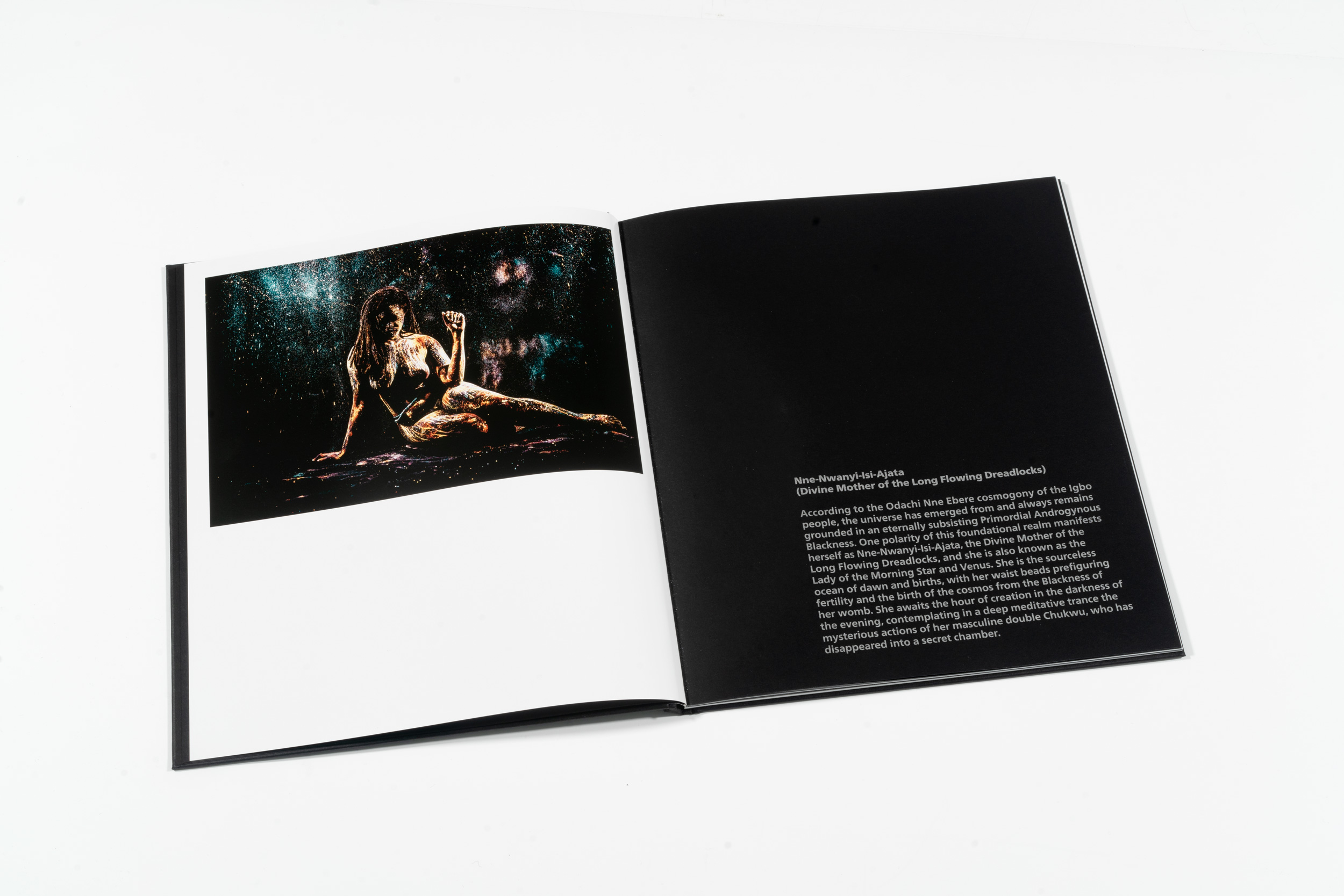
Mikael Owunna’s Cosmologies (14 images) creates a longer experience through extensive and diverse types of text. Published by ClampArt.
When a book approaches two hundred pages, the experience will likely occur over multiple viewings. At three hundred pages, the inevitability of multiple viewings is all but definite. Knowing the book will be viewed in multiple sittings impacts the design approach and the pacing and structure.
A couple years ago I tallied the number of images of a dozen books designed by my studio — they ranged from 14 to 377 images. Nine of the twelve contained between 42 and 62 images, which is often the sweet spot for single-author books, and enough to construct a multilayered narrative with varied pacing.
When the rough image count is determined the next step is to focus on the organizational method, refine the concept and to create a visual language that will strengthen and clarify the project and in doing so increase the reach, audience, and recognition of the work and photographer.
Caleb Cain Marcus, Luminosity Lab
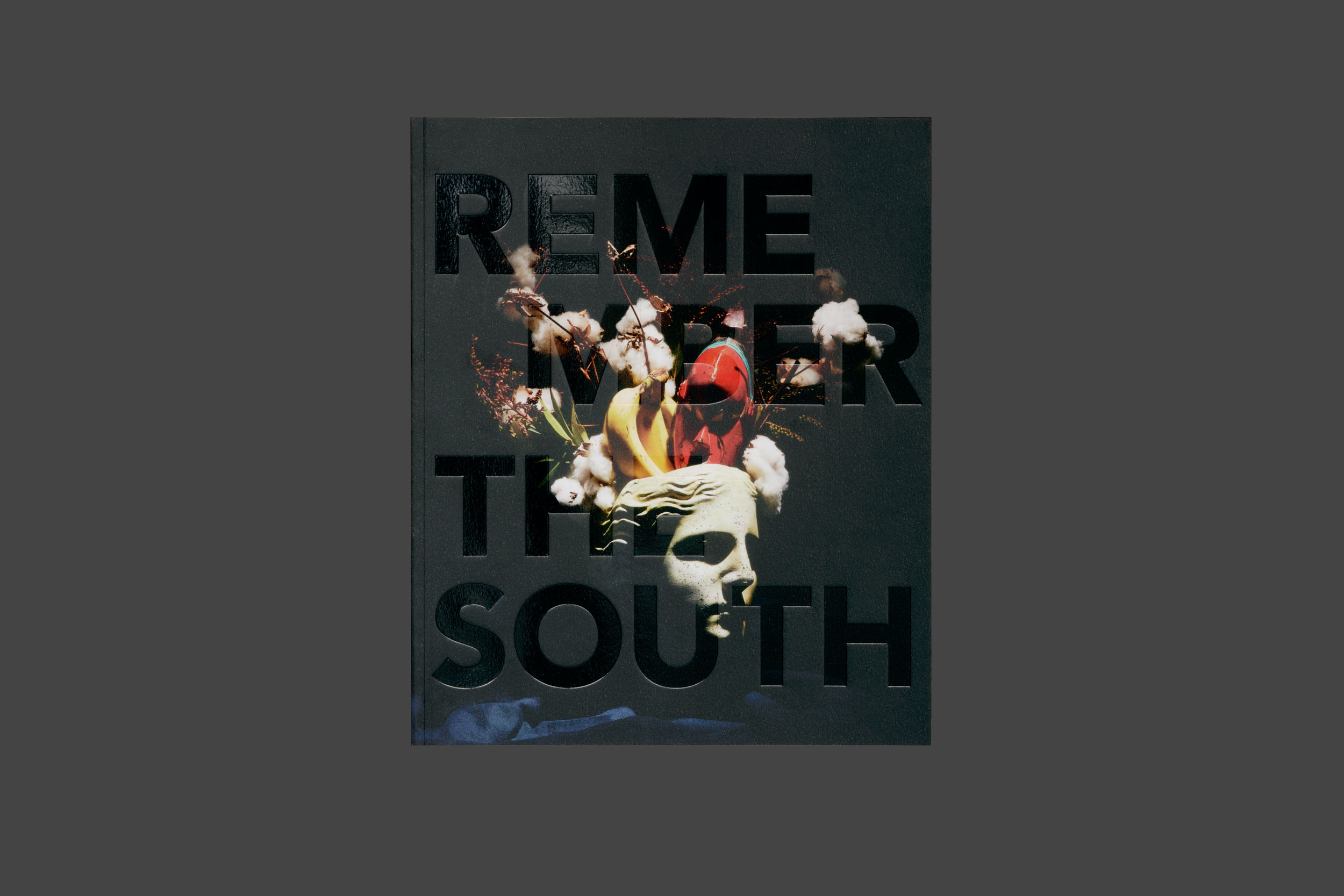
Frank Frances’ Remember the South (86 images) has an oversized format to encompass the reader in color and narrative, published by Kris Graves Projects
About Luminosity Lab.
We use our powers to advance institutions and people in the arts by translating their ideas into experiences that create a lasting legacy through books and identities that grow audience and reputation.
Books and Publications
With a distinct experience in book design and production, we find beauty arises from a response to the content that is led by strong ideas, typography, and attention to the book as a sculptural object.
Follow on Instagram:
@calebcainmarcus/
@luminositylabdesign
Posts on Lenscratch may not be reproduced without the permission of the Lenscratch staff and the photographer.
Recommended
-
Andrew Fedynak: The Last Snows of a Warming WorldMarch 15th, 2026
-
J. Lester Feder: The Queer Face of WarMarch 11th, 2026
-
Curran Hatleberg: Blood GreenMarch 9th, 2026
-
Kiana Hayeri: No Woman’s LandMarch 8th, 2026
-
McCall Hollister in Conversation With Douglas BreaultMarch 6th, 2026


