Cover the Book: Edition Three, Opening the Book
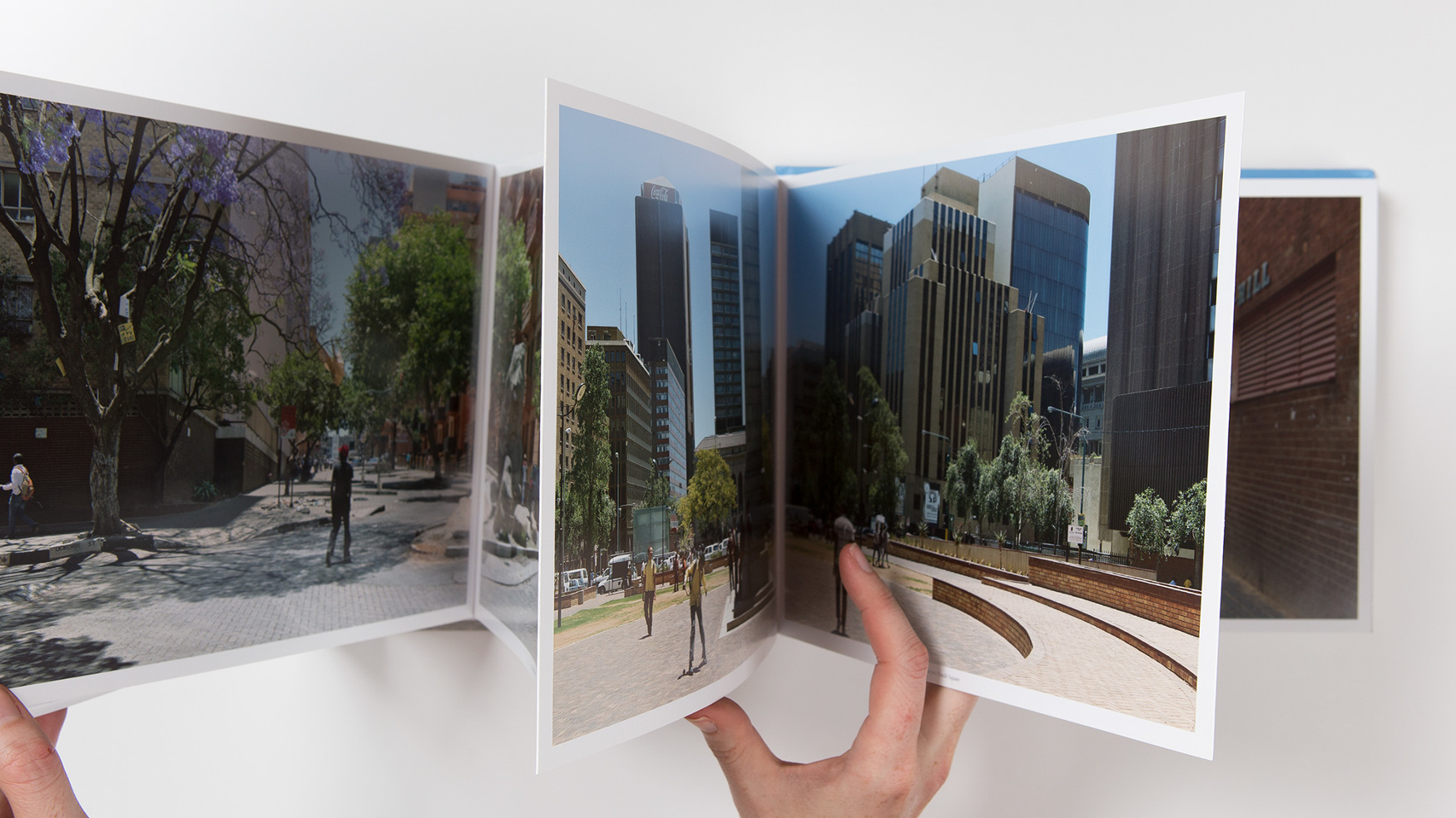
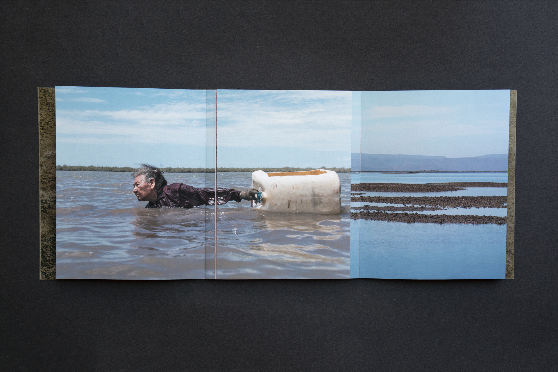
Joburg: Points of View, Guy Tillim from the website of designer Gabriella Guy and published by Punctum.
The nature of the photobook, any book for that matter, leads one to open it. The book object comes in many varied forms and rarely does one venture into the unimaginable and brand new. There are different takes on designs and designers toy with size, folds, hidden pages, text or images, boxes, inserts, but rarely does an audience encounter something that there they have no ability to conceive and define.
I speak often about the book object. This term in my mind is an exploration of how you can push the bounds of what we normally consider a book. Most books have a similar experience and create a common and familiar feeling. They usually open front to back, sometimes depending on their country of origin, back to front. They are hardbound or softbound with a spine that binds all the pages to be viewed or read, consecutively from start to finish. They lead one on a logical journey with a clear beginning, middle and end. The ritual is familiar, comfortable, and appropriate for many readers, designers and creators.
For this piece, I want to give some examples of types of book bindings that play with the traditional book model and the idea of destroying a book to see what is on the inside. One book from years ago was Christian Boltanski’s Scratch, a book that when initially opened only shows the silver coated pages. This surface, much like those on scratcher lottery cards prevalent in most U.S. convenience stores, is meant to be scratched off to reveal forbidden images. Self Publish, Be Happy produced a book by Lucas Blalock that was completely sealed in and the outer wrapper had to be removed to view the book. Another title, Beyond Drifting, by one of my new favorite publishers, Overlapse, requires the cutting, or if you are careful the un-sticking of the tab that reveals the hidden secret of the books’ first section. Other books have uncut pages with perforated edges meant to be cut to reveal the images. Some have doors that reveal hidden photographs and have to be opened in a way reminiscent of a Christmas advent calendar, revealing not the chocolates inside, but little photo treasures. In the process of enjoying, one may or must destroy the original object to explore the book.
Photobooks have three purposes from the collector’s standpoint – for reference, for enjoyment and for collectability. The philosophy of the collector, whether they have 10 books or 10,000 books, defines how the book is treated. Some strongly believe that the book is to be used. The collector sits with the book and reads, feels the weight of the book and the texture of the paper, smells the inks, and sees the quality of the printing. In some circles, destroying to reveal harms the book’s collectability, but may also increase demand as collectors often leave one copy the book untouched and purchase another, one for viewing and one for collecting.
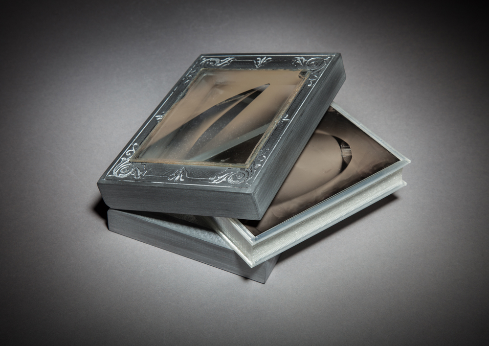
Bill Westheimer, Self-published limited edition Silver Sunbeam
I want to digress to explore one artist who is toying with the idea of what a book is and how the concept of destruction can be part of the final object and artist’s intent. Bill Westheimer uses Makerbot Replicator 2 printer (3D) to produce what could be considered pieces of sculpture. The original work is hollow with book-related object in the center, and is completely sealed within the exterior plastic casing, and the interior book is housed on a flash drive or some other digital medium. There can be an argument made that these are solely sculptural pieces, but to somewhat counter that statement, I must focus on Westheimer’s first experiment called Silver Sunbeam.
This publication is the namesake of John Tyler M.D.’s 1864 book, one that contains the recipes and instructions for processes known at the time including collodian, albumen, heliographic engraving and celestial photography. With this book, and I will use this term to apply to this publication throughout, he places a silver, 3D-printed replicate of the original publication in the center along with a USB drive that contains a copy of the publication’s text inside a sealed box. The limited edition of ten has an original tintype mounted on the cover. Westheimer uses the 3D process to produce other objects that verge into the art form and leave the photobook behind. There can be an argument made that this object does not reside in the realm of photobooks, and this discussion can go on at length for those who care to broach the subject and continue with the tedium that may comprise such at conversation.
This is an object and is also a book if we allow some definitions to define what a book is: It is in the shape of a book; it does contain a book; it can be read. Aside from likely discouraging the use of plastics in book production, I admire Westheimer’s willingness to take chances, explore new mediums, and broaden the definition of a book, even bordering on a rejection of the photobook medium. I would encourage all artists to explore new book ideas and discover new ways of self-expression.
This would extend to book binding and elements used within the book. The photographs should guide the design, and there may be one binding that suits the work. There are some that are more appropriate of certain books, but I would not argue that one should be used over the other. Find your ideal vehicle. It may not be the one you originally considered. Shake it up or tone it down. Imagine how the viewer may experience your book, how they will hold, grip or caress the book. Imagine how they may need distance and a viewing platform or pull the book in close for an intimate experience. Consider how they may unfold, unroll, and re-sequence. Think about how they will make the experience their own and determine how much power your will give them to do that. Think of what they may experience with at least four of five senses (taste is a sense that I have not used, at least so far). The book is an object unto itself to be experienced outside of merely the photographs it contains.
For design, there is things you don’t want and you also need to know the things you do. This is not a set of oppositions. There are nuances to the decisions. The choices are not infinite, but he combinations can seem to be endless.
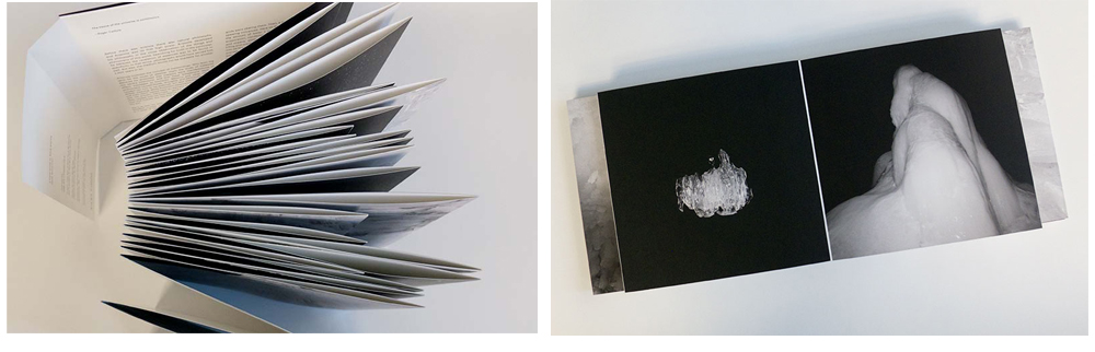
Find some examples of different bindings and book features in the illustrations below.
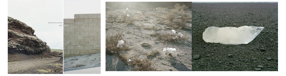
Marion Belanger, Rift/Fault, Radius Books. Hardcover / 12.125 x 9.75 inches, 112 pages / 48 color images, Includes two separate fold-out portfolios
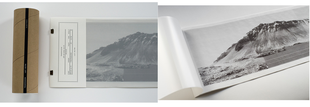
Lucy Helton, Transmission, Silas Finch. Limited edition of 350 numbered copies. Nine panoramic thermal prints made by the artist. Synthetic paper wrap printed with UV ink. Japanese clip binding. Presented in a cardboard tube.
Edén Bernal, Exilos from Inframundo. Handbound, 17.5 cm. x 22.5 cm, 60 pages.
Paula McCartney, A Field Guide to Snow and Ice, Silas Finch. Includes 48 black and white and full color plates printed with UV inks on uncoated paper. Leporello binding with multiple panel widths and stiff front and back covers. Spine closure printed on synthetic paper with an essay by Mark Alice Durant. With the spine detached from the front cover, the book becomes an installation piece approximately 34 feet in length.

Ren Hang, Wild, Dienacht Publishing. large format collection of unbound posters (book size: posters folded to 28 x 40 cm, open size 56 x 40 cm) printed on strong paper, held together by a banderole.
Melanie McWhorter has been consulting with photographers for almost two decades. After moving to New Mexico in 1997, she managed the internationally recognized photo-eye Bookstore + Project Space until 2016. Learn more or contact her at melaniemcwhorter.com.
Posts on Lenscratch may not be reproduced without the permission of the Lenscratch staff and the photographer.
Recommended
-

The Photography Show presented by AIPADApril 5th, 2024
-
2023 in the Rear View MirrorDecember 31st, 2023
-

The 2023 Lenscratch Staff Favorite ThingsDecember 30th, 2023
-

Inner Vision: Photography by Blind Artists: The Heart of Photography by Douglas McCullohDecember 17th, 2023
-

Black Women Photographers : Community At The CoreNovember 16th, 2023


