Today’s and tomorrow’s posts are not-to-be-missed in terms of learning what jurors look for when determining winners. A big thank you to Editor Stephen Pierson and Canteen Magazine for asking Lenscratch to be a part of this processes and for creating a truly transparent opportunity for exposure.
Tomorrow night at 7pm in Brooklyn, New York
Canteen Magazine’s Naked Judging 2012 Photography Contest moves into the final live round, where three jurors,
Arnold Lehman, director of the Brooklyn Museum,
Amy Stein, photographer, and
Susan Bright, author and curator will discuss portfolios LIVE and reveal insights into why the work is selected or rejected. The event is moderated by
Anthony Goicolea, photographer. This is a
Free event and
please
RSVP via Facebook for the live-streaming and the ability to ask live questions.
If you are in New York, the live juroring will take place at NYU-Polytechnic University’s Pfzier Auditorium: Downtown Brooklyn, 5 MetroTech Center, 11201. This event will also be live-streamed, with Internet-based questions taken. Livestreaming can be found here: http://www.youtube.com/watch?v=Bm7MMjQAX3w Please note: The point of this is not merely spectacle, but to make a normally opaque process transparent; and to not merely hand down judgement, but to spark an open, honest, and provocative conversation about photography.
The
first round of judging was jurored by: Photographer
Anthony Goicolea, photographic duo
Tribble and Mancenido, and photographer (and
Canteen‘s Art Director)
JJ Sulin. The jurors looked at 230 portfolios and moved 26 to the second round.
I thought it would be interesting to share 18 of the 204 portfolios that did not make it to the second round, feature the jurors critiques and a response from the photographer. I thank today’s 9 photographers (I will feature 9 more tomorrow) for their willingness to share their experience so that we all may learn. There were other photographers willing to participate, but I randomly selected a cross section of imagery to feature.
Art criticism is subjective, but there are reasons behind juror’s decisions. The jurors have seen thousands of portfolios over the years, understand photographic history, the current photographic landscape, and have a keen knowledge of what it takes to succeed in this arena. We can all learn from this experience, and hopefully the transparency of this contest will be of value, not just to the participants but to the Lenscratch readers. Two of the jurors give their feedback and 9 portfolios follow.
From Tribble and Mancenido:
Can anyone really answer what makes a great photograph? It’s all relative to personal experience and preference. One can argue that trends in art can influence how one views work, whether it be a photograph or an object. And therein lies the seemingly ongoing debate of photography’s justification as art. A photograph is not an object, at least not in the same way as a painting or a sculpture. It has reproductive and very democratic values. While we do not wholeheartedly agree with Walter Benjamin’s theory of the “aura” of a work, and its absence in a reproduction, we did however search for that “aura” when deciding what a great photograph was, for us.
So to try and answer our own question in relation to judging a photo contest, we were simply offering up our opinions based on our experiential knowledge of the medium of photography, both with our frustrations and utmost admiration for it, and hope those who have entered work can walk away with something, whether it’s advice–take it or leave it–or insight that may be completely personal and socially or politically biased. Lifting the veil of what happens is important, transparency prevails. Although I’m not sure they can fully experience all the coffee and food we went through while conducting these judging rounds. As image makers, what does a photograph mean to you, and how much has that changed for you in the last 10, 15, 20 years?
From Anthony Goicolea:
When I was asked by Canteen to participate in a transparent, live-judging process for their photography competition, I was both excited and nervous. I have never been a part of a jury panel before. I have repeatedly submitted work to fellowships, residencies, and grants; reward and rejection has always seemed random or arbitrary. The decision letter you get in the mail is never an especially revealing document.
Participating in the other end of the process and experiencing the dynamic of a juried panel composed of working artists, curators, and writers, was enlightening. The sheer number of submissions was overwhelming. The entries that rose to the top really highlighted the crucial role that the editing process plays in creating cohesion, showcasing breadth of work, and distinguishing entrants from the sea of submissions. Although I hope that this transparent process is helpful to all those who entered, I know that it has has been helpful to me and will inform my future competition submissions. Watch out Guggenheim Memorial Foundation Fellowship, now I know your secrets.
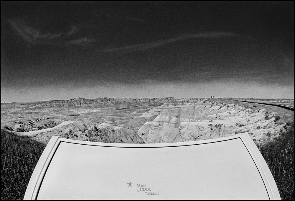
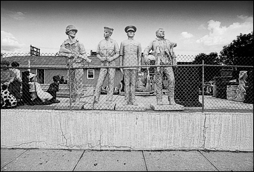
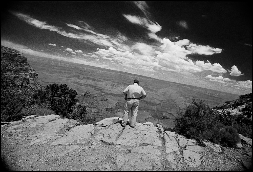
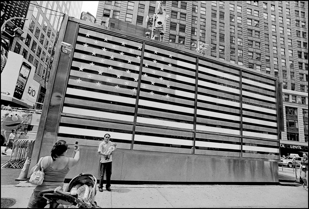
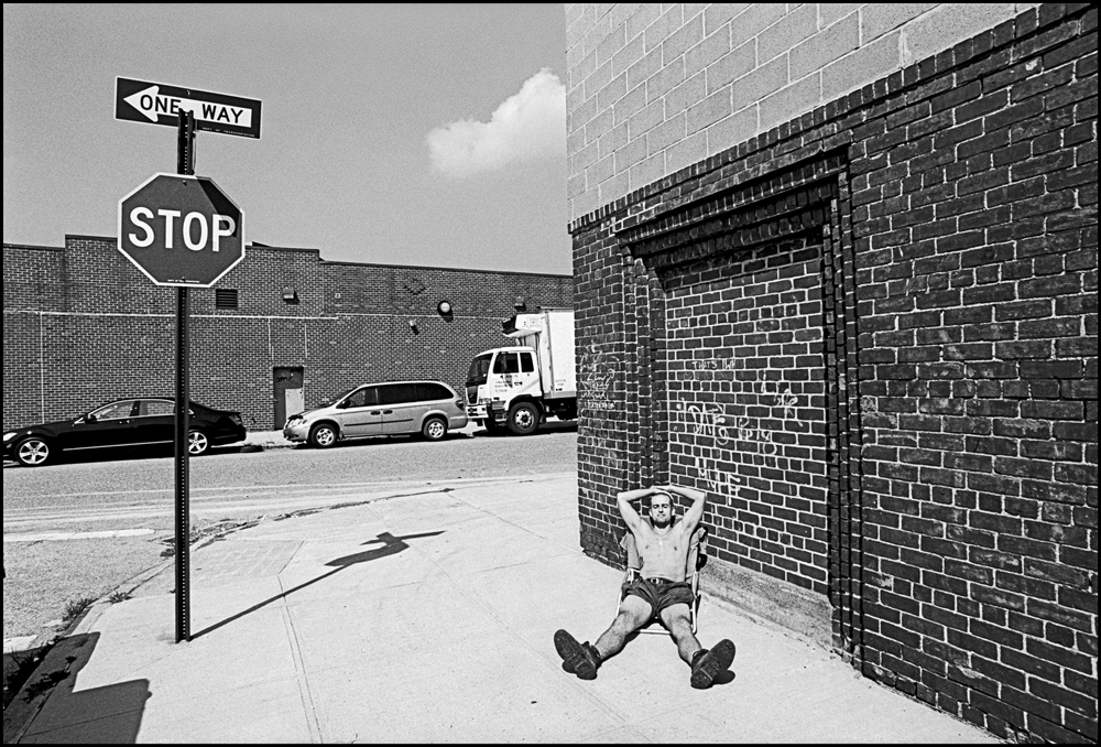
Featured Portfolio (#8): Stan Banos, NYC/San Francisco
Statement from the Jurors:
Great style, but I’d like something that ties the photos together that goes beyond styling–not necessarily a coherent narrative, but something that makes the images somehow build on each other. But I do love the mood of these, the antiquated feel. This photographer is obviously skillful. Though I also don’t get the crooked shots employed in a few of these–I’m not getting how they benefit the composition.
Response from the photographer:
First off, I think what Canteen, and now you, are doing should be mandatory for most judging- it adds a level of transparency and clarity to a much needed area (at a much needed time), and in so doing serves to remove suspicion and transform the process from one of mere elimination, to one of insight and revelation.
Once a particular level of “professional” competency is achieved in one’s craft, judging becomes subjective, much of it flavored by current tastes and trends. I’m of certain age and fully realize that unless I have a few oddballs and holdouts on the jury still open to my now rendered quaint tools (35mm B&W)- the “antiquated feel” doomsday remarks are not exactly unanticipated. It is however somewhat disingenuous to remark (in my case) that the photographer is “obviously skillful,” only to then question why I would tilt the horizon in certain shots. It’s as valid (and proven) a compositional technique as any other, and the simple fact is- there wouldn’t have been a shot otherwise (a sometime curse of that particular format where you have to effectively balance the additional horizontal real estate). Reminds one of the question that no lawyer should ask in court- the one they don’t know the answer to.
Latter ’70s color remains art world legal tender to this day- perhaps if I put down 27 instead of 57, my Early Cretaceous “antiquated feel” would effectively translate to hipster “retro cool.”
Statement from the Jurors:
The first image promises a lot (it’s quite brilliant), and the rest doesn’t quite deliver for me. To me, the first image is wonderfully other-wordly–straddles the line between real/not-real. I’d like to see the rest of this series pushed further in this direction, to continue straddling that line, even if that means not shooting strictly diegetically.
Response from the Photographer:
I was very excited when I first learned of what Stephen Pierson and the rest of the folks at Canteen were doing with the 2012 Canteen Awards in Photography. When I read the overview (http://www.canteenmag.com/2012contest), I felt as though they had read my mind and were addressing so many of the concerns that I have had over the years with typical juried photography competitions.
The marketing of these contests usually states or implies that having your work seen by a judge-with-connections, such as “a highly acclaimed museum curator,” is a way to get exposure for your work with the goal of having your work exhibited in a museum. The truth is that the judges are hired by the contest organizers in a very different capacity than what they typically do for their museum. Especially in the high-volume contests, they make quick decisions on the day(s) of the jurying, and have no involvement in the rest of the process. They do not provide input or feedback to the artists whose images did not get chosen, and often, do not even provide feedback to those who were chosen. They typically do not offer input or feedback in the printing or framing of the work, nor in the hanging of the actual show.
As an example, I had a piece chosen for the 2010 Art of Photography Show, one of about 100 chosen out of over 13,000 entries. It has been a nice line on my CV, but I did not learn anything or grow from the process of entering or having my work chosen. The museum curator-for-hire did not provide any specific feedback as to why my work was chosen and I was left feeling much more like I had won the “Roland Barthes punctum” lottery than done anything worthy of “winning” a contest.
I could go on for pages as to many of the other things that I believe are wrong with typical photography contests, but I want to move on to my experience with this Canteen contest. In reading Canteen’s Issue Six, which holds the intriguing discourse from the judges of the 2010 Canteen Awards, I am very excited to read and see the conclusion of this year’s contest. I will also be tuning in to the live finale on Thursday to watch what I think will be an equally exciting and educational experience on how photography is judged.
All in all, I am of course disappointed that my work was not chosen for the 2012 Canteen Awards, but it’s nice to have the feedback from one of the judges. From it, I have another piece of information as I continue to grow as an artist, and that is very valuable. My only criticism, as I wrote on my comment on their website, is that ideally Canteen would have published feedback from all four of the first-round judges, but one is certainly better than none.
I get the feeling that the judges in this show are much more invested in the contest itself and in the process of judging (and perhaps even in the contestants and their work), which is very refreshing. I’m excited to keep following along this year and in the future. I’m curious to see what will happen when this contest grows exponentially, which it is likely to do, since they are doing it right and getting lots of attention for it. I would be fearful that the model will fall apart with a much larger volume of entries, but I hope it does not.
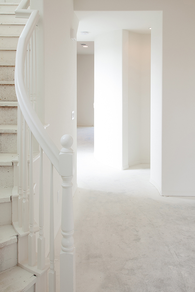
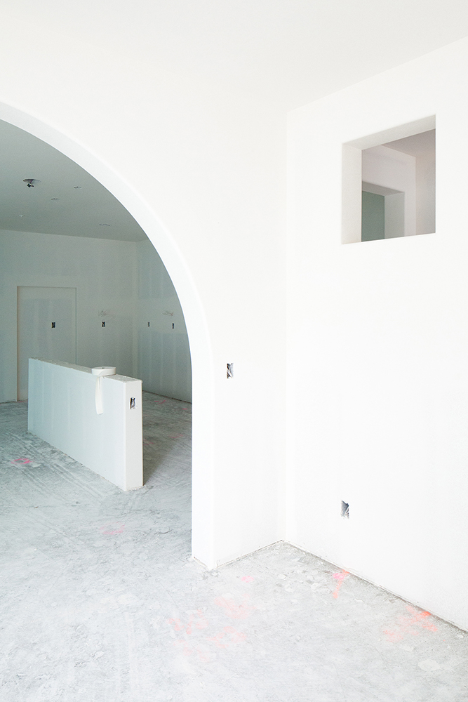
Featured Portfolio (#62): Clive Frost, Brighton, England
Statement from the Jurors:
Some great shots in this series. Formally, there’s some really compelling work here. It’s a close call on forwarding this; at the end of the day, the content doesn’t have quite enough visceral impact on me. But I realize that this is a highly subjective call. Strong work.
Response from the photographer:
The idea of ‘open judging’ is what attracted me to enter the Canteen contest as this is a refreshing and unique approach amongst current photography competitions. Having said that, when you are judging and writing brief comments about 229 submissions, you almost inevitably get a ‘school report’ result – summarised, a little superficial and something of an overview. This opinion recognises the reality of the situation, rather than being intended as a negative criticism per se, because the very act of the judges having to commit their ideas and critiques to words, requires a greater consideration of the work than the usual ‘silent’ competitions where the only ‘judgement’ is in/out, yes/no. I found the judgement of my own series was encouraging rather than necessarily being helpful in the sense of leading me to refine or change or see my work in a different way. It immediately provided the catalyst for me to write a proposal, and simultaneously find a very unusual and powerful exhibition space, to show some of the complete body of work from which the Canteen entry series was edited, in a forthcoming arts festival in my home city in the UK. Many thanks for organising the contest – I found the experience well worth while even though, sob sob, my work wasn’t one of the entries selected for the final round on Thursday.
Statement from Jurors:
Feels like a class assignment on location lighting. Too staged for my tastes. Wants to be a narrative, and I appreciate that instinct, but there’s no front or back end to get me engaged. The singular film stills thing, decontextualized from a broader narrative, only works when the image is super-engaging (e.g., Alex Prager, Cindy Sherman), and none of these quite get there for me.
Response from the Photographer:
The transparent judging process gives this competition the flavor of a portfolio review, which is helpful to participants. I would like to thank the reviewers for taking this extra step to make the experience more transparent.
It is difficult to translate these short remarks into something actionable, but I certainly did not find them off-putting. In my case the reviewer said ‘I don’t find them engaging,’ which is a perfectly valid opinion, but it provides no indication why and not enough detail for me to decide if I agree with the reviewer. Of course, providing that much detail would be far too much work for a simple competition, so we probably got the best one can reasonably expect.
On a side note, I do want to point out that all of the images were taken by available light 
Featured Portfolio (#139): Kris Moore, San Diego, CA
Statement from Jurors:
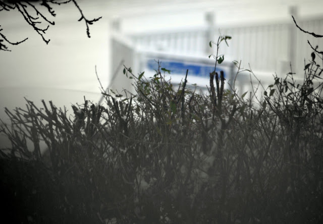
I don’t mind the idea of a consistently out-of-focus series. But it needs to serve a real contextual purpose, convey an idea (or at least one that’s more immediately apparent to me), and start with more interesting shots.
Response from the Photographer:
I appreciated the open format of this contest. You never get to hear what the judges say and it leaves you wondering what it was they didn’t like. I somewhat agreed with the response to this work, although I expected more judges to weigh in. When I submitted this particular group it was to see if it would be rejected for being out of focus, so I was gratified to hear a definitive response to that. I’m still stewing over the “not interesting” comment as it’s the stripped-down look of some of them that appeals to me, but the series is very new and by now, I have many images that I like better. As far as a contextual purpose or conveying an idea, this series is simply a way of embracing my challenges to focus mentally and with aging eyes. Sometimes I think “contextual purpose” is the layering added to an image by the intellectual observer. When so much “meaning” is added to an image in this way a modern artist often feels the pressure to over think the creative process.
original image
image changed after juroring
original image
image changed after juroring
Statement from the Jurors:
I tend to be overly critical of diptychs–and in some of these I’m not sure the combined images are better than each image separately. Plus, I’m just not that into ghostly superimposed figures–my personal bias; seems slightly cheesy to me. That said, take out the ghostly stuff, and I’m really intrigued by a lot of what I see. Images 1 and 6 work brilliantly well as is. And I’d love #5 with the ghostly face removed. In spite of my biases and critiques, there’s promising stuff here. And, oddly enough, I do want to forward it to the voting round.
Response from the Photographer:
In my life as a painter and in this one, I’ve been drawn to pairing images. Apparently dyslexic artists, perhaps in particular dyslexic Gemini such as I, tend to do that. There’s nothing like the experience similar to (but not quite ike) having an image for each eye. (I’m kind of kidding.) Presenting diptychs exclusively was an idea. It’s time to loosen it up. Not every image needs a creature inhabiting it, either, in this series. I’ll let them appear by surprise, occasionally. Pointing out the slightly cheesy shows me that I was off on those, compared to the ones without added cheese. I appreciate the help. A follow-up would be cool.
Statement from the Jurors:
Hesitant to advance because it looks very typical. I do like that (unlike other portrait series we’ve seen so far) it’s clear that she/he’s studying a family, and actually spent time with them. A little hit-or-miss. Overall it paints a compelling narrative. But this type of photography is done so much that I need to love every image, and I only can say that about 4 or 5 of them. Close call.
Response from the Photographer:
By reading a sampling of the critiques, I felt that I gained an insight into the standards by which work is judged. However, my critique left me with more questions than answers. I don’t know which photos the judges thought were ‘hits’ or which were ‘misses.’ I don’t know what about my work the judges thought was ‘typical.’ The judges implied that they loved about half of the photos, but without knowing which ones, I’m unable to utilize their criticism to push my work forward.
Featured Portfolio (#160): Karin Ott, Denmark
Statement from the jurors:
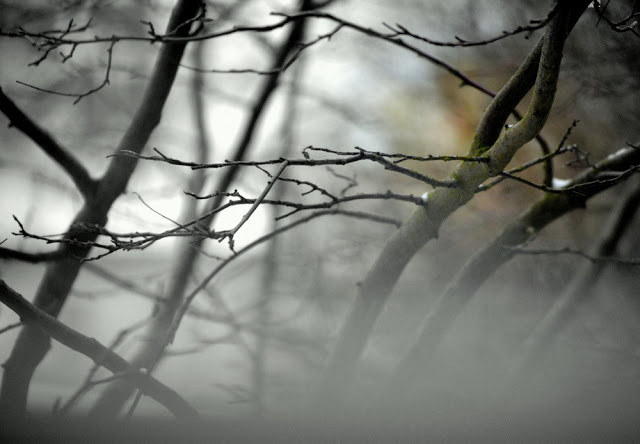
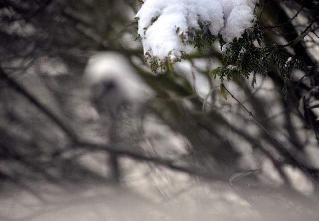
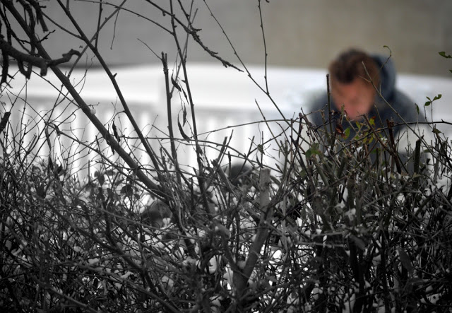
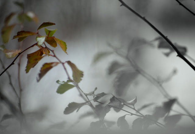
At first glance I was dismissive, thinking that the close-ups of the tree branches lack a visual hook. Now I see the hook. Witty, and I like the subtlety of it, how it shifts your visual focus gradually, away from the center. I like the concept. Though the subject matter isn’t interesting enough to me. I’d like to see this concept applied to other subject matter.
Statement from the photographer:
At first I was disappointed at being rejected but reading the comments changed my views. I realized my vision for the series was not being reflected clearly enough in the images and have already revised it. I also felt very encouraged by what the judge did like about my work. It felt like praise rather than rejection and I have been hugely encouraged to keep working. So the open judgment changed my experience from one of feeling dejected to a feeling of having something to build on. At the moment I’m working my way through every single submission, reading every single comment, and unlike other competitions I can actually learn from this one, not in the sense of reading the one truth but as a backdrop for forming my own opinions.
Featured portfolio(
#218):
Cole Wheeler, Memphis, TN
Statement from the Jurors:
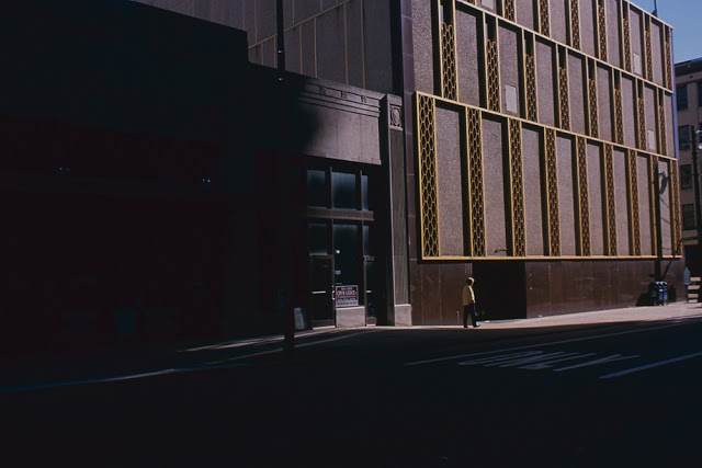
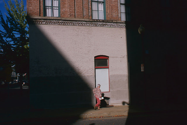
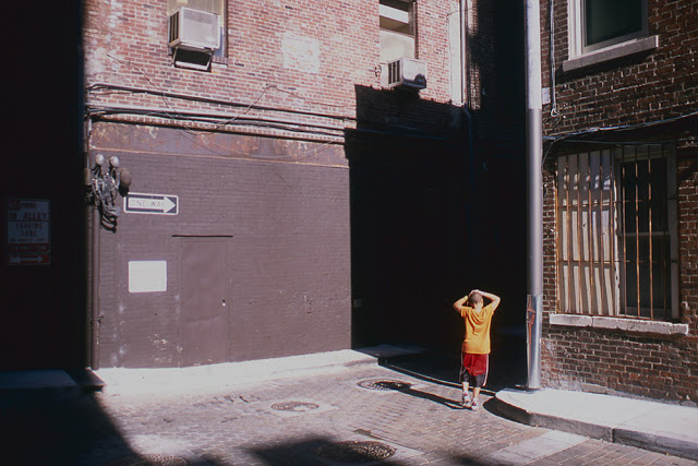
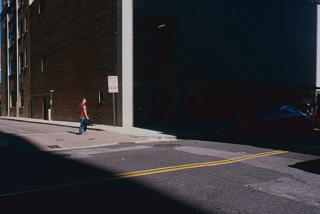
This person definitely looked at Paul Graham’s show. It’s clean, meticulously shot, but is it too derivative? The images are well done, but the photographer needs to add their voice to what they’re looking at. There’s nothing wrong with emulating someone, as long as you’re adding something of your own, and I’m not quite able to find that here. Still, being able to successfully mimic great work is a solid starting point.
Response from the Photographer:
The 2012 Canteen Naked judging Contest was extremely interesting to be apart of, and an extremely responsible move by all involved. I’m most impressed with the individual critiques: even if a bit short, there is nothing more important than advice and response by professionals. As for my own critique, I found it very telling. I was unaware my work was so evidently influenced by Paul Graham.


