Nick Marshall: The States Project: New York

_e_scapes (2013-2014) ©Nick Marshall
Nicholas Marshall is a Rochester, NY-based conceptual artist whose works drift in and out of multiple mediums including photography, painting, and sculpture. Recently, I had a chance to talk with him about his series _e_scapes in which he depicts photographs of travel juxtaposed with specifically sampled colors of typical wall paints.
Nick Marshall has taught photography courses at Alfred University and Rochester Institute of Technology and is currently Manager of Exhibitions and Programs at George Eastman House. Marshall received a BFA from Columbus College of Art and Design and an MFA from RIT.
![]()
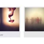
_e_scapes
“Turn your bathroom into the retreat of your dreams.” — Sherwin Williams
In the 19th and 20th centuries, tourism proliferated due to rapid developments in transportation and the accessibility of photography. The distant, whether in space or time, became closer at hand. Displayed in albums, printed on Kleenex® boxes, or painted on bedroom walls, the promise of escape soon found its way into our lives at home.
My recent photographs and paintings explore the desire to withdraw from the everyday into representations of the idyllic. With the sea as a backdrop, the work creates imaginative horizons by turning our often absurd attempts to substantiate the ephemeral–air and water–into anonymous or impossible locales. Through the use of consumer house paint and vacation photos, I reveal our cultural attempts to materialize and reconstruct memory and fantasy.

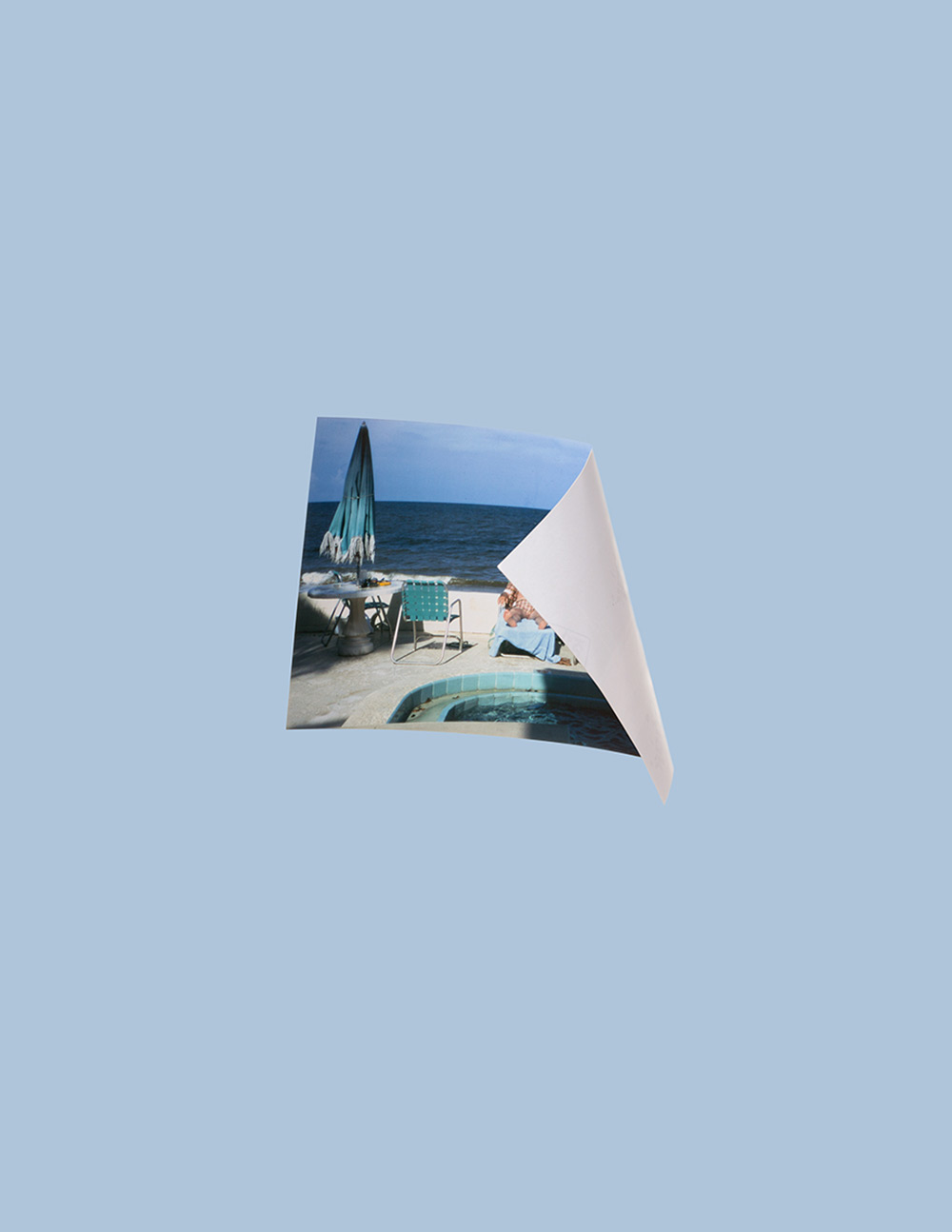
_e_scapes (2013-2014) ©Nick Marshall
Your series _e_scapes seems to explore the ways in which memory is constructed through photography as well as the human desire to escape — not only the desire to actually escape through travel and vacation but also the latent escape that is achieved by looking at the pictures that were taken previously, while traveling. What influenced the way in which you shoot the collected photographs, specifically the skewed photographs, and the cuts that are made in the photographed printed imagery?
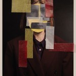
I’ve always been interested in painting as a medium. Its influence has developed throughout my recent projects even though the majority of my work is photo based. With the photographs in this particular series, I utilize a similar technique achieved in trompe-l’oeil paintings as a way to create an artificial sense of dimensionality. The snapshots are objects with corners and edges, fronts and backs, folds and tears. Because of the snapshots’ inherent instability, and dependency on where or how they are stored, their color is also in flux. What is left is an object that bears the marks of its tactile and chemical histories. My method stresses this “objectness” of the snapshots by emphasizing their materiality.

_e_scapes (2013-2014) ©Nick Marshall
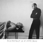
Could you tell me a bit about the sculptural elements of some of the pieces? Specifically those works like Sunrise, Sunset, Shadow?
Most of my work, though often two-dimensional, is concerned with physicality which I think offers itself to sculptural interpretations. With Sunrise, Sunset, Shadow I was able to incorporate elements of both the photographic and painterly works from the _e_scapes series which ultimately helped tie everything together, aesthetically and conceptually.
I had drawn out the piece in my sketch book, and it existed on those pages for awhile until my exhibition at the University of Rochester’s Hartnett Gallery. I was dealing with a challenging gallery layout—the space has two long walls coming together at a 45-degree angle, and the height of the ceiling goes up an extra ten-plus feet in that corner. I knew that I needed to anchor the area with something that had some verticality and presence, so this felt like the right time to produce the work. It ended up being a 4×8’ piece of Sheetrock with a framed stock image of a seascape. I wanted the piece to look as if it could have been cut out of a wall in someone’s home and placed there leaning against the wall of the gallery.
The title of the work refers to the colors of paint used for the piece as well as the framed photograph—leaving it up to the viewer to determine whether the orange paint on the drywall or the orange sky in the stock image refers to the “Sunrise” or “Sunset”. The “Shadow” part of the title literally addresses the shadow that is created on the wall from the work leaning against it which was masked out and painted with Sherwin Williams’s Evening Shadow SW 7662.
The shadow is a reoccurring theme in the series that surfaces in a number of the photographs through the bends and curves of the material and is made evident in the paintings’ horizons.

_e_scapes (2013-2014) ©Nick Marshall
How do you see the use of the Sherwin-Williams paint? Are the colors used in paint sampled from the photograph and relate to that same transportation that photographs provide? But perhaps in a quieter more subconscious way? (the serenity of color in a sunset then sampled and applied to walls of a domestic space perhaps providing a glimpse of the same serenity that is experienced when viewing a real sunset?)
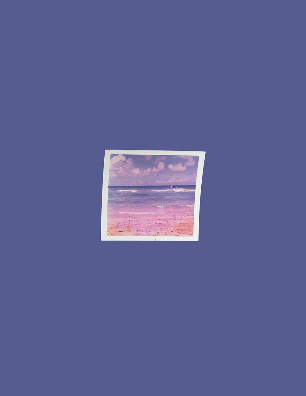
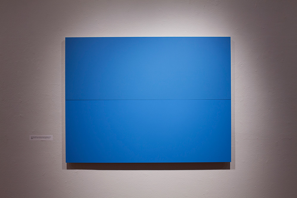
The “background” colors for the photographs are sampled from the snapshots that float within them—sometimes from the air, sometimes from the water. The colors for the paintings are first selected by their manufacturer’s name which again refers to the sky or sea (but not limited to just paint colors from Sherwin Williams. There are also works created from Behr and Benjamin Moore, and additional companies have found their way into my forthcoming book including Valspar, Pratt and Lambert, Behr, and Glidden).
Once I have separated the swatches into their respective categories—air and water—I begin pairing them together based on language to form seascapes, where a fictitious horizon is created, for instance, by stacking Crisp Morning Air 780 over Caribbean Blue Water 2055-30.
The paintings aren’t sampled directly from the photographs, but they do share similar shades of blue, and both call upon memory as a way to make the distant closer at hand—or as you suggest, a sort of transportation to another place or state of mind. I do think the paint manufacturers’ goal is to create or sell that sense of serenity though I’m not sure the end result lives up to the promise.
_e_scapes (2013-2014) ©Nick Marshall

_e_scapes (2013-2014) ©Nick Marshall
_e_scapes (2013-2014) ©Nick Marshall
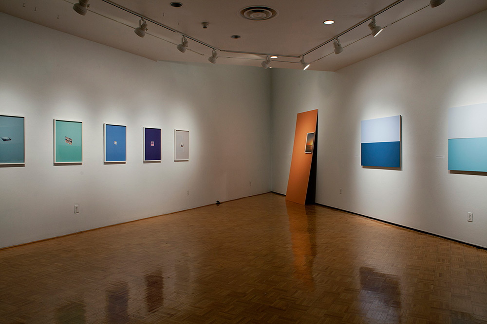
Installation view of _e_scapes (2014) ©Nick Marshall
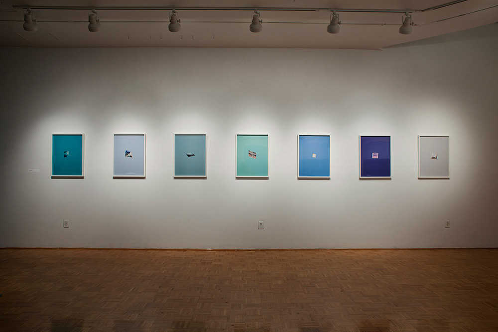
Installation view of _e_scapes (2014) ©Nick Marshall

Installation view of _e_scapes (2014) ©Nick Marshall
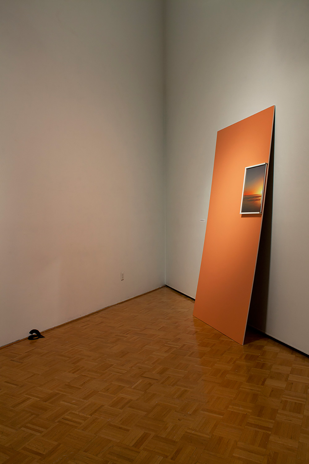
Sunrise, Sunset, Shadow installation view (2014) ©Nick Marshall
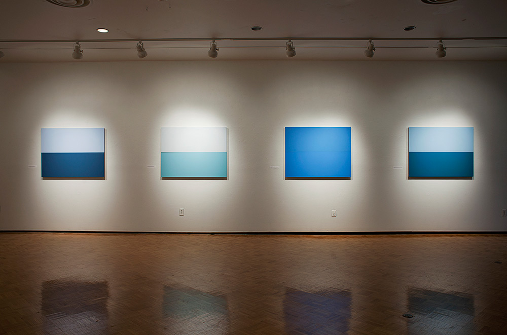
Installation view of _e_scapes (2014) ©Nick Marshall
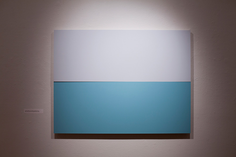
Cool Sky 530E-2 over Shallow Sea 520D-4 from the series _e_scapes (2014) ©Nick Marshall

Crisp Morning Air 780 over Caribbean Blue Water 2055-30 from the series _e_scapes (2014) ©Nick Marshall
Utah Sky 2065-40 over Clearest Ocean Blue 2064-40 from the series _e_scapes (2014) ©Nick Marshall
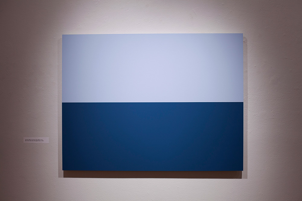
Utah Sky 560A-3 over Seven Seas 560D-6 from the series _e_scapes (2014) ©Nick Marshall
Posts on Lenscratch may not be reproduced without the permission of the Lenscratch staff and the photographer.
Recommended
-

Enid Crow: American ValuesJuly 5th, 2026
-

Alena Solomonova: Self IncompleteJune 26th, 2026
-
The Infinite Light of Duane MichalsJune 16th, 2026
-

HANDMADE ARTIST BOOKS WEEK: VERONIKA SCHÅPERSMay 29th, 2026
-
HANDMADE ARTIST BOOKS WEEK: Ryoko AdachiMay 28th, 2026


