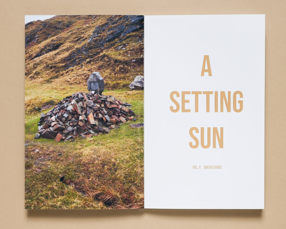
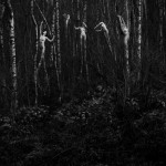
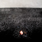
A Setting Sun Vol. V by Gregg Evans
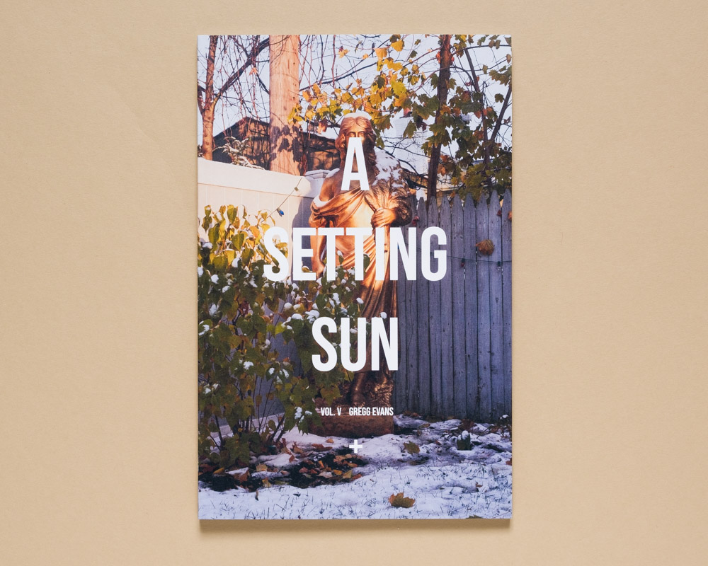
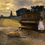
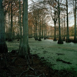
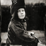
© Gregg Evans, A Setting Sun Vol. 5, by Kris Graves Projects (+KGP)
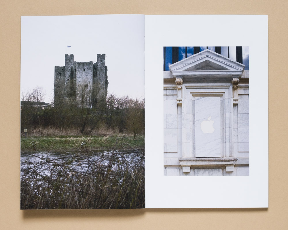
A Setting Sun by Gregg Evans is an ongoing project, published by Kris Graves Projects, that deals with issues of aging, archaeology, and the passage of time. It consists of photographs of varied subjects ranging from portraits of everyday objects within my daily life, to photographs of rocks, fossils and recent technologies which already appear dated. In doing so, I ask the questions “What do we leave behind? How will we be remembered?” without providing easy answers.
I watched a Youtube video the other day about the Silurian Hypothesis – a thought experiment in which scientists speculate if it would be possible that, given the timeline of the history of all life on earth, an undiscovered advanced civilization could have risen and fallen without any traces left today. Would there be any markers of their existence? How could we investigate the question of their history after any potential fossils had been crushed by the weight of the geologic record that came after them? What, if anything, could they have left behind that would stand the test of deep time? Does everything eventually turn back to molecules and isotopes?
For the past two days my eyes have been burning from the smoke filling the air in New York as a result of the forest fires raging in Quebec. Last week I read a report that the island of Manhattan is sinking under the weight of all the buildings that have occupied it for the past few hundred years. A recent study found that 77% of participants were found with microplastics in their blood. Scientists believe that three isotopes – cesium 137, plutonium 239 and 240 – will leave a defined mark in the geologic record from the atomic blast on July 16th, 1945, 5:29 a.m.
Are we the Silurians in this thought experiment? Will we leave behind fossilized Coca-Cola bottles and solar powered phone chargers? Mount Rushmore and the New York Public Library, Dennis Quaid burning books for warmth? Will we be remembered by caulking guns and novelty polyester halloween costumes?
In today’s conversation with Gregg Evans, I ask him about the genesis of the project as well as the newest edition, Vol V.; how he got into photography, how he makes decisions about the series, and what he’s up to next.
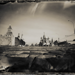
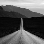
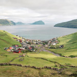
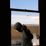
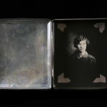
© Gregg Evans, A Setting Sun Vol. 5, by Kris Graves Projects (+KGP)
Sara J. Winston: Please tell us about growing up and what brought you to photography.
Gregg Evans: My dad worked at various private boarding schools in the New York City/Hudson Valley area growing up, and we always lived on campus in faculty housing. My mom grew up in England (though she was born in Texas) and my dad met her while he was teaching at American schools overseas. We moved around a lot from school to school, so my home was always kind of in flux in a way. Our family collections felt really important as a kid – like it didn’t feel like we were “home” until we had unpacked everything and put all our books on the shelves and put out my dad’s rug he got while he was teaching in Turkey and my mom’s teapots, etc. I think that sense of objects having a sort of history or story around them really stuck with me as a result.
I took a photography class here or there along the way, but was much more interested in music throughout childhood and into my teen years. I went to Purchase College in 2001 not really knowing what I wanted to do with my life, and was planning on majoring in Journalism (going into art felt like an unreasonable risk coming from a working class background, and journalism felt like a reliable job still at the time.) Pretty quickly I realized I didn’t want to be a journalist, and took a photography class in the Visual Arts program with Jed Devine before I had decided what my next move was. The way he talked about photographs was so expressive and philosophical, I just kind of fell in love. It really opened my eyes to what photographs could be, and I honestly felt like I had discovered a new language. I applied to the photo program and got in, basically inhaled every photobook the library at Purchase had to offer and took every photo class I could get into until I graduated.
So long story short, I took a photography 101 class in college and it blew my mind, and I’ve been an obsessive nerd ever since.
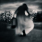
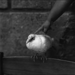
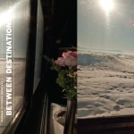
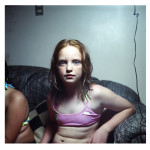
© Gregg Evans, A Setting Sun Vol. 5, by Kris Graves Projects (+KGP)
SJW: After you made the first volume of A Setting Sun, how did you know that the work was unfinished?
GE: When I started making the first volume of A Setting Sun it almost felt like an exercise. I had been working on the project in one form or another for only about two years, give or take, and I was showing a lot of older work in group shows that I had made in grad school at Columbia College Chicago but wasn’t really interested in making anymore.
I wanted to see the new work together and see how it felt as a group, so I made a zine in InDesign and was planning on self-publishing it. I started making zines in high school, mostly the embarrassing punk rock teenager variety, and had made a bunch in college and grad school. I always liked how fluid they felt – like a zine could be an experiment, more of a sentence or paragraph rather than a whole novel. I was also reading a lot of graphic novels and comic books at the same time – both more “art” oriented stuff like Anders Nilsen’s work and superhero stuff like Moon Knight, Thor, and Ms. Marvel. I liked the seriality of that type of publishing, and the sense that the story could often just keep on going and morph into a new thing along the way. So when I set out making the first one I was interested in making a series of zines that had this sense that they were discreet paragraphs in a larger story, that they weren’t a precious finalized “project” and something more akin to a chapter in a larger narrative. I liked the way it freed me to throw out the rules a little bit of what “conceptual photography” was… Like there was no more need to have this rigid narrative framework that defined the photobooks with a beginning, middle and end. I sent a pdf of the first volume to Kris to see if he would give me some feedback about it, and he liked it enough to want to publish it together. I remember I was super shocked and really excited to publish it with him, and I still kind of feel the same way whenever we put out a new one haha.
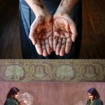
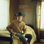
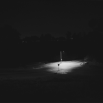
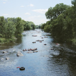
© Gregg Evans, A Setting Sun Vol. 5, by Kris Graves Projects (+KGP)
SJW: What has it been like each time a new volume is released?
GE: I am the king of self-doubt, so every time Kris and I put out a new volume I’m convinced nobody will ever buy it and Kris will end up with a giant pile of unsold books in his studio. Luckily that never happens! Kris is really great to work with, both in terms of the editing process (not to mention he is a wonderful person), and in terms of marketing the books and being present at so many great book fairs. It feels like the reception has been better with each volume, which is a great feeling once my anxiety subsides lol.
© Gregg Evans, A Setting Sun Vol. 5, by Kris Graves Projects (+KGP)
SJW: Are there distinct differences between the five volumes?
GE: For sure. Like I said before, the first volume was initially supposed to be a self-published zine before Kris asked if I wanted to publish it with him, so I would say it’s the loosest of the five books. It’s short, definitely fits a little more into the “poetic narrative” genre of photobooks, and is side stapled instead of perfect bound. Our dog had just developed a brain tumor and passed away when I was making it, so the photographs have a more somber tone at times. I was really interested in Alec Soth’s “Niagara” and “Dog Days, Bogota” when I made that volume, which is kind of funny because when I left grad school we had talked so much about Alec Soth I felt like I never needed to hear his name again. Obviously that changed once I had a little bit of room to not be constantly talking about the “canon” or whatever.
The second volume really focused a lot more overtly on the passage of time, and I had made a series of still lives with fruit and vegetables that I left to rot on my kitchen table in my partner and I’s apartment in Brooklyn. They were taken at various times of day over the course of about two weeks, and became a gridded (is that the word I’m looking for?) double page spread along with these photographs I took of some reeds in Prospect Park over the course of several months. I was working part time at Benrubi Gallery (among other gigs), and they had a Simon Norfolk show up of photographs he made in Afghanistan that focused on the landscape of the country and the history hidden in that landscape, and I was really influenced by that work a lot.
The third volume is when I really started trying to bring in more elements of a deeper scale of time to contrast the fleeting nature of the present tense. I traveled to Yosemite and to San Francisco, and was thinking a lot about how much both of those places had been photographed. I also became really interested in the objects people lose while hiking, which are often left out in case someone comes back for them. There was something kind of ghostly about those objects waiting for owners to retrieve them for who knows how long.
For the fourth, I was thinking about how many images I had started to accumulate, and so I designed the book on top of the actual layout of the prior books. There are images from the previous volumes peeking out from behind many of the images, and I put together some spreads that grouped similar images together by color or subject matter. I was also using text again, which is something I had done a lot of in grad school but had largely abandoned when I got into this project.
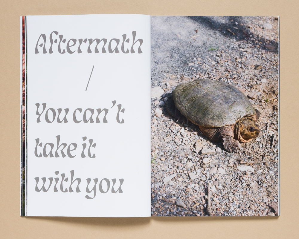
With this most recent book I’ve tried to move away from some of the prettier “poetic” moments I’ve more heavily included in past volumes and make the edit a bit more focused. I’ve had a somewhat more concrete list of things I was interested in while I’ve been shooting as well, so it’s more focused on specifics like dead tech, consumerism, fossils or industry. I also really enjoyed playing more with the text elements and making them more expressive and prominent.
© Gregg Evans, A Setting Sun Vol. 5, by Kris Graves Projects (+KGP)
SJW: How do you decide when a volume is complete and ready to be considered for the book form?
GE: I’m not the best at editing things down. I shoot a lot, and have a tendency to second guess myself while editing, so I will basically just keep making work for long periods of time until it starts to feel like something is coming together. I just always feel like I don’t have enough work for a book until I realize I have like hundreds of 4 or 5 starred images in my catalog that are waiting for someplace to live. Then I’ll put all of the images I’m interested in into one big folder, make work prints of them and just kind of live with those on my walls. Just kind of seeing what gaps need to be filled and what is and isn’t working for me.
I’ll end up with like hundreds of pictures and then it will seem time to start putting something together into a book, and that’s when I start being a little more harsh with my editing… Kris and I have edited some of the books down from folders instead of me laying out a preliminary mockup first, and I always feel like I look insane because it’s a folder with like 300 images in it. But it helps me to pull out themes and tease out tangents that way, and some images make it into a book that I maybe wouldn’t have thought about as much when they weren’t in conversation with the others. It’s part of the process I guess, even if it’s not the most organized way of going about things.
© Gregg Evans, A Setting Sun Vol. 5, by Kris Graves Projects (+KGP)
SJW: Would you share a little bit about your editing criteria for the books?
GE: The actual layout of the books tends to stick somewhat to the same format – I want them to feel like they fit together or live with each other, so I tend to use the same basic layout from the first one with tweaks here and there where it feels like it informs the read and flow of the book. A lot of it is pretty intuitive the first few drafts – trying to not have too many like pictures next to each other, what dominant colors compliment each other best, which photographs feel like they’re speaking to each other, etc. It’s where I really feel like I can be playful the most, before things start to feel more nailed down and I start feeling like it’s “time to get serious here.” Then I start playing with more direct themes that I want to weave through the books, whether that is something as broad as “the passage of time” or as specific as outdated technology. The last parts these days tend to be the text pieces, which I always want to inform the imagery but not explain it.
© Gregg Evans, A Setting Sun Vol. 5, by Kris Graves Projects (+KGP)
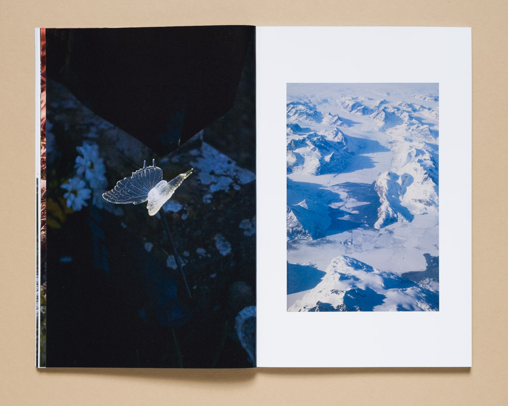
SJW: Does the criteria change with each volume?
GE: On some level, yes. It’s always based on theme or mood – I kind of think about each volume the same way a musician or a band will think about an album… I have a basic style of photograph I am interested in making, and each book fits within that framework, but with each one I work with a different tone. What makes the cut, editing wise, changes based on that change in tone. With Volume V, for example, I had been thinking a lot about science fiction that deals with climate change and what our future will look like, and I had also been thinking more directly about death and loss. I included a lot more imagery of outdated technology like satellite dishes and the like in this book, along with imagery of fossils or of memorials. The palette changed somewhat, I included images where I was experimenting with more artificial/rainbow/surreal colors. I wanted that contrast between the deeper sense of history some of the objects or places I was photographing had and the more contemporary, almost neon, palette I was sometimes using. It all comes down to vibes I guess lol.
SJW: Is there anything about Volume V that surprises you?
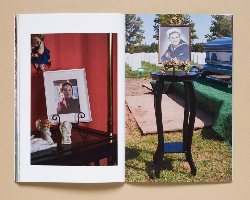
GE: I think when I finished Vol. V I was really surprised how dark it felt. Vol. IV came out just before Covid started in the fall of 2019, and all of the work in Vol. V was made during those 4 years, some images being made just before Covid hit but the majority being during it and in the ongoing “aftermath” so to speak. My partner’s older sister and father both passed away during that time, and the world felt like a really dark place most of the time I was making this group of images. I knew that going into editing obviously, but it really felt emotional looking at all of the work together. I included some pretty somber images that I debated keeping in – the memorial images of his sister and his father for one, but also this image of these discarded funeral arrangements I took in Dublin that spell out “Mam” (Mom) and “Nan” (Grandma). They’re images that feel important but still make me really sad to think about. I also included a lot of text pieces which referenced youtube conspiracy theory videos and things from apocalyptic science fiction novels. Looking at it from a distance now it feels really grim, almost paranoid, despite the bright color palette.
© Gregg Evans, A Setting Sun Vol. 5, by Kris Graves Projects (+KGP)
SJW: Did it become what you intended or something different?
GE: I think they always turn out different then the image I have in my mind when I set out on a new volume. There’s something about the layout and editing process that just forces me to let things go, to let the process take me where the book wants to go. That’s kind of how I work in general – the photographs I make happen in kind of the same manner. I’m not an artist who thinks in distinct “projects” and I feel like the images work best for me when they evolve over time and incorporate new ideas or techniques in a more fluid manner. I’ve been making this body of work that has become “A Setting Sun” for ten years now, and I’ve begun to realize that where I started back in 2014 and where I am now with the work are two different, but related places. Initially, I thought a lot about ideas around aging, the march of time, loss and the world we leave behind in a more personal, somewhat sentimental way. I was thinking of the photographs I was taking of a kind of artifact of the recent past. I still think about a lot of those same ideas ten years later, but I’m thinking of them in a more political manner. When I’m thinking of those earlier ideas now, it’s in addition to fears around climate change and the anthropocene, in addition to archaeology and evidence, etc. Instead of thinking about the work on a personal scale like where I started, I’m now thinking of it on a larger societal scale.
The books are intended to reflect that change naturally – they demarcate time simply by being published in volumes. So as the work shifts over time the books shift and evolve over time as well. In a way I intended that from the beginning, but it naturally grows as the work grows and shifts.
© Gregg Evans, A Setting Sun Vol. 5, by Kris Graves Projects (+KGP)
SJW: How does text function in these books, and particularly, how does it function in volume V?
GE: I made a lot of text based work in grad school, and when I first started the work that would become A Setting Sun I was also making a lot of text based pieces when I was working through my initial ideas. I still have a few of them on my website, but at this point I just think they look and feel too much like Ed Ruscha lol. So when I started making the first volume I kind of decided I wasn’t going to include the text work in it because it felt too different and I didn’t know how to handle it. I included short essays a lot in the first three volumes in place of it, and intended those to be like little additional related bonus material to the photographs in each book.
When I started working on Vol. IV it started to feel like maybe text could add something to the book in a different way. I wanted the text to reflect on the themes of the book but not describe them. I used a lot of time stamps from the metadata in my files as text pieces, and words I had written down in my notes app when I was making lists of things I wanted to keep an eye out for when I photographed. They’re pretty simple phrases – “Dinosaurs” and “Important Dates” are some that I had used or considered using.
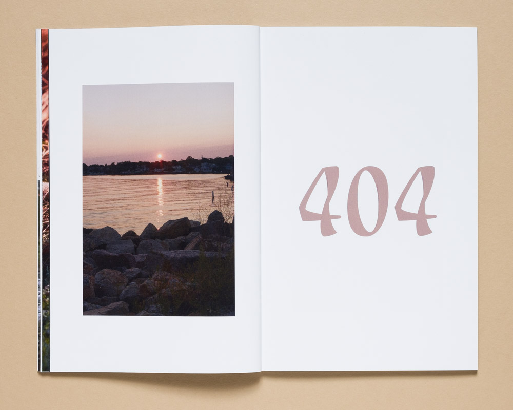
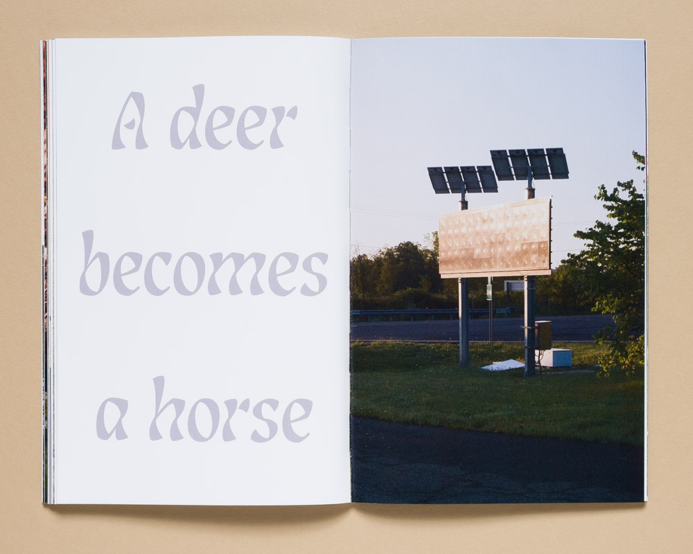
For Vol. V I decided to make the text pieces more prominent, and I was kind of thinking of pull-quotes in a magazine layout. I’ve been really obsessed with Adam Curtis’ documentaries over the past few years, particularly HyperNormalisation and Can’t Get You Out of My Head, and I really love the way he uses text and intertitles. They’re often on brightly colored backgrounds, with a bold but kind of governmental san-serif font using phrases that hint at a sense of unease within the story he is telling or deliberately break from that story. They’re really jarring, in a really hyper-colored modern manner.
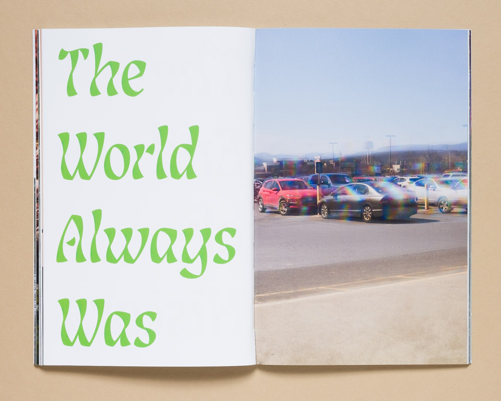
So I decided to take a page from his work and make the text in this volume more prominent. The phrases are again things I wrote down in my notes app, but instead of them being simple objects to photograph and things like that, they reference phrases I wrote down while watching youtube conspiracy videos, quotes from apocalyptic science fiction novels, the isotopes used in carbon dating, link rot/dead internet theory – things of that nature. I often matched the colors from photographs directly next to the text pieces, or used vibrant colors to contrast the mood of what the text was implying. I think my favorite is two panels which on the front page says “The End Of History” in bright red and “History Always Was” in neon green on the opposing side. They’re followed by an image of cars in a parking lot here in the Hudson Valley, shot through this mylar window film that creates a refracted rainbow pattern throughout the image. To me the panels imply a sense of paranoia and futility that’s felt so prevalent the last few years, which is reinforced by the oil-sheen quality of the photograph of the cars in the parking lot has. I want my text pieces to work in a similar fashion – to hint at something in the images, or to confuse the viewer and perhaps engage a deeper read of the photographs.
© Gregg Evans, A Setting Sun Vol. 5, by Kris Graves Projects (+KGP)
SJW: How do you decide on the font design for the text?
GE: For the cover and title page, the font is a clean and angular San-Serif that I’ve used for lots of text pieces over the years, Bebas Neue. It’s just a bold and simple font and I like the lines of it. I don’t want to change the cover section because I appreciate the uniformity and cohesiveness it gives each volume as a set of books. It wasn’t a really difficult design choice, it’s just a font I liked.
For the text pieces, however, I do think more about my font choice and what it implies, and I have let myself have more fun with it in the most recent book. In Vol. IV, I used a standard font for the text panels (it’s so boring – Times New Roman Italic) because it has that sort of “paper of note” documentary weight to it. I think it makes sense in the book but I definitely wanted to play more with text in future volumes. For Vol. V, I played around with a variety of fonts ranging from blocky san-serif fonts (too much like Adam Curtis) to more historical fonts (I didn’t feel like it matched the tone of the book.) In the end I chose a font that felt a little bit psychedelic, but also had some sort of historical qualities too. It kind of reminds me of Olde English or Hebrew, which I thought was an interesting contrast to the bright colors I was using and sort of paranoid quality of the phrases themselves.
As for the essay in book V, Kris had Caleb Cain Marcus of Luminosity Lab consult on the final fonts and layout for the colophon and essay, and I really love the font he chose for it and how he cleaned up my (very basic) layout skills on the essay portion. I would love to work with him more in the future, I’m a huge fan of the design work he has done with Kris on various projects.
© Gregg Evans, A Setting Sun Vol. 5, by Kris Graves Projects (+KGP)
SJW: Tell us, is Volume VI in the works?
GE: I have a hard time shooting and laying out a book at the same time, so I took a bit of a break last year getting Vol. V together. But I’ve been shooting a lot more again and traveling a bunch, which always feels like it gets me in a more creative mood again. So yeah, I am working on photographs that will eventually become the next book, but there’s not a set deadline I’ve given myself to be done by. True to form, I’m keeping things loose for now.
SJW: What is inspiring you right now?
GE: I’ve always been inspired by science fiction books and movies, and that certainly hasn’t changed. I recently read New York 2140 by Kim Stanley Robinson, which imagines a future in which sea levels rose by 100 feet and New York City has become a series of toxic canals that people live their lives around and on. I found that really fascinating, and I’ve been thinking a lot about what our landscape will look like in the future, and how much the earth’s landscapes have changed in the past. I also saw a gorgeous Linda Conner show in San Francisco this past spring that was a series of photographs of geologic rock formations and images of broken glass plate negatives taken from observatories that I keep thinking about. I’m always really inspired when I travel and I try and do that as much as I can afford to. I was in Norway recently and really enjoyed falling in love with Edvard Munch again and his color palette at the National Museum in Oslo. I also found the constant flow of cruise ships and container ships in the Norwegian landscape really unnerving and interesting. It’s definitely got me thinking about possible photographs for the future…
© Gregg Evans, A Setting Sun Vol. 5, by Kris Graves Projects (+KGP)
SJW: What’s next for you?
GE: I have a book signing coming up at the ICP Photobook Fest on September 7th (this interview unfortunately comes out after that I think, but 🤷.) I’m going to have a piece up in a group show at my Alma Mater, S.U.N.Y. Purchase, which I think opens September 18th, so if you’re in Westchester/the Hudson Valley it’s definitely worth checking out! It will have a lot of work from faculty and alumni, and there are some amazing photographers who have come through the program in one capacity or another, so it should be a great show. Also I’m going to try and make a lot of new work and try to focus a bit on industry and shipping, so we’ll see how that goes.
SJW: Thanks, Gregg, and best of luck!!
EG: Thanks for talking with me about the books, Sara!
Gregg Evans is an artist working in New York’s Hudson Valley. He holds an MFA in photography from Columbia College Chicago and a BFA in Fine Art from the State University of New York at Purchase. Among other exhibitions, he has shown at the Aperture Gallery; New York, The Griffin Museum of Photography; Boston, White Columns; New York, and Photographic Center Northwest; Seattle. He has published four volumes of his ongoing series A Setting Sun with +Kris Graves projects to date and has books in the collections of the Metropolitan Museum of Art, the Solomon R. Guggenheim Museum and the Museum of Modern Art.
Kris Graves Projects (+KGP) collaborates with artists to create limited edition publications and archival prints, focusing on contemporary photography and works on paper.
Sara J. Winston is an artist and contributor to Lenscratch.
Follow Gregg Evans, Kris Graves Projects, and Sara J. Winston on Instagram:
@annotatedimages; @kgpnyc; @sarajwinston
Posts on Lenscratch may not be reproduced without the permission of the Lenscratch staff and the photographer.
Recommended
-

Andrew Fedynak: The Last Snows of a Warming WorldMarch 15th, 2026
-

J. Lester Feder: The Queer Face of WarMarch 11th, 2026
-
Curran Hatleberg: Blood GreenMarch 9th, 2026
-

Kiana Hayeri: No Woman’s LandMarch 8th, 2026
-

McCall Hollister in Conversation With Douglas BreaultMarch 6th, 2026


